
When you focus too much on perfect symmetry and balance, your designs can feel stiff, unnatural, or unsettling because they lack the subtle imperfections our brains find engaging. Instead, embracing asymmetry and imperfections adds energy, authenticity, and visual interest. These elements guide your viewer’s eye naturally and create a more lively, genuine feel. If you want your designs to resonate more deeply, understanding how to balance without strict symmetry is key—and there’s more to explore.
Key Takeaways
- Perfect symmetry can feel unnatural or sterile, lacking the subtle imperfections that create visual interest.
- Balanced designs achieved through asymmetry often appear more dynamic and authentic than rigidly centered arrangements.
- Overly centered elements may disrupt visual flow, making compositions feel static or monotonous.
- The brain prefers slight variations and imperfections, which add vitality and emotional resonance to designs.
- Asymmetrical balance provides movement and engagement, preventing the discomfort often associated with perfect centering.
How Does Balance Differ From Symmetry?
While balance and symmetry are often used interchangeably, they actually refer to different concepts in design and aesthetics. Balance creates visual harmony by distributing elements so that no part feels heavier or more dominant, achieving a sense of design equilibrium. It considers weight, color, and size to make the composition feel stable. The role of contrast also influences how balanced a design appears, affecting how elements are perceived relative to each other. Additionally, understanding visual weight helps in creating dynamic compositions that feel balanced without strict symmetry. You can achieve visual harmony through asymmetrical arrangements that feel balanced because of thoughtful placement and proportion. Recognizing distribution principles enables designers to craft compositions that evoke the desired emotional response. Moreover, visual hierarchy plays a crucial role in guiding viewers’ attention and emphasizing key elements within a balanced design. Incorporating balance techniques can also help in achieving a cohesive and appealing aesthetic. Ultimately, understanding this difference helps you craft designs that feel engaging and well-structured without relying solely on perfect symmetry.
Why Does Our Brain React to Imperfect Designs?
Your brain is naturally wired to respond positively to imperfect designs because they create a sense of interest and visual engagement. This response stems from our aesthetic preferences for perceived harmony, which doesn’t require perfect symmetry. Imperfections often introduce subtle variations that make compositions feel more dynamic and authentic, capturing our attention. When a design isn’t perfectly balanced, your mind actively seeks to interpret the slight asymmetries, making the viewing experience more engaging. These imperfections challenge your brain’s desire for order while still offering a sense of coherence. As a result, your brain perceives these designs as more lively and interesting, highlighting that absolute symmetry isn’t always the most appealing. Additionally, understanding Gold IRA Markets can help investors recognize the importance of balance and trust in financial decisions, just as visual harmony influences aesthetic appeal. Recognizing the role of visual perception can deepen our appreciation for why imperfect elements often resonate more profoundly. Moreover, the psychology of aesthetics suggests that our preference for slight imperfections is rooted in evolutionary adaptations that favor natural and authentic appearances, fostering a deeper emotional connection. Slight imperfections also evoke feelings of authenticity and natural beauty, which are highly valued in both art and design. Interestingly, these irregularities can make a space or object feel more relatable and comforting, aligning with innate human tendencies toward familiarity and stability. Instead, slight imperfections foster a sense of natural beauty and visual intrigue.
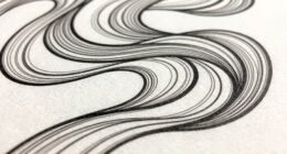
How Asymmetry Creates Visual Interest

Have you ever wondered why some designs instantly catch your eye despite lacking perfect balance? It’s often because asymmetry creates dynamic tension that draws your attention. When elements are unevenly distributed, your eye moves around the design, seeking harmony and contrast. Recognizing the importance of visual storytelling can also enhance your appreciation of asymmetrical compositions. Asymmetry generates visual intrigue, keeping you engaged longer. Additionally, movement and flow in a composition are essential for guiding the viewer’s gaze naturally, which asymmetry effectively achieves. Asymmetry breaks the monotony of predictability, making a composition feel lively and spontaneous. It invites you to explore different focal points and appreciate subtle differences, which can deepen your understanding of aesthetic balance and its role in creating compelling visuals. Understanding how visual perception influences our emotional response can further deepen your appreciation for these dynamic designs. Furthermore, creative flexibility allows designers to experiment beyond traditional norms, resulting in more innovative and captivating visuals.
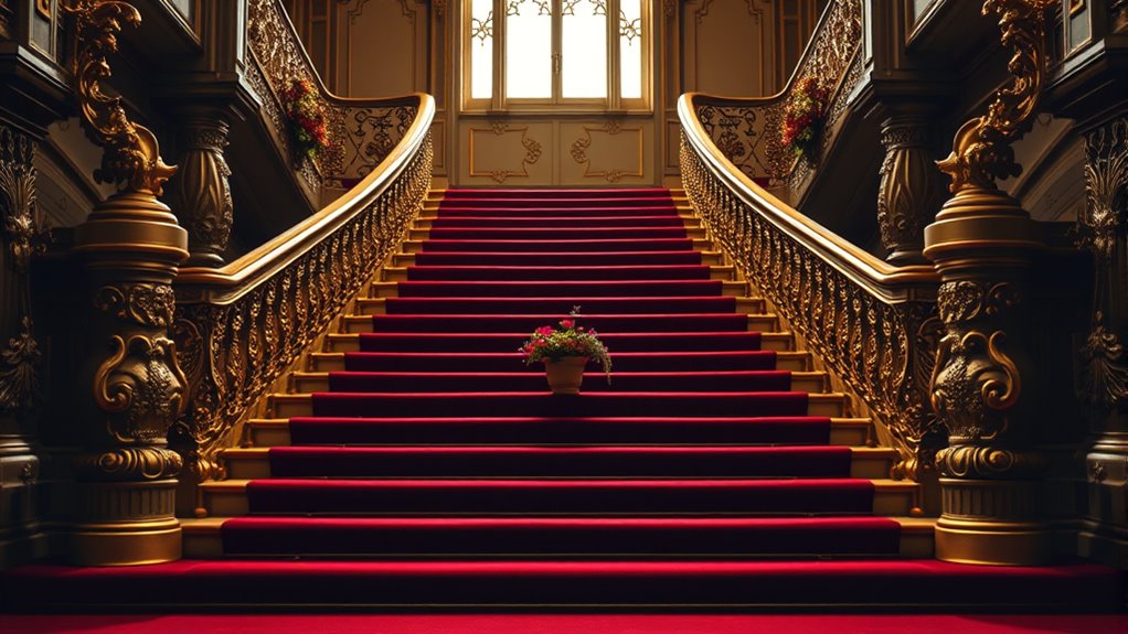
When Perfect Symmetry Feels Unnatural or Off-Putting
Even when symmetry is used intentionally, it can sometimes feel unnatural or unsettling, especially if it’s overly perfect or rigid. This creates a sense of centered chaos, where the eye expects harmony but is met with an unsettling sameness. Subtle imperfections, which are often overlooked, play a crucial role in making designs feel more alive and relatable. Unnatural balance appears stiff, lacking the subtle imperfections that make designs feel alive. When everything is precisely aligned, you might sense a dissonance—an absence of organic flow. This feeling often stems from subconscious cues that tell you something’s off, even if you can’t pinpoint it. Recognizing these cues can help in creating more organic visual harmony that feels naturally appealing. Incorporating biological patterns or slight asymmetries can enhance the sense of naturalness and comfort in design. Additionally, understanding the importance of visual imperfections can help designers create more engaging and less sterile compositions. Sometimes, intentionally introducing minor variations can evoke a more authentic and inviting atmosphere that resonates on a subconscious level.
Why Imperfection Can Be Beautiful (Wabi-Sabi)

You might find that flaws and imperfections add a unique charm to what you see around you. Embracing these quirks reveals beauty in simplicity and authenticity. Sometimes, it’s the imperfect details that make something truly mesmerizing. Recognizing the value of minimalist principles can help us appreciate the subtle elegance found in imperfection. Interestingly, understanding how AI ethics shape technology can also remind us that imperfections in design and decision-making often lead to more authentic and relatable outcomes. In the realm of backyard design, embracing free floating elements can create a more relaxed and natural aesthetic that resonates with the principles of imperfection. Incorporating natural textures further enhances this appreciation for organic irregularities, highlighting that true beauty often lies beyond symmetry and perfect balance.
Embracing Flaws and Uniqueness
Imperfection often carries a quiet beauty that perfection simply can’t capture. When you embrace flaws, you develop a deeper imperfection appreciation, recognizing that imperfections tell unique stories. Home improvement and interior design can also benefit from embracing asymmetry and irregularities, creating spaces that feel more authentic and inviting. Instead of seeking flawlessness, you celebrate the individuality that imperfections bring, making each piece or moment stand out. Flaws highlight character, history, and authenticity, reminding you that beauty isn’t about sameness or perfection but about genuine expression. By valuing these imperfections, you shift your perspective from criticism to admiration, fostering a sense of acceptance and connection. This celebration of uniqueness allows you to see the world—and yourself—in a more compassionate, vibrant light. When you accept imperfections, you create a richer, more meaningful appreciation for the diverse beauty that surrounds you.
Beauty in Simplicity
When you start to see beauty in simplicity, you realize that imperfections often add depth and character to what might otherwise seem plain. At-home beauty devices and skincare often emphasize natural, authentic results that celebrate these subtle variations. Embracing natural textures, like rough wood or weathered stone, highlights the authenticity of a space or object. Vibrant colors, even if slightly muted or imperfectly applied, can energize without overwhelming. This appreciation for subtle details reveals that perfection isn’t always necessary for beauty. Instead, it’s the honest, unrefined qualities that make something feel genuine and unique. By focusing on simplicity, you allow imperfections to stand out, creating a sense of harmony that feels both calming and real. Ultimately, embracing these imperfect elements invites a deeper connection to what you see and experience.
How to Balance Elements Without Symmetry

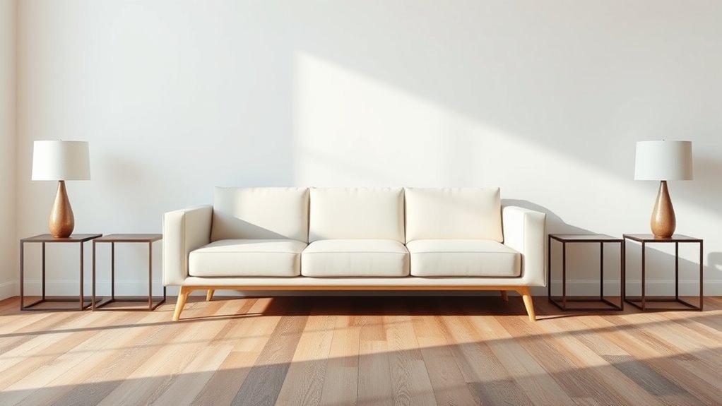
Balancing elements without relying on symmetry requires a keen eye for visual weight and placement. To create a compelling dynamic composition, you can vary size, color, and texture to guide the viewer’s eye. Use asymmetry intentionally to generate visual tension that adds energy and interest. Consider this table to help you visualize different balancing techniques:
| Technique | Example |
|---|---|
| Varying Scale | Larger object offsets smaller ones |
| Contrast | Bright colors against muted backgrounds |
| Placement | Off-center focal points |
| Color Balance | Warm and cool tones distributed evenly |
| Texture | Combining rough and smooth surfaces |
Experiment with these methods to achieve harmony without symmetry, making your design feel lively and engaging.
Examples of Designs That Embrace Asymmetry
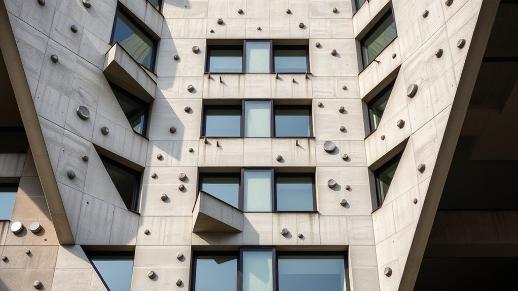
Have you noticed how some striking designs intentionally break symmetry to grab attention? These examples create an organic flow that guides your eye smoothly across the layout, making the experience feel natural and engaging.
Designers often use asymmetry to build dynamic tension, where imbalance sparks curiosity and energy. For instance, a magazine cover might feature a bold, off-center image paired with text that balances the composition without being perfectly symmetrical.
Similarly, websites may position elements unevenly but harmoniously, emphasizing certain features and establishing a visual rhythm. These approaches show that embracing asymmetry isn’t about chaos but about intentional design choices that evoke movement and interest, making your visuals more memorable and compelling.
Tips for Creating Harmonious, Engaging Layouts
To create engaging layouts, consider embracing asymmetrical balance to add visual interest.
Use visual weights intentionally, balancing elements of different sizes and shapes for harmony.
Embrace Asymmetrical Balance
While symmetrical designs can feel predictable, embracing asymmetrical balance allows you to create layouts that are both engaging and dynamic. Instead of perfectly mirroring elements, focus on achieving an organic flow that guides the viewer’s eye naturally across the design.
Asymmetry encourages you to play with different sizes, shapes, and placements, fostering a sense of natural harmony. This approach makes your layout feel more lively and authentic, avoiding the stiffness of perfect symmetry.
To succeed, balance visual weight thoughtfully—use contrasting elements to attract attention where needed, but guarantee the overall composition remains cohesive. Embracing asymmetry invites creativity and helps your design connect more deeply with viewers, making it memorable and visually interesting.
Use Visual Weights
Ever wonder how some layouts feel perfectly balanced and engaging? It’s often because you’ve used visual weights effectively. Visual hierarchy guides the viewer’s eye, emphasizing focal points that grab attention.
By adjusting the size, color, and placement of elements, you create a sense of weight that balances the composition naturally. Heavier visual elements—like bold images or large headlines—anchor your layout, while lighter elements fill in the gaps.
This balance keeps the viewer’s eye moving smoothly across the design without feeling overwhelmed or distracted. Use contrast and proximity strategically to highlight focal points, ensuring your key messages stand out.
Mastering visual weight helps you craft layouts that feel harmonious, engaging, and intuitively organized—without relying solely on symmetry.
Frequently Asked Questions
Can Asymmetry Improve User Experience in Web Design?
Yes, asymmetry can enhance your user experience by creating a dynamic visual hierarchy that guides visitors naturally through your content. It breaks the monotony of perfect symmetry, making your brand identity more memorable and engaging.
When you intentionally offset elements, you draw attention to key features, encouraging interaction and exploration. This approach makes your website feel more authentic and lively, ultimately improving user engagement and satisfaction.
How Does Cultural Perception Influence Preferences for Symmetry?
Cultural perception heavily influences your preferences for symmetry, as cultural bias shapes your aesthetic standards. In some cultures, symmetry is valued for its harmony and order, making it more appealing.
In others, asymmetry is appreciated for its uniqueness and natural beauty. Your perception of what looks attractive depends on these cultural influences, guiding your preferences and how you interpret visual balance in design.
Are There Psychological Reasons Behind Why Perfect Balance Feels Unsettling?
Yes, there are psychological reasons why perfect balance can feel unsettling. Your visual perception is sensitive to subtle asymmetries, which your brain interprets as natural and dynamic.
When things are perfectly centered, it can trigger a cognitive bias called the “uncanny valley,” making you feel uneasy because it appears almost natural but not quite. This discomfort arises because your mind expects slight imperfections, signaling authenticity and harmony.
What Role Does Context Play in Choosing Symmetry or Asymmetry?
Context plays a vital role in whether you choose symmetry or asymmetry because it guides your visual hierarchy and emotional impact. When you consider the scene’s purpose and audience, you naturally select the arrangement that emphasizes certain elements, creating harmony or tension.
For example, in a calm setting, symmetry offers stability, while in dynamic situations, asymmetry captures attention and evokes excitement. Your choice shapes how viewers interpret and feel about your design.
How Do Different Art Forms Utilize Asymmetry to Evoke Emotion?
In various art forms, you use asymmetry to create visual tension and evoke emotional imbalance, making your work more engaging. For example, in painting, placing a focal point off-center draws viewers in, stirring curiosity or unease.
In photography, asymmetrical compositions highlight contrast and movement, enhancing emotional impact. This deliberate imbalance guides your audience’s feelings, making your art evoke deeper, more dynamic emotions than perfectly symmetrical designs often can.
Conclusion
Remember, embracing imperfection and asymmetry can make your designs feel more natural and engaging. Instead of aiming for perfect balance or symmetry, focus on creating visual interest and harmony through deliberate imbalance. Trust your instincts and experiment with different arrangements. By doing so, you’ll craft compositions that feel authentic, lively, and enthralling—showing that sometimes, the most compelling designs come from embracing imperfection rather than perfection.