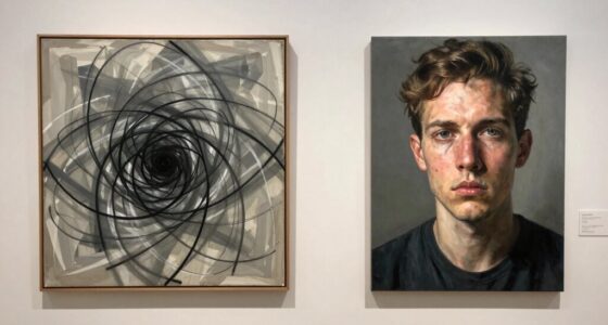

Colors in art evoke strong emotions because of their psychological and cultural meanings. Warm hues like reds and oranges spark excitement and passion, while cool tones like blues promote calmness. Combinations of contrasting or harmonious colors shape how you perceive a scene’s mood. Artists intentionally use these palettes to convey messages and evoke feelings. If you continue exploring, you’ll discover how understanding color psychology can help you create more impactful and emotionally resonant art.
Key Takeaways
- Certain color palettes evoke strong emotional responses due to their cultural associations and psychological effects.
- Warm colors like red and orange stimulate excitement and passion, hitting viewers with energy and urgency.
- Cool tones such as blue and green promote calmness, creating soothing or contemplative emotional reactions.
- High saturation levels intensify feelings, making palettes more impactful and memorable to viewers.
- Artists intentionally use specific color combinations to influence mood, engagement, and emotional connection.
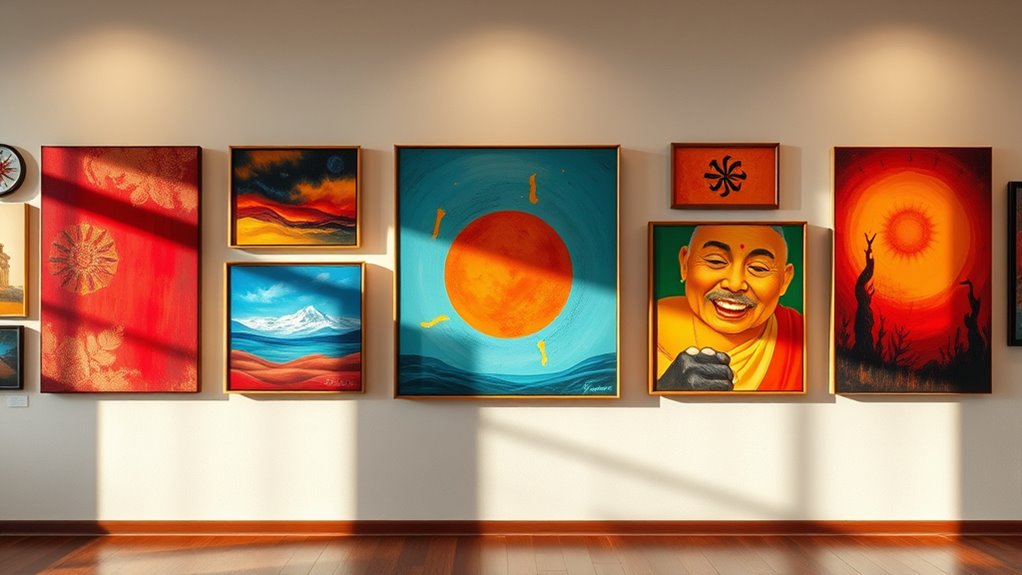
The Emotional Power of Warm and Cool Colors

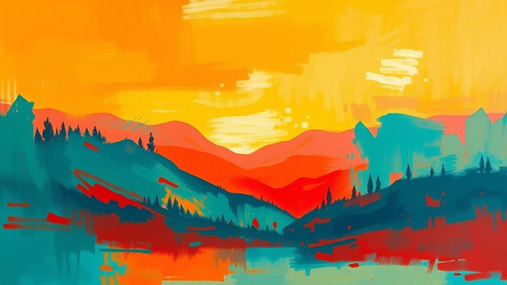
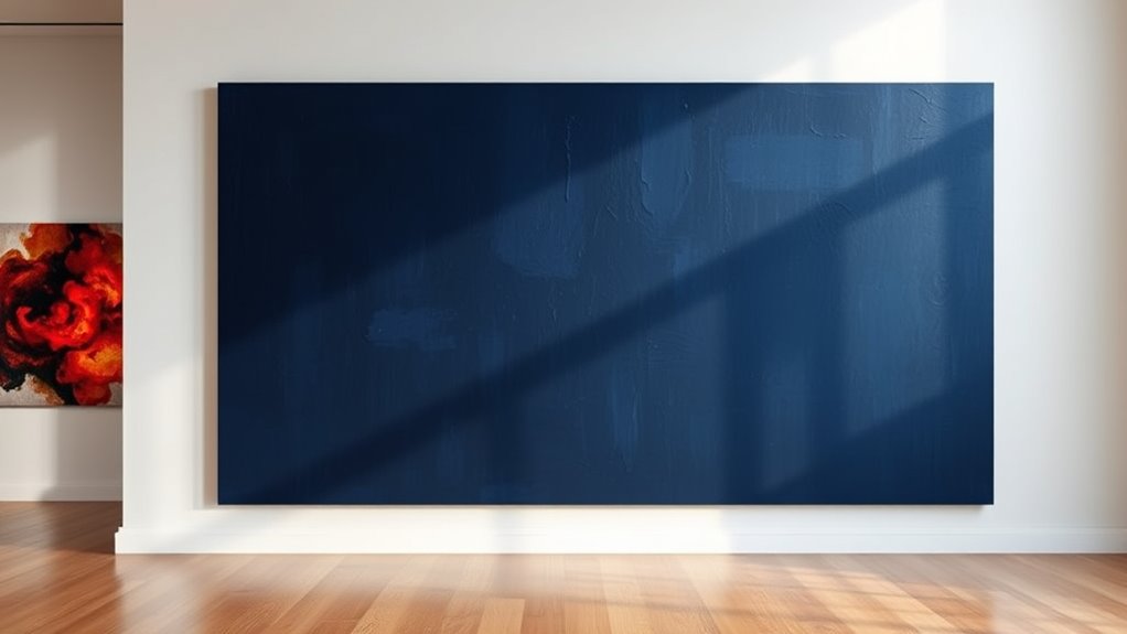
Warm and cool colors evoke distinct emotional responses that influence how you experience art. Warm hues, like reds, oranges, and yellows, often evoke feelings of energy, passion, and comfort. They can create a sense of intimacy or excitement, drawing you into the artwork. Conversely, cool tones such as blues, greens, and purples tend to produce calming, soothing effects. They can evoke tranquility or sadness, depending on their context. When artists use warm or cool colors intentionally, they guide your emotional reaction and shape your perception of the piece. Your mood can shift based on these color choices, making the palette a powerful tool for expressing feelings and influencing the overall tone of the artwork. Additionally, understanding the fundamentals of color psychology allows artists and viewers to better interpret the emotional impact of various palettes. Recognizing how color associations influence perception can deepen your appreciation of art and its emotional resonance. Being aware of visual perception principles helps explain why certain color combinations impact viewers so profoundly, as our brains interpret colors through cognitive processes that shape emotional responses.
How Color Combinations Influence Mood and Perception
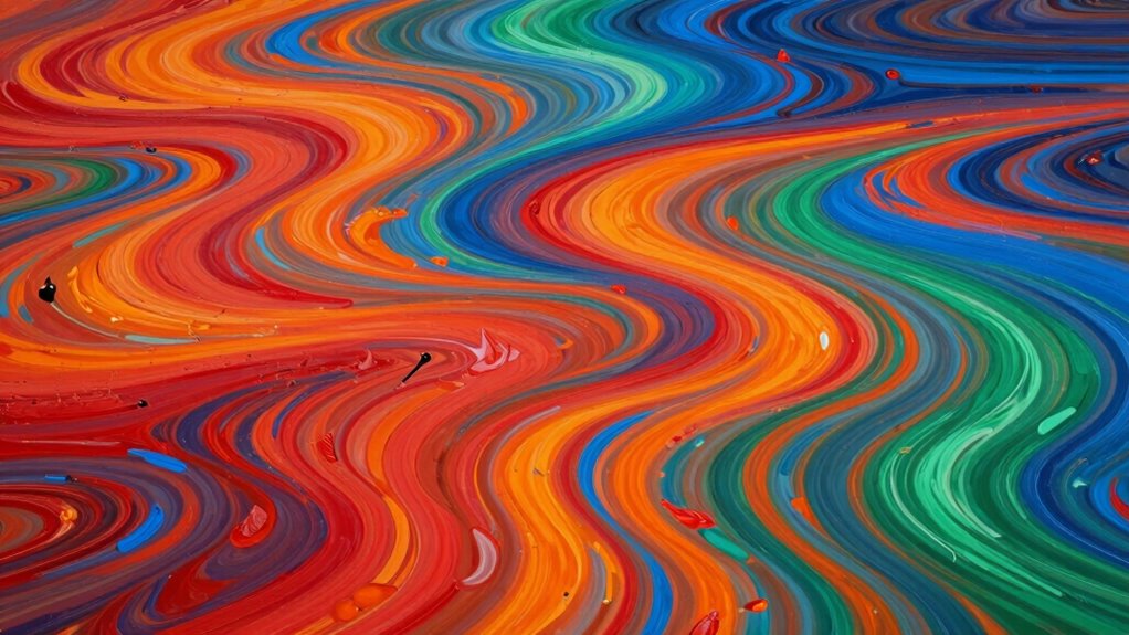
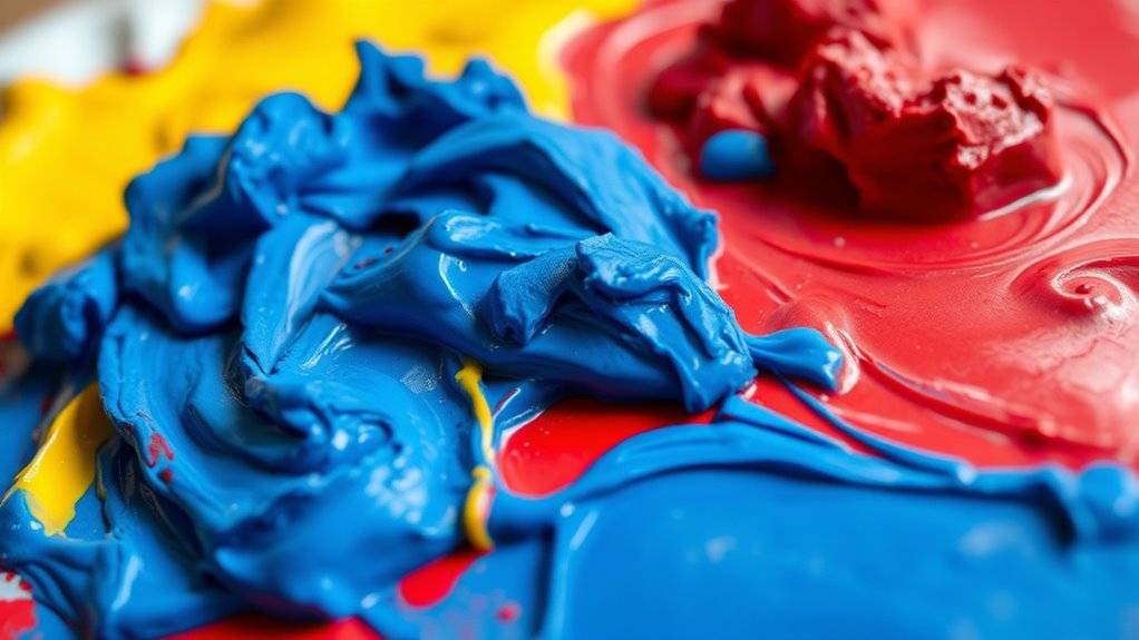
The way colors are combined in an artwork can considerably shape your mood and perception. When artists achieve color harmony, the result feels unified and pleasing, guiding your emotional response effortlessly. A balanced palette creates visual balance, preventing any one color from overpowering the others, which helps you feel calm or energized depending on the combination. For example, complementary colors can generate excitement, while analogous hues evoke harmony and serenity. The contrast and arrangement influence how you interpret the scene, making certain feelings more prominent. By carefully selecting and blending colors, artists manipulate perception, drawing your eye and shaping your emotional experience. Additionally, understanding color theory can enhance how artists choose palettes to evoke specific emotional reactions. Recognizing the psychological effects of colors allows both artists and viewers to better understand the emotional language conveyed through color choices. Ultimately, how colors are combined profoundly impacts your connection with the artwork and your overall mood.
The Role of Cultural Associations in Color Preferences
Colors in art don’t just evoke emotions through their visual qualities—they also carry powerful cultural meanings that influence your preferences. Cultural symbolism shapes how you interpret colors based on your background and experiences. For example, red might symbolize luck and prosperity in Chinese culture, while in Western societies, it often signifies passion or danger. Regional color meanings deepen these associations, making certain hues more appealing or meaningful depending on where you’re from. These cultural associations can override universal color responses, guiding your emotional reactions and preferences subconsciously. When you view a piece of art, your understanding of these cultural symbols influences how you connect with the colors used, making your experience uniquely personal and culturally rooted. Additionally, awareness of cultural associations can enhance your appreciation of diverse artistic styles and their emotional impact. Recognizing the cultural significance of colors helps deepen your interpretation of artworks beyond their visual appeal, allowing for a richer engagement. Being aware of these cultural distinctions can also help you better understand cross-cultural art, enriching your overall appreciation of global artistic expressions. Furthermore, understanding the role of cultural context in color meaning can influence how artists choose palettes to evoke specific responses in different audiences.
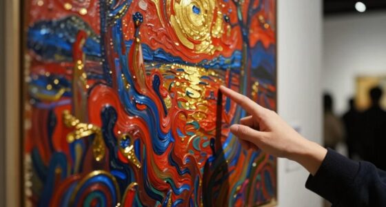
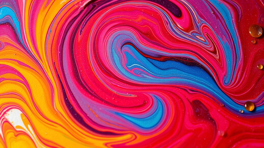
Color Intensity and Its Effect on Viewer Engagement

Vivid and highly saturated hues tend to grab your attention more effectively than muted tones, increasing your overall engagement with a piece of art. When color saturation is intense, it stimulates your senses and keeps you focused longer. Higher color intensity can evoke stronger emotions and make the artwork more memorable. Additionally, color saturation influences the viewer’s perception of depth and harmony within a composition. The visual impact of saturated colors can be amplified through proper contrast and placement, further enhancing viewer engagement. However, excessive saturation might overwhelm or tire your eyes if overused. To maximize viewer attention, artists balance saturated colors with softer tones. Consider these points:
- Bright, saturated colors quickly attract your gaze.
- Moderate saturation prevents visual fatigue.
- High color intensity enhances emotional impact.
- Using varied saturation levels maintains interest without overwhelming.
- Understanding the psychological effects of color saturation helps artists create more compelling compositions.
- Incorporating digital tools can assist artists in experimenting with different saturation levels to achieve desired effects.
- Recognizing the role of contrast in saturation can further improve the overall harmony and effectiveness of an artwork.
Understanding how color saturation influences your engagement helps you appreciate why certain palettes resonate more deeply and keep your attention fixed.
The Psychological Impact of Monochromatic and Contrasting Palettes
Monochromatic and contrasting palettes evoke distinct psychological responses that influence how you perceive and feel about a piece of art. Monochrome minimalism often creates a sense of calm, focus, and clarity, emphasizing simplicity and introspection. In contrast, contrasting harmony uses bold color combinations to energize or evoke tension, engaging your emotions more intensely. These palettes shape your experience by highlighting different aspects of the artwork’s mood and message. Consider the table below for deeper meanings:
| Monochrome Minimalism | Contrasting Harmony |
|---|---|
| Simplicity, calm | Energy, tension |
| Focused, introspective | Dynamic, engaging |
| Subtle emotions | Bold expressions |
| Clarity, purity | Excitement, contrast |
Additionally, understanding how color psychology influences viewer reactions can deepen your appreciation of these palettes. Recognizing the emotional impact of different color schemes can help you better interpret and connect with artwork on a personal level. Moreover, awareness of halal standards can guide you in making ethical choices when selecting art supplies or decorations, ensuring alignment with your values.
Artists’ Intentions: Using Color to Convey Meaning
Artists intentionally choose colors to communicate specific emotions and ideas, shaping your perception of their work. By understanding their intent, you can better grasp the message behind the palette. They often use color symbolism to evoke feelings or highlight themes, aligning their choices with the story they want to tell. Recognizing artist intent helps you see beyond aesthetics and appreciate deeper meanings. For example, warm tones might express passion or energy, while cool shades convey calm or sadness. Proper care and maintenance of artworks can also influence how their colors age and appear over time. Additionally, color application techniques play a crucial role in how effectively artists convey their intended message and evoke emotional responses. Understanding these choices enhances your connection to the artwork, revealing how artists manipulate color to influence your emotional response and convey complex messages. By analyzing these elements, viewers gain insight into artistic communication, enriching their overall experience and interpretation of art. Moreover, understanding the psychological effects of color can deepen your appreciation of the artist’s strategic use of palettes to elicit specific reactions. Exploring quality assurance practices in art conservation can further ensure the longevity of these emotional and visual impacts.
The Science Behind Color and Human Psychology

Colors influence your emotions and behavior because our brains respond to different hues in specific ways. Your color perception shapes how you interpret and react to visual stimuli, triggering particular emotional responses. For example, warm colors like red and orange can evoke feelings of excitement or urgency, while cool colors such as blue and green often promote calmness and relaxation. This connection exists because certain wavelengths of light activate neural pathways associated with emotional processing. Scientific studies reveal that your brain quickly associates specific colors with certain moods or sensations, influencing your overall perception and behavior. Additionally, fundamentals of visual perception play a crucial role in how we interpret and respond to colors, reinforcing the idea that understanding this science helps explain why artists choose particular palettes—each color can evoke subconscious reactions, making your emotional responses to art both powerful and instinctive. Recognizing these color associations enables artists to intentionally craft compositions that resonate emotionally with viewers. Furthermore, understanding the neuroscience of color can help artists and designers create more impactful visual experiences that align with desired emotional outcomes. Moreover, recent research indicates that neural responses to color can differ among individuals based on factors like age, culture, and personal experience, further influencing emotional reactions to visual art.
Applying Color Psychology to Enhance Personal Artistic Expression
By understanding how different hues influence emotions, you can intentionally select and apply colors to express your personal vision more effectively. Using knowledge of color symbolism, you can craft personal color palettes that resonate with your feelings and message. This approach helps you create artwork that communicates clearly and authentically. To enhance your artistic expression, consider these strategies:
- Experiment with combinations that evoke specific emotions
- Develop personal color palettes based on your emotional responses
- Use color symbolism to reinforce your artwork’s theme
- Adjust hues to match the mood you want to convey
Additionally, understanding color application techniques grounded in safe and thoughtful practices can help you achieve your desired emotional impact while maintaining healthy artistic habits.
Frequently Asked Questions
How Do Different Lighting Conditions Alter Perceived Color Emotions?
Different lighting conditions profoundly impact your perception of color emotions by causing a perception shift. Under warm, soft lighting, colors may feel more comforting or intimate, while harsh, cool lighting can make them seem distant or clinical. The lighting impact influences how you interpret a palette’s mood, making certain colors evoke different feelings depending on the environment. So, changing the light can transform your emotional response to the same artwork.
Can Color Preferences Change Over Time or With Age?
Yes, your color preferences can change over time due to age-related color shifts and evolving tastes. As you age, your experiences and emotional associations influence your color preference evolution, making certain palettes more or less appealing. You might find yourself drawn to calmer, muted tones as you mature, or return to vibrant colors from childhood. These shifts reflect your changing perceptions and emotional responses, shaping your unique relationship with different colors over the years.
Do Individual Personality Traits Influence Color Choice in Art?
Personality profoundly influences your color choices, shaping your artistic expression. If you’re passionate and playful, you might prefer vibrant, vivid hues that reflect your lively spirit. Conversely, a calm, contemplative personality gravitates toward muted, soothing shades. Your unique traits guide your palette preferences, turning personal tendencies into powerful, expressive colors. So, your personality traits aren’t just traits—they’re the brushstrokes that define your artistic identity.
How Do Digital Displays Affect Color Perception Compared to Physical Media?
Digital displays influence your color perception through factors like digital calibration and screen glare. You might notice colors look different on screens because calibration varies between devices, affecting how vibrant or accurate they appear. Screen glare can wash out or distort colors, making them seem dull or overly bright. To see true colors, you need well-calibrated screens and a glare-free environment, ensuring your perception aligns more closely with the artist’s intent.
Are There Universal Color Associations That Transcend Cultural Differences?
You might notice some universal color symbolism, like red for passion or danger, but cultural color meanings can vary widely. While certain shades evoke similar emotions across cultures, many colors hold unique significance depending on your background. Recognizing these differences helps you understand how cultural context influences your perception of color, making your reactions more nuanced and personal, even amid some shared associations.
Conclusion
So, next time your favorite color stirs unexpected feelings, remember—it’s not just in your head. Artists have long exploited this power, and now you’re in on the secret. Ironically, the same hues that evoke calm or chaos are often chosen to manipulate your mood. So, enjoy the magic of color—just don’t blame the palette if it unexpectedly hits you harder than you thought! After all, who said art isn’t a little psychological warfare?