If you mismatch color temperature with your scene’s light source, your artwork can feel off or unnatural. Warm tones under cool lighting or vice versa create visual discord, disrupting the scene’s harmony and making it seem unconvincing. These inconsistencies can confuse viewers about depth, space, and time, affecting the mood you want to convey. Understanding how to align color temperature with lighting helps keep your art believable and engaging—stick around to explore how to master this balance.
Key Takeaways
- Mismatched color temperature and lighting disrupt visual harmony, making artwork appear unnatural or unsettling.
- Incorrect color choices under specific light sources can distort scene realism and emotional tone.
- Clashing warm or cool tones with their lighting context confuses viewers’ perception of space and depth.
- Disregarding light source influence causes visual discord, undermining the scene’s mood and narrative clarity.
- Consistent alignment of color temperature and lighting enhances authenticity and prevents artwork from feeling “off.”
Have you ever wondered how the warmth or coolness of a color can influence the mood of a piece of art? It’s a fascinating aspect of color psychology that can dramatically shape how viewers interpret your work. When you choose a color palette, you’re not just picking colors for their aesthetic appeal; you’re also setting a mood, evoking feelings, and even influencing perceptions of space and time. But what happens when the color temperature doesn’t match the lighting conditions or the scene’s context? That’s when your artwork can look off, even if the colors are technically accurate.
Light source influence plays a critical role here. Our brains naturally expect certain colors to appear under specific lighting conditions. For example, daylight tends to cast a neutral or slightly warm glow, while incandescent bulbs produce a warm, yellowish hue. If you paint a scene with warm tones but place it in a setting illuminated by cool, bluish light, the contrast can feel jarring. Conversely, cool colors under warm lighting can seem unnatural or unsettling. When the color temperature of your palette clashes with the perceived light source, it disrupts the natural harmony our eyes anticipate. Your audience may sense something’s wrong even if they can’t pinpoint why—because they subconsciously rely on light source influence and color psychology to interpret the scene.
This mismatch can make a good piece of art look wrong because it confuses the viewer’s visual expectations. Our perception of depth, space, and even time hinges on consistent lighting cues. If the colors suggest a particular mood but the lighting contradicts it, the entire piece can feel disjointed or unsettling. For example, a sunset scene painted with cool tones might evoke a sense of calm, but if that scene is lit with an overly warm light source, it can throw the viewer off. The inconsistency between color temperature and lighting source disrupts the narrative you’re trying to tell. Additionally, understanding how light source influence interacts with color choice is essential for creating believable and engaging scenes. Recognizing these subtle relationships can also help you intentionally create atmospheres that evoke specific emotional responses.
To avoid this, it’s crucial to factor in the light source influence when selecting your colors. Think about the scene’s environment and the lighting conditions that will be present. Matching your color temperature to the scene’s light source creates a cohesive, believable atmosphere. When your colors align with the lighting cues, your art resonates more naturally, and viewers are more likely to feel immersed rather than confused. Understanding these subtle relationships between color psychology and light source influence helps you craft artwork that feels authentic and compelling, rather than visually discordant.

Kelepu Portable Color Temperature Light Wand, Rechargeable 6 Modes 2700K-6000K Photography Light Wand for Decoration Designer Use
Precise Color Control: This versatile lighting tool offers a wide range of color temperatures from 2700K warm white…
As an affiliate, we earn on qualifying purchases.
As an affiliate, we earn on qualifying purchases.
Frequently Asked Questions
How Does Color Temperature Influence Emotional Impact in Artwork?
Color temperature directly influences the emotional impact in your artwork by shaping viewer perception through color psychology. Warm tones evoke feelings of warmth, comfort, or even tension, while cool tones can create calmness or sadness. When you choose the right color temperature, you guide your audience’s emotional response effectively. Misusing it, however, can lead to unintended feelings or disconnect, making your art seem emotionally inconsistent or confusing.
Can Adjusting Color Temperature Improve or Ruin a Digital Photo’s Realism?
Adjusting color temperature can improve a digital photo’s realism if you maintain color consistency, ensuring the tones match the scene’s natural light. However, overdoing it or misjudging the temperature can ruin realism, making the image look unnatural. Remember, color temperature also allows for artistic interpretation; you can creatively manipulate warmth or coolness to evoke mood, but always balance it carefully to keep the photo believable.
What Are Common Mistakes Artists Make With Color Temperature?
You often make the mistake of ignoring color harmony and visual balance when adjusting temperature. This throws off your artwork’s mood and realism, making scenes feel unnatural or jarring. You might overuse warm tones or cool hues, disrupting the cohesive flow. Keep a careful eye on how temperature shifts affect overall balance, ensuring your colors complement each other to create a harmonious, believable image that captivates viewers.
How Do Different Light Sources Affect Perceived Color Temperature?
Different light source variations considerably impact perceived color temperature, causing color perception shifts. For example, daylight provides a cool, neutral light, while incandescent bulbs emit warm tones. Fluorescent lights often cast a cooler, bluish hue. As a result, your artwork might look different under each source, making colors seem warmer or cooler than intended. Understanding these effects helps you adapt your palette and lighting choices for accurate color representation.
Is There an Ideal Color Temperature for Landscape Versus Portrait Art?
Think of landscape art as a sunrise—warm, inviting, and full of life—so a color temperature around 5000-6500K enhances color harmony and mood. For portraits, aim for 3300-4300K, creating a softer, more intimate atmosphere. This balance boosts mood enhancement and helps your art feel authentic. Modifying these temperatures guarantees your work resonates emotionally, whether capturing vast vistas or intimate moments.
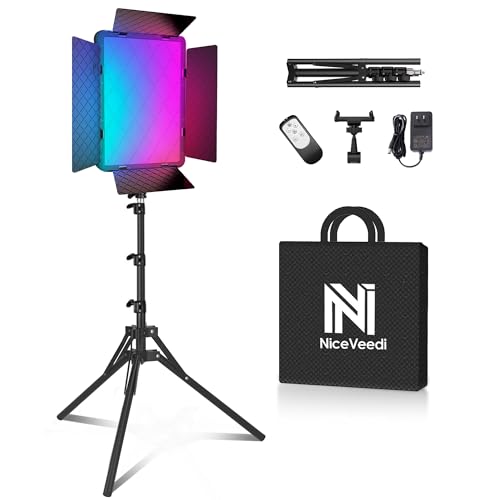
NiceVeedi 40W RGB Photography Lighting with 20 Effects, 360° Full Color/2700-6500K Studio Lights with Remote & Display, Lighting for Video Recording/Photography/Streaming/YouTube/TikTok/Content Creat
【Powerful Bi-Color Photography Lighting Kit】Equipped with 540 high-brightness LEDs, the RGB video light reaches up to 40W of…
As an affiliate, we earn on qualifying purchases.
As an affiliate, we earn on qualifying purchases.
Conclusion
Remember, color temperature is like a magician’s wand—when wielded skillfully, it transforms your art from good to breathtaking. But if misused, it can turn your masterpiece into a confusing blur. Don’t let the illusion fade; master the warmth and coolness of your palette. After all, isn’t art about capturing emotion? So, trust your eye, embrace the subtle shifts, and let your colors tell the true story—your story.
Lystaii 9pcs Gel Light Filter Color Correction Colored Overlays Transparent Color Film Lighting Gel Filter Plastic Sheets Correction 9 Colors 11.7 by 8.3 Inches for Film, Video, Photo, Stage
Quality Material: These gel filters are made of high light transmission PVC plastic, can be used as a…
As an affiliate, we earn on qualifying purchases.
As an affiliate, we earn on qualifying purchases.
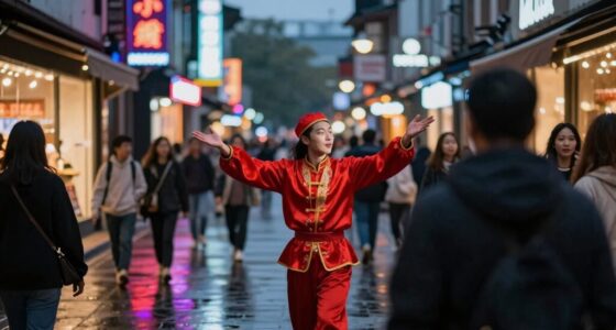
artificial light source for accurate color rendering
As an affiliate, we earn on qualifying purchases.
As an affiliate, we earn on qualifying purchases.