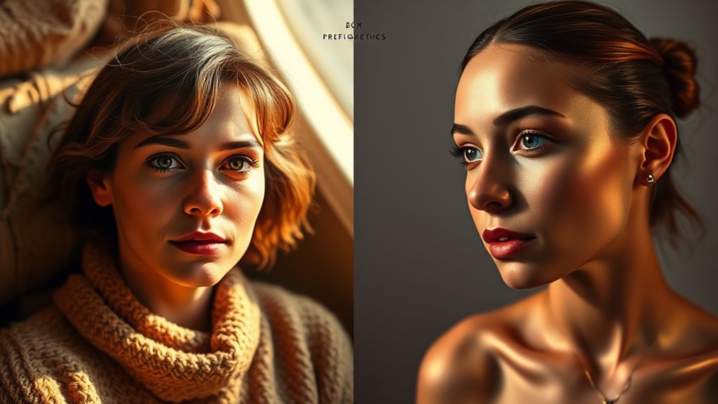
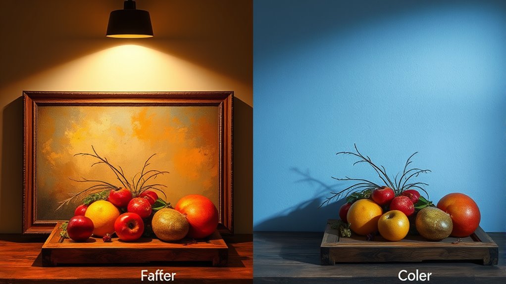
Warm light, with lower Kelvin (2,700K–3,200K), creates a cozy atmosphere that boosts warm tones like reds and yellows, making artwork feel inviting and emotionally engaging. Cool light, with higher Kelvin, sharpens cooler hues like blues and greens, highlighting fine details and textures, giving a modern look. Understanding how color temperature influences mood and perception helps you choose the right lighting to showcase your artwork effectively and beautifully. Explore further to learn more.
Key Takeaways
- Warm light (2,700K–3,200K) enhances warm tones, creating cozy atmospheres and making reds, oranges, and yellows more vibrant.
- Cool light (above 3,200K) sharpens colors, emphasizes cooler hues like blue and green, and highlights fine details and textures.
- Warm lighting evokes emotional connection and a relaxed mood, while cool lighting promotes clarity and a modern feel.
- Proper placement and control of light ensure accurate color rendering and prevent glare or shadows in artwork display.
- Adjusting color temperature influences viewer perception, mood, and the overall impact of the artwork.

Canon imagePROGRAF PRO-1100: 17” Professional Wireless Inkjet Photo Printer
11 PIGMENT-BASED INK SYSTEM PLUS CHROMA OPTIMIZER: The 11 pigment-based ink system provides a broad color gamut and...
As an affiliate, we earn on qualifying purchases.
What Is Color Temperature and How Does It Differ?
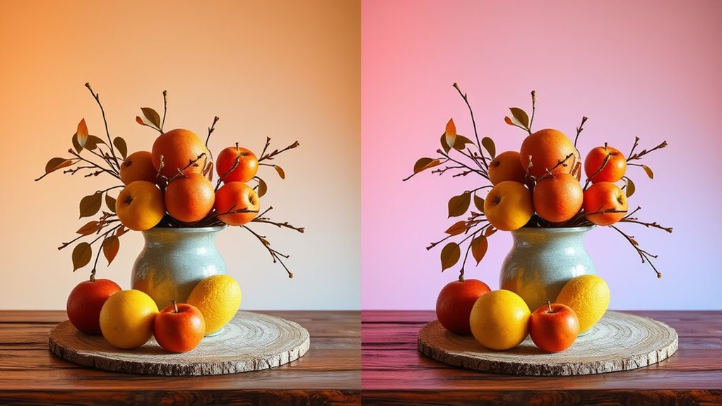
Color temperature describes the warmth or coolness of light, measured in Kelvins (K). It influences how you perceive colors and can dramatically affect the emotional impact of a space. Different environments benefit from specific color temperatures to achieve desired effects. Warm light, with lower Kelvin ratings, tends to create cozy, inviting atmospheres that make colors appear softer and more saturated. In contrast, cool light, with higher Kelvin ratings, makes colors look sharper and more vibrant, often evoking a sense of alertness or cleanliness. Your perception of artwork and decor shifts depending on the lighting conditions, as it alters the way hues are seen and felt. Additionally, understanding the contrast ratio of your lighting can further enhance the visual impact of your space. Recognizing how light color interacts with artwork can help you select the optimal lighting to emphasize specific features or moods. Adjusting light color based on the artwork’s tones can significantly enhance its visual appeal and emotional resonance. Moreover, considering the color rendering index ensures that colors appear natural and true to their original hues under different lighting conditions, further refining how artwork is perceived. Understanding this difference helps you select lighting that enhances the mood and emotional tone you want to convey, whether it’s a relaxed, intimate setting or a bright, energizing environment.

Glendan Picture Light for Wall, Professional Art Light for Museum & Gallery
Vivid Viewing Experience: This led picture light integrates anti-glare optics, high CRI 95+, and ultra-clear projection. Visitors enjoy...
As an affiliate, we earn on qualifying purchases.
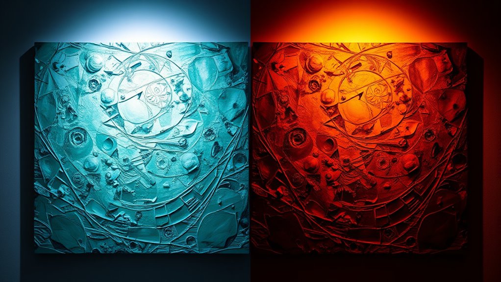
How Does the Kelvin Scale Define Warm and Cool Light?
The Kelvin scale provides a clear framework for defining warm and cool light by assigning specific temperature ranges. Warm light typically falls between 2,700K and 3,200K, producing a soft, amber glow that enhances warm tones in artwork. Sticking Wall Decor Regularly checking the integrity of your lighting setup ensures your artwork remains well-illuminated and protected. The Kelvin scale helps you understand how different color temperatures influence color rendering, making colors appear more vibrant or subdued. Additionally, light diffusion plays a role in how the Kelvin temperature affects artwork; warmer light tends to diffuse softly, creating a cozy atmosphere, while cooler light may be more direct, highlighting details and texture. Recognizing precious metal IRAs can also inspire choices for sustainable lighting solutions that improve artwork presentation. Understanding color rendering index (CRI) helps you select lighting that accurately displays the true colors of your artwork, ensuring optimal visual impact. For example, the spectral power distribution of a light source impacts how well it reveals the nuances in color and detail across different types of artwork.

Canon imagePROGRAF Professional 13" PRO-310 Wireless Inkjet Photo Printer with 3.0-Inch Color LCD Monitor, 9 Color Pigment-Based Ink System, Black
9 COLOR + CHROMA OPTIMIZER pigment-based ink system produces gallery-quality prints.
As an affiliate, we earn on qualifying purchases.
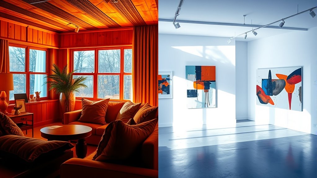
How Warm Light Enhances Artwork’s Warm Tones and Mood
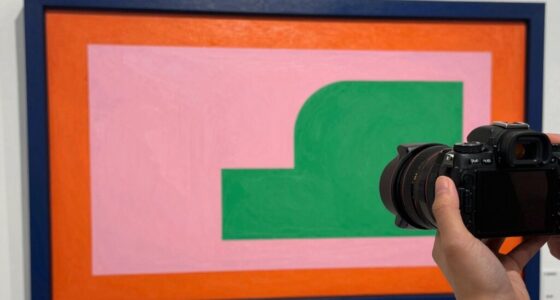
Warm light naturally enhances the richness of warm tones in your artwork, making reds, oranges, and yellows appear more vibrant and inviting. This warm glow creates an emotional ambiance that deepens the viewer’s connection with your piece. You’ll notice how warm lighting amplifies the depth and warmth, emphasizing the mood you want to convey. Proper lighting placement is essential to maximize these effects and ensure your artwork’s best presentation. Additionally, understanding the color temperature helps in selecting the right lighting to achieve the desired emotional impact. Recognizing the impact of lighting quality can also make a significant difference in how your artwork is perceived in different environments, especially when considering the artwork’s environment and how light interacts with its colors. Being aware of lighting consistency ensures that your artwork maintains its intended appearance over time under different conditions.

Canon imagePROGRAF PRO-2600
CES Imaging is a Canon Platinum Reseller
As an affiliate, we earn on qualifying purchases.
How Cool Light Highlights Cool Tones and Details in Art
Cooling the lighting shifts the focus to cooler tones and fine details within your artwork, creating a different emotional atmosphere. When you use cool light, it accentuates the subtle nuances of blue, green, and purple hues, making them more vivid and striking. Additionally, cool lighting can influence the perceived color temperature, affecting how viewers interpret the mood and depth of the piece. This type of lighting emphasizes detail enhancement, allowing viewers to notice delicate brushstrokes, texture, and intricate elements that might be subdued under warmer lighting. The lighting conditions play a crucial role in how art is perceived, impacting the overall experience. Studies show that light spectrum can alter the way colors are perceived, making cool light especially effective for highlighting cooler aspects of your artwork. Considering the visual perception of viewers, cool lighting helps to bring a sense of clarity and freshness, highlighting the cooler aspects of your piece and giving it a crisp, modern feel. Using lighting techniques can further enhance the way your artwork’s cooler tones are showcased, ensuring that every detail is appreciated. If you want to showcase the fine craftsmanship and cool-toned color palette of your artwork, using cool light is an effective way to draw attention to these specific qualities.
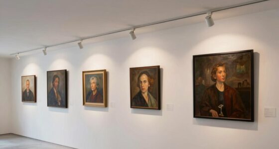
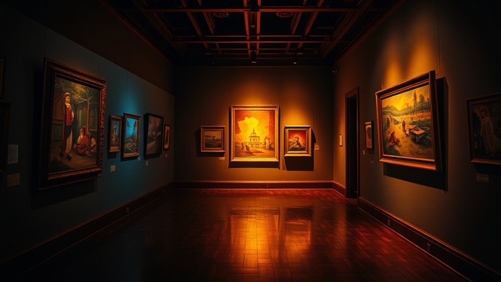
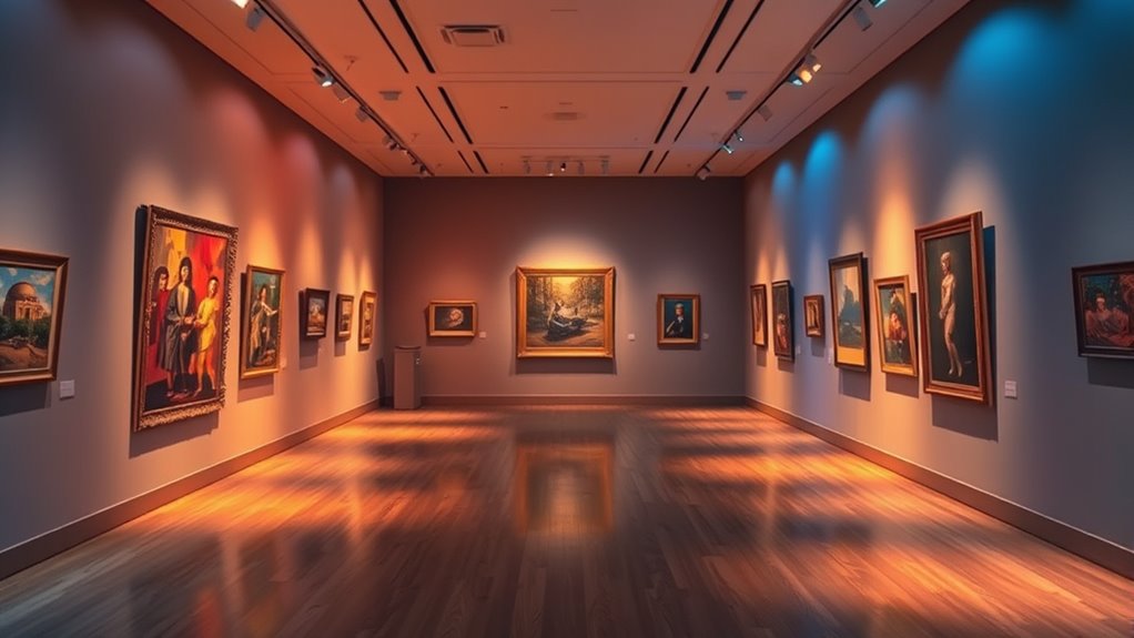
How to Use Lighting Effectively in Galleries and Museums
To showcase artworks effectively, you need to pay attention to proper light positioning, ensuring each piece is illuminated evenly and without glare. Maintaining consistent lighting conditions helps visitors experience the art as intended and prevents color distortion. Proper lighting placement is essential for highlighting textures and details, enhancing the viewer’s appreciation of the artwork. Additionally, understanding lighting parameters such as color temperature and intensity can further improve how art is perceived under different lighting scenarios. Incorporating smart lighting technology can also allow for more precise control over these parameters to adapt to different exhibits and environments. Developing a methodical approach to lighting setup ensures systematic and effective illumination of each artwork. Awareness of lighting effects can help curators select the best lighting to evoke specific moods or emphasize particular features.
Proper Light Positioning
Effective light positioning is essential for showcasing artwork in galleries and museums, ensuring each piece is illuminated without causing damage or distortion. Proper light fixture placement minimizes glare and highlights details effectively. Focus on angling lights to avoid unwanted shadows and reduce reflections that can obscure artwork. Shadow management is vital; position fixtures to prevent harsh shadows that distract viewers or distort features. Use adjustable track lighting or wall-mounted fixtures for flexibility. Here’s a helpful overview:
| Light Fixture Placement | Shadow Management | Notable Tip |
|---|---|---|
| Above artwork at 30° | Avoid direct front lighting | Use diffusers |
| Side lighting at 45° | Minimize floor shadows | Keep fixtures consistent |
| Angled from above | Prevent dark corners | Regularly check positions |
Additionally, understanding the color temperature of lighting can influence how artwork appears to viewers and impact its preservation. Adjusting the lighting parameters appropriately ensures colors are accurately represented and the artwork remains protected. This strategic setup enhances visual clarity and preserves artwork integrity.
Consistent Lighting Conditions
Maintaining consistent lighting conditions is essential for accurately showcasing artwork in galleries and museums. Consistent color matching guarantees that visitors see the artwork as intended, without color shifts caused by changing light.
To achieve this, you should carefully select lighting that maintains stable color temperature throughout the display area. It’s important to differentiate between ambient versus task lighting; ambient provides overall illumination, while task lighting highlights specific pieces.
Balancing these sources prevents uneven lighting and color inconsistencies. Regularly monitor and adjust your lighting setup to avoid fluctuations that can distort artwork appearance.
How to Choose the Best Light for Art Photography
Choosing the right light for your art photography depends on understanding how light color affects mood and detail.
You’ll want to take into account brightness and intensity to highlight textures without washing out colors.
Keep in mind color temperature tips to ensure your images accurately reflect the artwork’s true hues.
Light Color Impact
Have you ever noticed how the color of your light can dramatically change the mood and perception of your artwork? Light color influences how viewers interpret your piece through color psychology—the way different hues evoke emotions and reactions.
Warm lighting creates a cozy, inviting atmosphere, emphasizing richness and depth, while cool lighting offers a crisp, modern feel, highlighting details with clarity. Your choice of ambient lighting sets the tone and guides the viewer’s emotional response.
When selecting light for art photography, consider how color temperature affects these perceptions. The right balance enhances your artwork’s impact, making it feel more vibrant or serene, depending on your intent.
Ultimately, understanding light color impact helps you craft the perfect environment for showcasing your art.
Brightness and Intensity
The brightness and intensity of your lighting can dramatically influence how your artwork is perceived, affecting both visibility and emotional impact. Bright, intense lighting enhances lighting contrast, making details pop and emphasizing texture. Conversely, softer lighting creates a more subdued mood, reducing harsh shadows. To maximize color vibrancy, adjust intensity carefully; too bright can wash out colors, while too dim dulls details. Consider your artwork’s focal points and desired atmosphere when selecting brightness levels. Use the table below to compare different lighting approaches:
| Lighting Level | Effect on Contrast | Impact on Color Vibrancy |
|---|---|---|
| Bright | High contrast | Colors appear vivid |
| Moderate | Balanced contrast | Colors remain natural |
| Soft | Low contrast | Colors may seem muted |
| Overly Bright | Loss of details | Colors may wash out |
Choose wisely to enhance your artwork’s visual appeal.
Color Temperature Tips
Selecting the right color temperature is essential for capturing your artwork’s true essence. To enhance color contrast, choose lighting that complements the artwork’s dominant hues—warm light for rich reds and oranges, cool light for blues and greens.
Consider the emotional mood you want to evoke; warm light creates a cozy, inviting feel, while cool light offers a calm, clinical atmosphere. Test different temperatures to see how they affect your piece’s vibrancy and overall impact.
Adjusting color temperature can also help minimize unwanted reflections or color shifts, ensuring your photo accurately represents the artwork. Keep in mind that consistent lighting helps maintain true color contrast, making your art more compelling and true to life.
Tips for Lighting Your Home Display and Collections
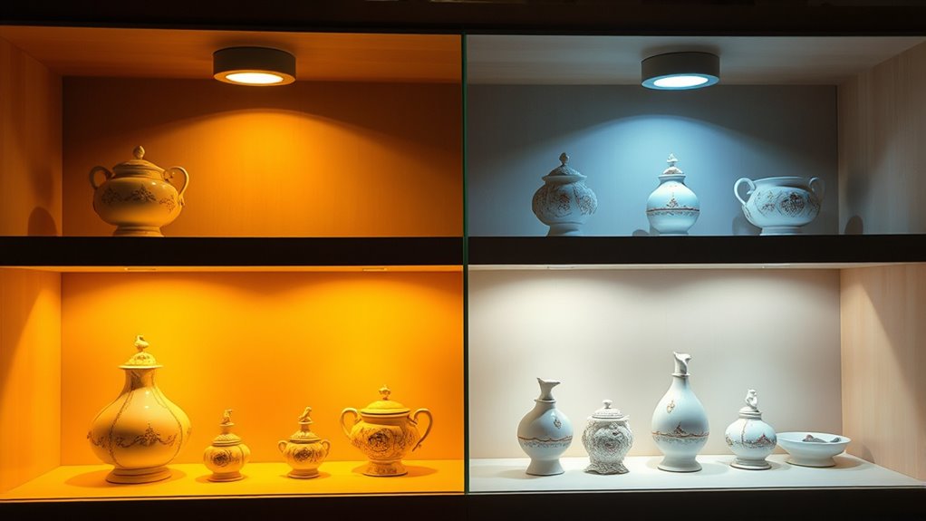
To effectively showcase your home displays and collections, thoughtful lighting is essential. Proper illumination highlights details, preserves art conservation standards, and minimizes energy use. Use adjustable LED fixtures to tailor light intensity and color temperature, ensuring artworks stay vibrant without damage. Position lights to avoid glare and shadows, maximizing visual appeal. Consider using warm light for vintage collections or cool light for modern pieces, aligning with their mood. Incorporate dimmers to control brightness and save energy.
| Tip | Benefit |
|---|---|
| Use adjustable LED lights | Art conservation, energy efficiency |
| Position lights carefully | Reduce glare, enhance details |
| Vary color temperature | Match artwork style and mood |
| Install dimmers | Save energy, control ambiance |
| Regularly clean fixtures | Maintain brightness, prevent dust buildup |
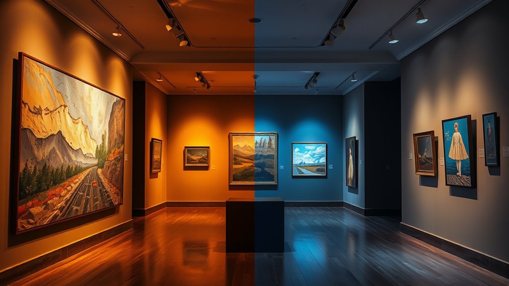
How Light Temperature Shapes Viewer Perception and Atmosphere
Lighting choices do more than just illuminate; they influence how viewers perceive your space and its mood. The color temperature you select impacts lighting psychology, shaping emotional responses and overall atmosphere.
Warm light creates a cozy, inviting environment that fosters comfort and relaxation, making viewers feel at ease. In contrast, cool light promotes alertness and focus, often lending a modern or clinical vibe.
Your lighting decisions can evoke specific feelings, influencing how viewers interpret artwork and space. By understanding how light temperature affects perception, you can craft an environment that aligns with your desired emotional impact.
Whether you aim to energize or soothe, thoughtful lighting choices ultimately guide your audience’s experience and emotional connection to the setting.
How to Balance Warm and Cool Light for Perfect Illumination
Achieving the perfect illumination involves carefully blending warm and cool light to create a balanced environment that supports both comfort and functionality. Effective lighting design relies on color balancing to highlight artwork without overpowering it. To do this, consider using adjustable fixtures that allow you to set the right mix of warm and cool tones. Position lights strategically to avoid harsh shadows and ensure even coverage. Use the table below as a guide:
| Warm Light Focus | Cool Light Focus |
|---|---|
| Enhances cozy atmosphere | Creates modern, crisp look |
| Highlights warmer hues | Accentuates cooler shades |
| Used in living spaces | Ideal for task lighting |
| Balances overall ambiance | Improves clarity and detail |
This approach guarantees your artwork is presented beautifully, with lighting tailored to your desired mood.
Frequently Asked Questions
Can Mixed Lighting Create Visual Confusion in Artwork?
Yes, mixed lighting can create visual confusion in artwork. When different light sources with varying color temperatures are used, it disrupts color consistency, making it harder for viewers to perceive the true hues.
This inconsistency can distract or mislead viewers, affecting their perception of the artwork’s intended mood or detail. To avoid this, aim for uniform lighting that enhances the artwork’s colors and maintains clear, accurate viewer perception.
How Does Aging Affect the Perception of Warm and Cool Lighting?
Aging effects cause your perception of warm and cool lighting to shift over time. As you age, your eyes become less sensitive to certain colors, making warm lights seem less vibrant and cool lights appear duller.
This perception shift can alter how you see artwork, possibly requiring adjustments in lighting to maintain accurate color appreciation. Staying aware of these aging effects helps you choose lighting that preserves the artwork’s true colors for longer.
Are There Specific Light Temperatures Best for Certain Art Mediums?
You should choose light temperatures that maximize color rendering and light durability for specific art mediums.
For paintings, a neutral or slightly warm light enhances true colors without distortion.
For textiles, cooler temperatures may prevent fading.
Always select lighting with high color rendering index (CRI) and durable light sources to preserve artwork’s vibrancy over time.
This ensures your artwork remains vivid and accurately viewed under ideal conditions.
How Does Ambient Light Influence the Effectiveness of Targeted Lighting?
Ambient influence plays a vital role in the effectiveness of targeted lighting, as it sets the overall lighting dynamics in your space. When ambient light is too bright or mismatched, it can wash out or distort the artwork’s colors, making targeted lighting less effective.
To enhance your display, you should control ambient light levels, ensuring it complements and enhances the focused lighting. This creates a balanced and visually appealing environment.
What Are the Environmental Impacts of Different Lighting Choices?
You should consider that different lighting choices impact the environment through energy consumption and ecological footprint. LED lights, for example, use less energy and have a smaller ecological footprint than incandescent bulbs, making them more eco-friendly.
Opting for energy-efficient lighting reduces carbon emissions and conserves resources, helping protect the environment. Your choice of lighting directly affects sustainability, so selecting eco-conscious options benefits both the planet and your energy costs.
Conclusion
Understanding how warm and cool light influence your artwork helps you create the perfect display. By choosing the right color temperature, you can enhance tones, highlight details, and set the mood you want viewers to experience. Whether in galleries, photography, or your home, balancing these lighting options lets you showcase your art beautifully. Experiment with different temperatures to find what makes your pieces truly shine and evoke the desired atmosphere.