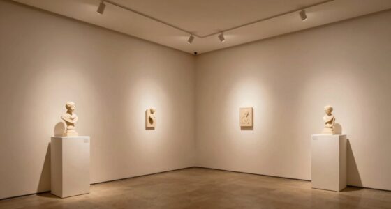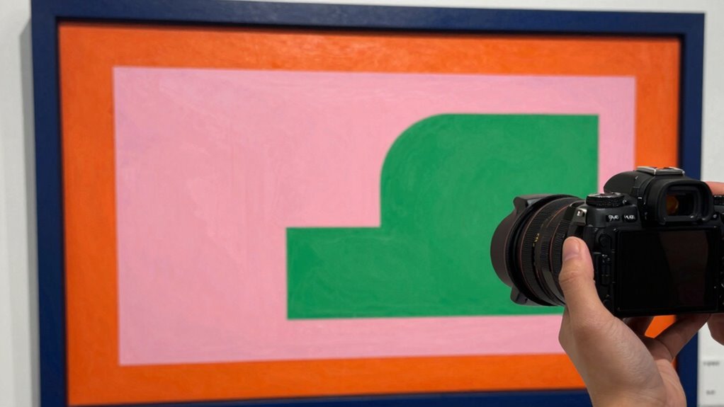

Choosing the right mat color can make your artwork stand out by creating contrast and guiding viewer focus. Using complementary or contrasting hues, like blue with orange, adds energy, while neutral tones add sophistication and balance. Think about your artwork’s main colors and the mood you want to evoke—bold for impact or subtle for elegance. To master this art trick and make your pieces truly pop, explore how color choices influence perception and harmony.

Get school and study supplies delivered free — and shop member deals
- Fast, free delivery on millions of items
- Access to Prime Big Deal Days deals on October 6–7
- Prime Video, Amazon Music and more included
Key Takeaways
- Contrast between the mat color and artwork enhances visual impact and draws viewer attention.
- Matching the mat color to the artwork’s dominant hue creates harmony and emphasizes key elements.
- Using contrasting or complementary colors around the mat adds vibrancy and makes the art stand out.
- Testing different mat shades in the display environment helps choose the most effective color for impact.
- Incorporating color psychology through mat choices can evoke specific emotions and amplify the artwork’s message.
As an affiliate, we earn on qualifying purchases.
How Colors Affect Feelings and Perception
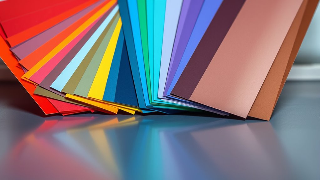
Have you ever wondered how a simple color can influence your mood or perception? That’s the power of color psychology. Colors evoke emotions and shape how viewers perceive your art. When you understand the impact of color, you can more intentionally craft visual narratives that resonate on a deeper level. For example, red can energize and create excitement, while blue tends to promote calmness and trust. When you choose colors thoughtfully, you guide the viewer’s feelings and reactions without them even realizing it.
Colors influence emotions and perception, shaping how viewers connect with your art.
Understanding how colors affect perception helps you craft compositions that communicate your intended message more effectively. It’s not just about aesthetics—colors can influence attitudes and responses, making your artwork more engaging. Additionally, knowing about visual perception can enhance how you leverage color choices to create impactful art. Recognizing color harmony and contrast can help you balance your palette and make certain elements stand out. Mastering the relationship between color psychology and viewer perception allows you to create visual stories that resonate deeply and leave a lasting impression.
color contrast mat for art framing
As an affiliate, we earn on qualifying purchases.
As an affiliate, we earn on qualifying purchases.
Using Contrast and Complementary Colors to Make Art Pop
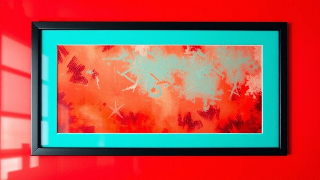
To make your artwork truly stand out, mastering contrast and complementary colors is essential. The color wheel is your guide for identifying these pairs—colors opposite each other create vibrant contrasts that catch the eye. Electric bikes and dirt bikes often feature powerful motors that utilize similar principles of contrast to enhance performance and appeal. Using contrasting hues establishes a strong visual hierarchy, directing viewers’ attention where you want it most. For example, pairing blue with orange or red with green creates energy and depth, making elements pop. When you apply these combinations thoughtfully, your artwork gains dynamic movement and clarity. Remember, contrast doesn’t just mean brightness; it also involves hue differences that sharpen focus. Understanding color theory helps artists develop more compelling compositions that effectively communicate their vision.
As an affiliate, we earn on qualifying purchases.
Why Neutral and Subtle Tones Can Elevate Your Artwork
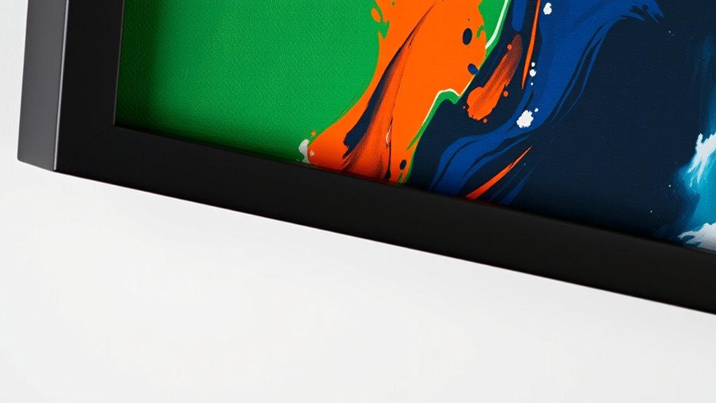
Neutral and subtle tones might seem understated, but they hold the power to elevate your artwork by adding sophistication and balance. Using matte finishes on your mat boards minimizes glare, allowing your art to stand out without distraction. These tones create a calm, refined backdrop that helps your colors and details shine. Incorporating the right fundamentals of framing—such as proper spacing and alignment—can further enhance the visual impact of your art. When choosing framing techniques, opt for simple, clean lines that complement the subtle palette, rather than overpowering it. Neutral shades also offer versatility, making your artwork adaptable to different spaces and styles. Additionally, understanding small appliance energy efficiency can help you maintain your display setup with minimal impact on your environment. Developing an understanding of wall surface preparation can ensure your artwork remains in excellent condition over time. Focusing on visual harmony in your presentation can make your artwork more captivating and cohesive.
As an affiliate, we earn on qualifying purchases.
Tips for Picking the Perfect Mat Color for Your Art
Choosing the right mat color is essential for enhancing your artwork’s impact. Start by considering your frame styles—sleek frames work well with bold mat colors, while ornate frames often suit more subtle tones.
Selecting the perfect mat color enhances your artwork’s overall impact and harmony.
The mat material also plays a role; rigid mats provide clean edges, making color choices more striking, whereas textured mats add depth. Pick a color that complements your art without overpowering it.
For vibrant pieces, a neutral or subdued mat can help balance the composition. If your artwork features a dominant color, choose a mat that either contrasts subtly or echoes that hue for harmony.
Testing different options with small samples before committing is highly recommended, as it allows you to see how the colors interact in your specific display setting. Color contrast can further help you make informed decisions about which mat colors will truly make your artwork pop.
Real Examples Showing How Mat Colors Change the Look
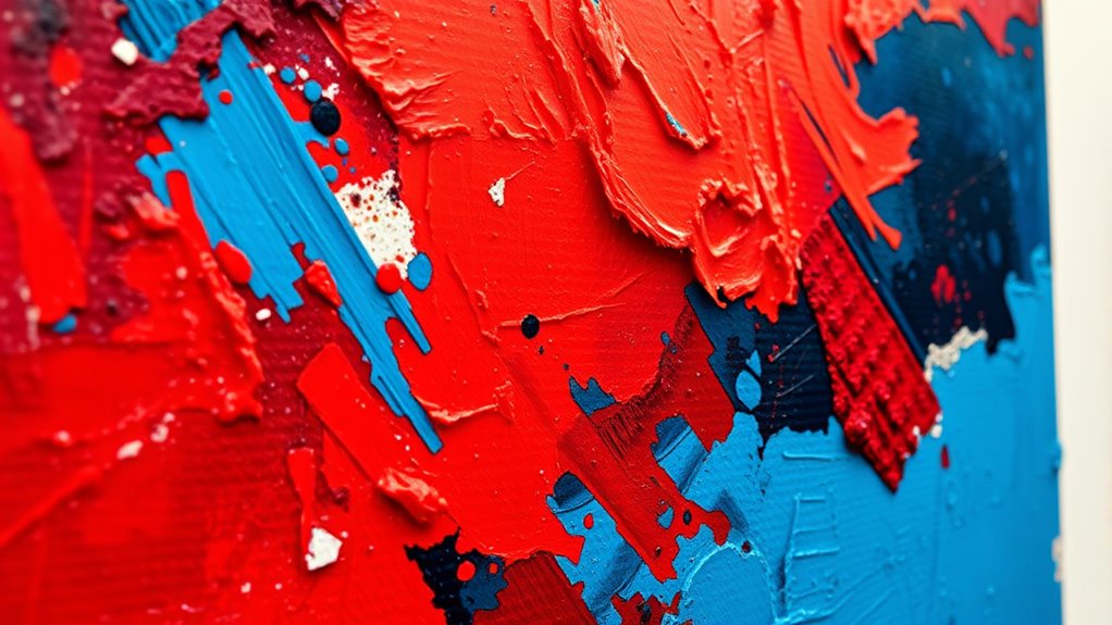
Seeing how different mat colors influence the overall presentation can be eye-opening. For example, a bold red mat can evoke energy and passion through mat color psychology, making the artwork stand out. Incorporating smart design principles can further enhance how mats complement your artwork’s mood and style. Additionally, understanding color theory can help you select hues that harmonize with your piece’s palette. Exploring visual balance techniques can help create a more cohesive and striking display. To deepen your understanding, studying perception and emotion reveals how color choices evoke specific feelings in viewers. Recognizing the impact of lighting conditions can also influence how colors appear and are perceived in different environments. Conversely, a soft gray creates a calming effect, emphasizing subtle details. Framing techniques also come into play—using a contrasting mat color draws immediate attention, while matching tones produce a seamless, elegant look. Real examples show that changing the mat color can transform the entire mood of a piece, guiding viewers’ emotions and focus. By experimenting with various hues, you’ll understand how mat colors shape perception and enhance visual impact. These practical insights demonstrate that thoughtful mat color choices are essential for making your art truly pop.
Frequently Asked Questions
How Do Cultural Differences Influence Color Perception and Choice in Art?
You should consider that cultural differences greatly influence how you perceive and choose colors in art. Cultural symbolism shapes your emotional responses, making certain hues more meaningful.
Regional palettes reflect local traditions and values, guiding your color preferences. By understanding these influences, you can create art that resonates more deeply with diverse audiences.
Ensuring your work communicates effectively across cultures and embraces the unique symbolism behind each color choice is essential.
Can Mat Color Choices Affect the Perceived Value of Artwork?
Yes, mat color choices can affect how viewers perceive the value of your artwork. Using colors aligned with color psychology, like gold or deep hues, can elevate its perceived worth.
Additionally, maintaining brand consistency through your mat choices helps reinforce professionalism and trust, making your art seem more valuable.
Smart color selection guides the viewer’s perception, enhancing both aesthetic appeal and perceived importance of your piece.
Are There Specific Color Combinations Best Suited for Abstract Versus Realistic Art?
Yes, certain color combinations work better for abstract versus realistic art. For abstract pieces, you should focus on color harmony to create mood and unity, using contrasting hues to add vibrancy and energy.
For realistic art, opt for subtle, harmonious shades that mimic natural tones, emphasizing visual contrast to highlight details without overwhelming. Your goal is to guide the viewer’s eye and evoke the right emotional response through strategic color pairing.
How Does Lighting Impact the Effectiveness of Chosen Mat Colors?
Lighting effects can dramatically influence how your mat colors appear, impacting their effectiveness. Bright, direct light enhances color contrast, making vibrant mats stand out more vividly.
Conversely, softer or dim lighting can mute hues, reducing contrast and making the artwork seem more subdued. To maximize your art’s impact, consider adjusting the lighting to highlight your chosen mat colors, ensuring they complement the overall display and make your artwork truly pop.
What Role Do Personal Preferences Play in Selecting Mat Colors for Professional Displays?
Your personal taste and aesthetic preferences play a significant role in selecting mat colors for professional displays. You should choose colors that resonate with your style and enhance the artwork’s impact, making certain they complement the piece without overpowering it.
Trust your instincts, but also consider how the colors will affect viewers’ perception. Balancing personal preferences with design principles ensures your display captures attention and communicates your vision effectively.
Conclusion
Choosing the right mat color can truly transform your artwork, making it stand out and evoke the right emotions. By understanding color contrasts, complementary shades, and subtle tones, you can elevate your pieces effortlessly. Trust your instincts, experiment, and see how different colors influence perception. Remember, the perfect mat isn’t just about aesthetics—it’s about enhancing your art’s story. With these tips, you’ll confidently select mats that make your art pop every time.
Halloween Picks
halloween
As an affiliate, we earn on qualifying purchases.