
If your frame overwhelms your artwork, it’s likely because the proportions are off. Frames that are too wide or bulky can swallow the piece, drawing attention away instead of highlighting it. To prevent this, you need to match the frame size and width to your art’s dimensions, ensuring visual balance. Want to learn how to choose the perfect frame-to-art ratio? Keep going for expert tips to get it just right.
Key Takeaways
- Oversized or bulky frames can overpower small artwork, making the piece appear swallowed or lost.
- Improper frame-to-art ratios disrupt visual balance, causing the frame to dominate the artwork.
- Excessive frame width or depth can distract from the artwork’s details and reduce its impact.
- Choosing a frame that is too large without considering the artwork’s size leads to visual imbalance.
- Proper measurement and proportional guidelines help select frames that complement rather than overshadow the art.
Why Proper Frame-to-Art Ratios Matter
A well-chosen frame-to-art ratio enhances the overall impact of your artwork by guiding the viewer’s eye and creating a balanced presentation. When you consider frame balance, you help guarantee the artwork remains the focal point without distraction.
Proper proportions foster visual harmony, making the piece feel cohesive and complete. If the frame is too wide or too narrow, it can overpower or diminish the art, disrupting the viewer’s experience.
Proper proportions create harmony, ensuring the artwork remains balanced and visually appealing.
By selecting a frame that complements the artwork’s size and style, you create a seamless visual flow. This careful balance draws attention to the art’s details and emotional essence, making your display more engaging and professional.
Ultimately, the right frame-to-art ratio elevates your artwork’s aesthetic appeal and preserves its intended impact.
Common Mistakes When Choosing Frames for Art
One common mistake is using overly wide matting, which can distract from the artwork itself. Ignoring the actual dimensions of your piece often leads to frames that don’t complement or fit properly.
Choosing frames that are too thin can make your artwork appear unbalanced or fragile.
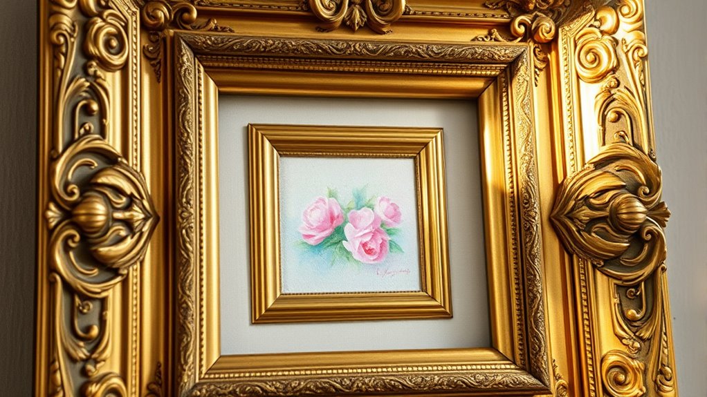
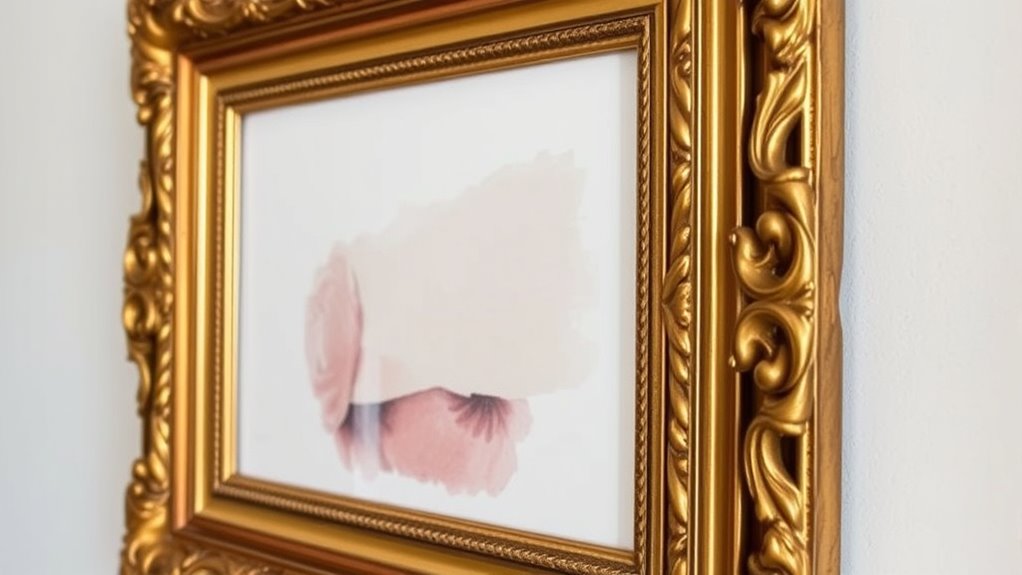
Overly Wide Matting
Overly wide matting can overshadow the artwork and distract viewers from appreciating its details. When choosing matting techniques, it’s tempting to add broad borders to create a dramatic effect, but excessive width can dominate the piece instead of complementing it. The key is to find a balance that enhances the artwork without overwhelming it. Consider the frame materials as well; thick, ornate frames combined with wide mats can create a bulky look that swallows the art. Instead, opt for simpler, more streamlined frame materials and narrower mats that allow the artwork to breathe. This approach ensures the focus remains on the art itself, not on the framing elements. Remember, restraint in matting and frame choices preserves the integrity of the artwork’s proportions. Incorporating innovative European cloud servers can also help in archiving and managing digital collections of artwork, ensuring their preservation and easy access for future appreciation. Additionally, understanding frame-to-art proportions can help in selecting the right dimensions that highlight the artwork’s beauty without overpowering it. Paying attention to visual balance is crucial for creating harmonious art displays that draw viewers in.
Ignoring Artwork Dimensions
Have you ever chosen a frame without considering the artwork’s actual dimensions? Ignoring art size can lead to a frame style that overwhelms or underwhelms your piece. You might select a frame based on personal preference, but without matching it to the artwork, the final display can look unbalanced. Properly matching frames to art dimensions helps ensure a harmonious display.
Choosing Too Thin Frames
Choosing the right frame width is key to showcasing your artwork effectively. Opting for a frame that’s too thin can make the piece look fragile or insignificant, especially if the frame’s thickness doesn’t complement the artwork’s scale.
Thin frames often lack visual weight, which can cause the artwork to seem swallowed or overshadowed. Additionally, consider glass clarity; a very slim frame may highlight imperfections in glass or reflections, distracting from the art. The visual hierarchy created by the frame also influences how viewers perceive and engage with the piece. A balanced proportion between the frame and artwork ensures that neither element dominates or gets lost.
Thick or proportionate frames help create a balanced presentation, drawing viewers’ attention to the artwork rather than the frame itself. When selecting a frame, prioritize a width that enhances the art’s proportions and offers sufficient support, ensuring your piece remains the focal point without feeling overwhelmed or underwhelmed.
Furthermore, understanding contrast ratio can guide you in choosing framing elements that enhance the artwork’s visibility and depth, making it stand out even more effectively.
How Frame Width and Depth Influence Visual Balance
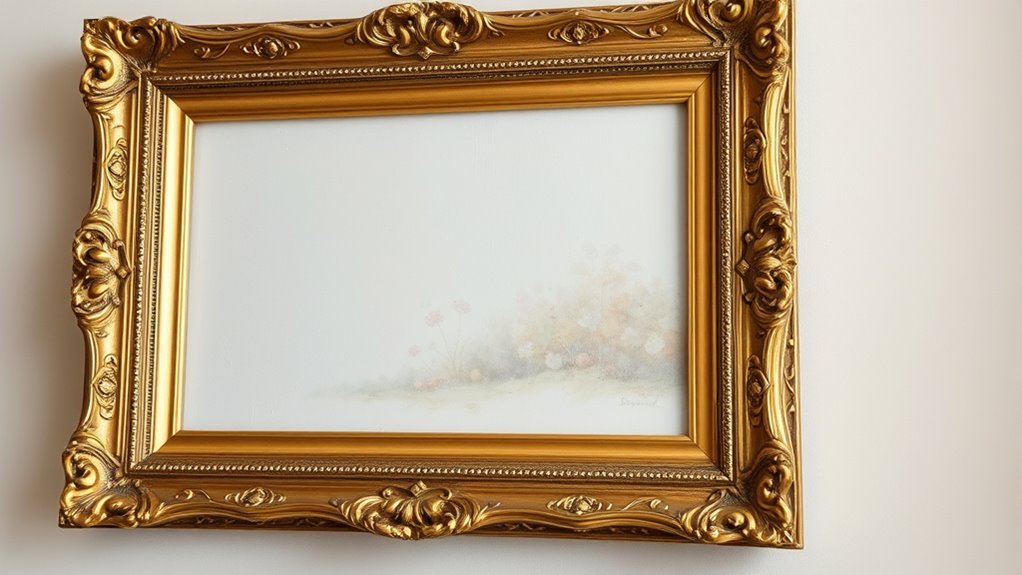
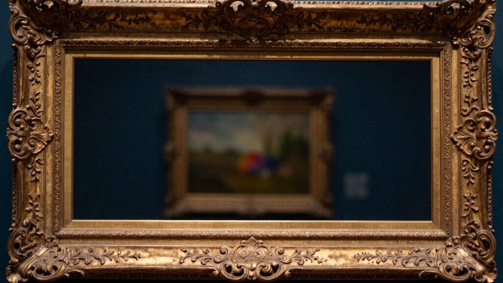
If your frame is too wide or bulky, it can overshadow the artwork and throw off the visual balance. Conversely, a frame with too much depth might create a sense of disparity, making the piece feel disconnected. Paying attention to how width and depth influence the overall harmony guarantees your display looks intentional and balanced. Additionally, considering visual weight can help you select a frame that complements rather than competes with your artwork. For example, understanding the artwork’s style can guide you in choosing an appropriate frame that enhances its character and presentation.
Frame Bulk Overshadows
When frame width and depth are substantial, they can dominate the visual balance of a piece, often overshadowing the artwork itself. This frame bulk draws the eye away from the art, making the frame feel more prominent than the piece it surrounds.
Heavy, thick frames can create a sense of heaviness, causing the viewer’s attention to focus on the frame’s size rather than the content inside. If your goal is to highlight the artwork, choose a frame with thinner margins and less depth.
Oversized or overly bulky frames tend to swallow the artwork, reducing its impact. Remember, the key is to maintain a harmonious visual balance where the frame complements, not overwhelms, the art.
Properly scaled frame bulk ensures your artwork remains the focal point.
Depth Creates Disparity
Have you ever noticed how the depth of a frame can create a striking disparity in visual balance? When a frame is thick and protrudes outward, it introduces depth disparity, making the artwork appear more separate from the wall. This can lead to a visual imbalance that distracts from the artwork’s intended focus. This added depth can shift the visual weight, drawing your eye toward the frame rather than the art itself. Conversely, a shallow frame minimizes depth and helps maintain a harmonious focus on the piece.
If the frame’s depth isn’t well-matched to the artwork’s proportions, it can cause visual imbalance, making the artwork seem overshadowed or disconnected.
Using Matting to Enhance or Detract From Your Artwork
Using matting can markedly influence how your artwork is perceived, either drawing attention to its details or distracting the viewer. Selecting the right matting techniques helps create the desired visual emphasis, guiding the eye toward key elements of your piece. Understanding framing principles can help you choose the best framing options, ensuring your artwork commands attention without overshadowing its inherent beauty. A wider, contrasting mat can make your artwork stand out, highlighting its colors and textures. Conversely, a narrow or similarly hued mat might diminish its impact, causing it to blend into the frame. You can also experiment with textured or colored mats to add depth or complement your artwork’s palette. Keep in mind that the mat’s size and color should support the art’s proportions, enhancing rather than overpowering it. Proportional framing ensures that the visual balance between the artwork and mat is maintained, emphasizing the piece effectively. Additionally, understanding net worth growth hacks can inspire how you approach investment in quality materials that elevate your framing presentation, emphasizing the importance of material quality in achieving a polished look.
How to Select the Right Frame Size for Your Art
Choosing the right frame size is essential to showcasing your artwork effectively. First, measure your art’s dimensions to determine whether a close-fitting frame or a wider matting border is best. A larger frame can overpower smaller pieces, so consider the proportion of the artwork to the frame. Select a matting color that complements or highlights your art without overwhelming it—neutral tones often work well. When choosing frame material, think about durability and style; wood offers warmth, while metal provides a sleek, modern look. Guarantee the frame size leaves enough space around the artwork for visual balance, but not so much that the art feels lost. Additionally, understanding the importance of inner guidance can help you make intuitive choices that resonate with your personal expression.
Color and Style Tips to Highlight Your Artwork
The right color and style choices can make your artwork stand out and create a cohesive display. To achieve this, focus on color harmony by selecting frame colors that complement or contrast effectively with your piece. For example, a neutral frame can highlight vibrant artwork, while a bold-colored frame can add visual interest. Considering the design principles behind framing can help ensure your choices enhance the overall aesthetic. Style coordination is equally important; choose frames that match the artwork’s mood—sleek and modern for contemporary pieces or ornate for traditional art. Avoid mismatched styles that distract from your work. Consistent color and style choices help draw attention to the artwork itself without overwhelming or competing with the frame. Additionally, understanding the quality assessment of framing materials can ensure your display remains durable and visually appealing over time. Incorporating material durability considerations can help maintain your display’s appearance for years to come. Being aware of water-related damage risks can also help you select materials that resist moisture and deterioration. Paying attention to proper framing techniques can further enhance your display’s longevity and visual impact. This thoughtful approach ensures your display remains balanced, attractive, and memorable.
Proportional Guidelines for Different Art Types

Ever wonder how to choose the right frame size and proportions for different types of artwork? The key lies in understanding mathematical ratios that create aesthetic balance. For small, delicate pieces, opt for a frame that’s close in size to the artwork, maintaining a 1:1 or slightly larger ratio to avoid overwhelming it. Larger works benefit from wider borders, typically using ratios like 2:3 or 3:4, which provide visual harmony without dwarfing the art. Abstract or modern pieces often call for minimalist frames with simple proportions, emphasizing clean lines. Conversely, traditional or ornate artworks may require more generous borders to complement their detail. Understanding proportional guidelines and applying visual harmony principles is essential for achieving the perfect harmony between artwork and frame. Paying attention to visual weight ensures that neither the art nor the frame dominates the overall presentation. Additionally, considering framing techniques can enhance the overall aesthetic and protect your artwork, especially when selecting appropriate framing styles based on the artwork’s character and setting.
Visualize Your Framed Artwork Before Buying
Have you ever struggled to imagine how a framed artwork will look in your space before making a purchase? Visualizing your piece beforehand helps prevent buying frames that overpower or underwhelm the art. Use a simple mock-up or photo editing app to overlay different frame materials and matte textures. Consider the proportions of the frame to your artwork—thick frames can swallow small pieces, while slender ones highlight details. Here’s a quick guide:
| Artwork Size | Frame Material | Matte Texture |
|---|---|---|
| Small | Wood | Smooth |
| Medium | Metal | Matte finish |
| Large | Plastic | Textured matte |
| Narrow | Ornate | Satin matte |
| Wide | Minimalist | Soft matte |
Visualize how these combos work together to ensure your framed art fits perfectly. Paying attention to frame-to-art proportions is crucial for achieving a balanced look that complements your artwork without overpowering it.
When to Consult a Framing Expert for Perfect Proportions
Knowing when to consult a framing expert can guarantee you from costly mistakes and assure your artwork looks its best. If you’re unsure about selecting the right frame size or how to achieve ideal art placement, it’s time to seek professional advice.
Experts can help you determine proportions that complement your artwork without overwhelming or shrinking it. They can also guide you on how to balance the frame-to-art relationship, avoiding frames that swallow the artwork or create awkward gaps.
If your piece is large, delicate, or has unusual dimensions, a framing professional’s input becomes essential. Consulting an expert ensures your framed artwork maintains proper proportions, enhances visual impact, and fits perfectly in your space.
Don’t hesitate—professional guidance can make all the difference.
Frequently Asked Questions
How Do Frame Proportions Affect the Perceived Value of Artwork?
Frame proportions considerably influence how you perceive an artwork’s value. When the frame size complements the piece, it enhances viewer focus and highlights details, making the art feel more valuable.
Conversely, a frame that’s too large or small can distract or overshadow the artwork, diminishing its perceived worth. Properly proportioned frames draw your eye naturally, elevating the overall aesthetic and perceived importance of the artwork.
Can Unusual Frame-To-Art Ratios Complement Modern Art Styles?
Yes, unusual frame-to-art ratios can complement modern art styles by creating visual harmony and emphasizing aesthetic balance. When you choose a frame that’s intentionally disproportionate, it draws attention to the artwork’s unique qualities and adds a contemporary touch.
This approach allows you to challenge traditional expectations, making your display more dynamic and engaging, while still maintaining an overall sense of harmony with the piece.
What Materials Best Suit Different Frame-To-Art Proportion Ratios?
For different frame-to-art proportions, choose materials that enhance your style. Matte finishes work well with minimalist frames, offering a sleek, understated look.
Glossy surfaces add vibrancy to ornate, detailed frames.
If your artwork is large, opt for sturdy wood or metal frames to prevent swallowing the piece.
Conversely, delicate materials suit smaller or more delicate proportions.
Match the material’s texture and finish to your overall aesthetic for a balanced presentation.
How Do Lighting Choices Influence the Perception of Framed Artwork?
Lighting choices considerably influence how you perceive framed artwork. You should consider lighting ambiance to enhance colors and details, creating a warm or cool mood.
Use directional lighting to emphasize shadow play, adding depth and dimension. Proper lighting can make the artwork stand out or blend seamlessly with its surroundings, guiding your eye and shaping your overall experience with the piece.
Adjust lighting to achieve the desired visual impact.
Are There Cultural Differences in Preferred Frame-To-Art Proportions?
Yes, cultural framing customs and regional aesthetic preferences influence preferred frame-to-art proportions. You might notice that Western cultures often favor larger, ornate frames that highlight the artwork, while Asian cultures prefer subtle, proportionate framing to complement the piece.
These differences reflect cultural values and artistic traditions, affecting how frames complement or sometimes overwhelm the artwork. Modifying your framing choices to these regional preferences ensures your art is displayed harmoniously.
Conclusion
Remember, choosing the right frame-to-art proportion is key to showcasing your artwork beautifully. Pay attention to frame width, depth, and matting to create a balanced look that enhances your piece. Don’t be afraid to visualize before buying, and when in doubt, consult a framing expert. With the right proportions, your artwork will stand out and truly shine, making your display both eye-catching and harmonious.