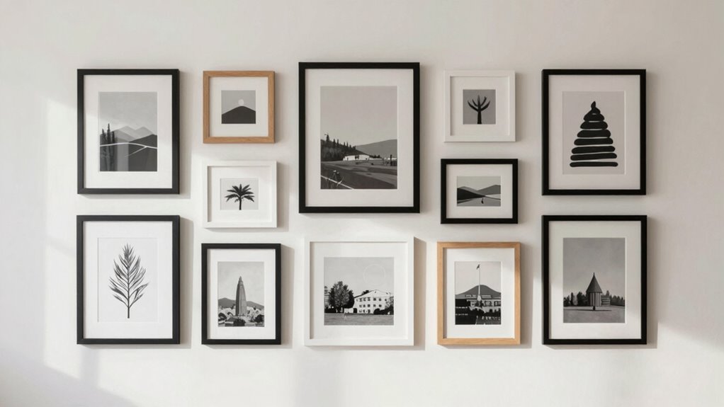

Create an intentional gallery wall by choosing a cohesive color palette and consistent style to unify your display. Mix different frame sizes, shapes, and finishes for visual interest, but keep arrangements balanced and aligned to maintain order. Establish a central focal point, like a standout piece, and arrange other frames around it. Pay attention to even spacing and slight adjustments for a polished look. Keep these principles in mind, and you’ll craft a gallery wall that always feels deliberate and harmonious.
Key Takeaways
- Choose a cohesive color palette and style to create visual harmony and avoid cluttered, mismatched looks.
- Mix frame sizes and finishes thoughtfully to add depth while maintaining overall balance.
- Establish a clear central focal point, such as a prominent piece, to anchor the arrangement.
- Maintain consistent spacing and alignment using tools like a level or ruler for a polished appearance.
- Step back regularly to assess overall balance, making subtle adjustments for a natural, intentional look.

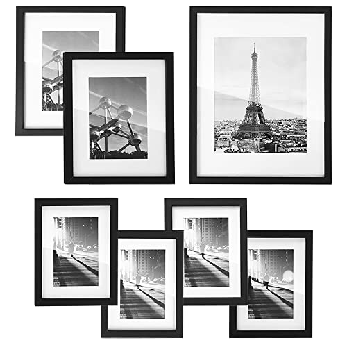
Vittanly 15 Pack Picture Frames Collage Wall Decor for Mounting or Tabletop Display, Gallery Frame Set for Family, Multi Sizes Including 3pcs 8×10, 6pcs 5×7, 6pcs 4×6, Black
Versatile Sizes for Display: Vittanly 15-Pack Multi-Size Picture Frame Set includes 3x 8×10", 6x 5×7", and 6x 4×6"…
As an affiliate, we earn on qualifying purchases.
As an affiliate, we earn on qualifying purchases.
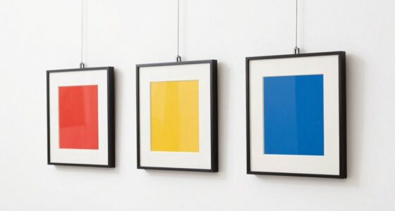
Choosing a Cohesive Color Palette and Style

When creating a gallery wall, choosing a cohesive color palette and style is essential to guarantee your display feels unified and intentional. Focus on color harmony by selecting shades that complement each other, avoiding chaotic or mismatched hues. This careful selection helps create a visual flow that guides the eye smoothly across your arrangements. Additionally, maintaining style consistency helps your gallery feel thoughtful and polished. Whether you prefer modern, vintage, or eclectic looks, sticking to a specific aesthetic ensures all pieces work well together. Limit your palette to a few core colors or patterns to keep the display coordinated. Incorporating design principles such as balance and contrast can further enhance visual harmony. Using visual hierarchy techniques also helps emphasize focal points within your arrangement. Furthermore, understanding the significance of color psychology can influence the mood and cohesiveness of your gallery wall. By thoughtfully combining color harmony with style consistency, your gallery wall will radiate cohesion and style. Consistency in design is also key to creating a balanced and harmonious look that appears deliberate rather than accidental.
SONGMICS Picture Frames with 7 Mats, Set of 7 Collage Photo Frames, One 11×14, Two 8×10, Four 6×8 Frames, Hanging or Table Display, Glass, Black URPF37BK
[Embellish Your Space] Incorporating one 11×14, two 8×10, four 6×8 photo frames, this set, accentuated by its black…
As an affiliate, we earn on qualifying purchases.
As an affiliate, we earn on qualifying purchases.
Selecting and Arranging a Variety of Frame Sizes

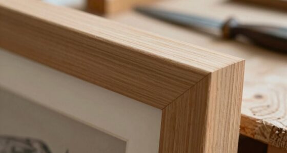
Incorporating a variety of frame sizes adds visual interest and depth to your gallery wall, but it requires careful planning to maintain balance. Mix larger frames with smaller ones to create a dynamic layout. When selecting frames, consider matte vs. glossy finishes—matte tends to soften, while glossy adds a sleek shine. Frame embellishments, like ornate borders or minimal designs, can also influence the overall feel. Use larger, simpler frames for a clean look and smaller, decorative ones to add detail. Arrange your frames so that the eye moves naturally across the wall, balancing bold and subtle elements. Additionally, paying attention to visual balance and composition techniques can significantly impact the overall aesthetic, ensuring your gallery wall appears thoughtfully curated and cohesive. Recognizing the importance of frame choice can help you create a more harmonious display that feels intentional and polished. Furthermore, understanding how home theatre projector technology influences display options can inspire creative framing choices that complement your viewing environment, encouraging you to consider display compatibility in your design.

Level Hang Magnetic Ruler, Precisely measure the frame dimensions for Wall Decor Alignment,There is a level inside, allowing you to easily install the picture frame and wall accessories.
3-in-1 Professional Hanging: Combines a measuring ruler, built-in level, and nail pusher to streamline the entire picture hanging…
As an affiliate, we earn on qualifying purchases.
As an affiliate, we earn on qualifying purchases.
Establishing a Central Focal Point

Have you considered making a single piece or arrangement stand out as the focal point of your gallery wall? This anchors your display and guides the eye. To do this effectively, use frame layering to add depth and dimension, which draws attention naturally. Position your most striking artwork or photograph slightly off-center or larger than the others, creating a visual hierarchy. Don’t forget wall texture—mixing different wall finishes or incorporating textured backgrounds can emphasize your focal point further. Keep the surrounding frames complementary but less prominent, ensuring they don’t compete with the centerpiece. By thoughtfully combining frame layering with wall texture, you establish a clear focal point that makes your gallery wall look deliberate and polished. Incorporating visual hierarchy principles helps balance your display and enhances overall harmony. Additionally, paying attention to proportion and scale ensures your focal piece remains impactful without overwhelming the entire arrangement, especially when considering free floating arrangements that free your gallery from rigid boundaries. Integrating design principles can further refine the overall aesthetic, making your gallery wall truly stand out.

Essential Color Card Deck: Break out of the Color Wheel with 200 Cards to Mix, Match & Plan! Includes Hues, Tints, Tones, Shades & Values
As an affiliate, we earn on qualifying purchases.
As an affiliate, we earn on qualifying purchases.
Maintaining Consistent Spacing and Alignment

After establishing a strong focal point, attention shifts to maintaining a clean, cohesive look across your gallery wall. Consistent spacing and alignment are key to this. To achieve this, consider these steps:
Achieving uniform spacing and alignment creates a polished, cohesive gallery wall.
- Use a ruler or level to ensure even spacing between frames, regardless of wall texture or gallery lighting variations.
- Hang artwork at the same height, aligning the top or bottom edges for uniformity.
- Adjust for wall texture differences, like uneven plaster, by using spacers or shims for smoother alignment.
- Regularly step back and assess the overall layout, ensuring gaps feel intentional and balanced.
Maintaining consistent spacing and alignment enhances the gallery’s visual flow, making it look curated and intentional. Proper gallery lighting can also highlight the spacing details, creating a polished, harmonious display.
Finalizing With a Balanced Layout and Adjustments

While establishing consistent spacing and alignment creates a cohesive gallery wall, finalizing your layout requires a keen eye for balance and subtle adjustments. Use harmony techniques, like varying frame sizes and colors thoughtfully, to enhance visual flow. Step back and assess the overall arrangement, ensuring no area feels too heavy or sparse. Small tweaks, such as shifting a frame slightly or adjusting spacing between pieces, can create a more natural, intentional look. Trust your intuition to identify uneven gaps or visual imbalance. Remember, a successful gallery wall feels effortless and deliberate. Pay attention to safe installation practices and use tools like a level or measuring tape to keep everything properly aligned. Incorporating visual balance principles from interior design can also help guide your adjustments. Recognizing composition principles can further improve the overall harmony of your display. Fine-tuning these details guarantees your display maintains harmony, guiding the viewer’s eye smoothly across the artwork and creating an engaging, polished aesthetic. Additionally, considering complementary color schemes can further unify your gallery wall and enhance its overall appeal. Developing a visual rhythm can help maintain viewer interest and create a cohesive look.
Frequently Asked Questions
How Can I Personalize My Gallery Wall to Reflect My Personality?
To personalize your gallery wall, use meaningful displays that reflect your personality, like favorite photos, artwork, or souvenirs. Incorporate personalization tips such as mixing frame styles or including items with sentimental value. Arrange your items intentionally, balancing colors and sizes, to create a cohesive yet unique look. This approach guarantees your gallery wall feels authentic and truly represents who you are, making it a beautiful, personalized focal point in your space.
What Are Common Mistakes to Avoid When Creating a Gallery Wall?
Think of your gallery wall like a well-orchestrated symphony—you want harmony, not chaos. Avoid common mistakes like uneven hanging symmetry and inconsistent frame styles, which can make it look cluttered. For example, if one frame hangs too high, the entire look feels off. Stick to a plan, maintain frame consistency, and measure carefully to guarantee your displays complement each other and create a balanced, intentional look.
How Do I Incorporate Different Art Styles Without Clashing?
To incorporate different art styles without clashing, focus on color coordination and frame selection. Choose a unifying color palette to tie diverse pieces together, making them feel cohesive. Opt for frames that complement each other or match in style or finish to create visual harmony. Mixing textures and materials in your frames can add interest, but keep the overall look balanced, so each piece stands out without competing.
What Tools or Materials Are Essential for Installation?
Think of your wall as a canvas waiting to be brought to life. You’ll need hanging hardware like hooks, nails, and spacers to secure each piece firmly. Layout templates act as your map, guiding placement and ensuring balance. Use a level for precision and a measuring tape to keep everything aligned. These tools transform your vision into reality, making your gallery wall both effortless and stunning, like art itself.
How Often Should I Update or Refresh My Gallery Wall?
You should refresh your gallery wall seasonally or whenever you want a focal point change. Regular updates keep it fresh and engaging, reflecting your evolving style or current favorites. Swap out artwork, add new pieces, or rearrange frames to maintain visual interest. By doing this, you guarantee your gallery wall remains a dynamic centerpiece that always feels intentional and personalized, making your space more inviting and reflective of your current vibe.
Conclusion
By following this gallery wall formula, you’ll create a stunning, intentional display that feels balanced and cohesive. Did you know that homes with gallery walls see a 25% increase in perceived warmth and personality? So, don’t be afraid to experiment with colors, sizes, and arrangements. Trust the process, make adjustments as needed, and enjoy your personalized art showcase. With these tips, your wall will become a mesmerizing focal point in your space.