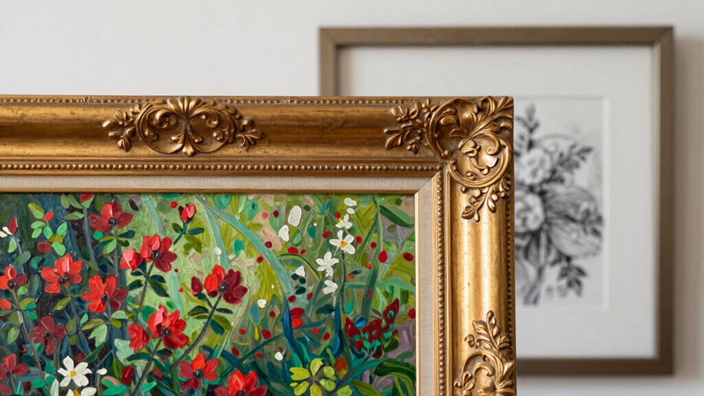

Choosing the right frame makes all the difference in how your art stands out. A frame that complements or subtly enhances artwork hues and textures highlights the piece without overpowering it, creating visual harmony. On the other hand, a clashing color or overwhelming material can distract or compete, taking focus away from your work’s details. By understanding these principles, you can select frames that support your art’s story and mood — and if you keep exploring, you’ll discover even more tips to perfect your display.
Key Takeaways
- Frames that complement or subtly enhance artwork hues draw attention without distraction.
- Material choices that match the artwork’s style and medium create visual harmony and avoid overpowering.
- Simple, understated frames support delicate art, while ornate frames can compete and detract from it.
- Proper color coordination and contrast ensure the frame enhances the art rather than competing with it.
- Thoughtful framing aligns with the artwork’s narrative, emphasizing its features and emotional impact.
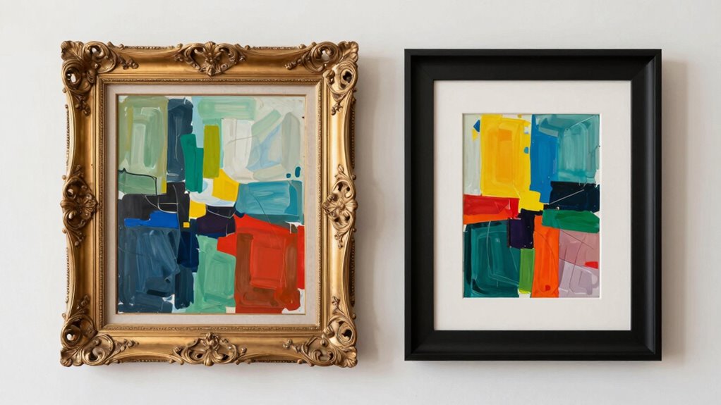
Have you ever wondered whether a frame enhances a piece of art or simply competes with it? The answer often depends on how well the frame complements the artwork itself. When choosing a frame, you need to consider two essential factors: color coordination and material contrast. These elements play a pivotal role in whether your frame acts as a supportive backdrop or an intrusive distraction. If the colors of the frame clash with the hues in the art, it can draw attention away from the piece, creating a jarring visual experience. Conversely, a frame with color coordination that echoes or subtly enhances the artwork can make the piece feel more cohesive and intentional. For example, a neutral-colored frame, like black or white, often works well with a variety of artworks because it doesn’t compete with the colors within the piece. Instead, it allows the focus to remain on the art itself.
Material contrast is equally crucial. When you select a frame, think about how its material interacts with the medium of the artwork. For instance, a sleek metal frame can lend a modern, minimalist appeal that highlights contemporary pieces. On the other hand, a richly carved wooden frame might add warmth and texture, emphasizing traditional or classic art. The key is striking the right balance; if the material of the frame overwhelms the artwork, it can steal the spotlight rather than support it. A good rule of thumb is to match the texture and style of the frame with the overall mood of the art. A bold, ornate frame might compete with a delicate watercolor, while a simple, understated frame can serve as a subtle partner to a detailed oil painting. Recognizing artistic harmony**** and how different framing elements influence viewer perception can help you make more informed choices.
Additionally, considering the framing’s role in visual storytelling can deepen the overall impact of the artwork and create a more engaging experience for viewers. Ultimately, the goal is harmony. When your frame’s color coordination aligns with the dominant tones or complements the color palette of the art, it enhances the viewing experience. Meanwhile, choosing a material contrast that complements the artwork’s style and medium ensures the frame acts as a supportive element rather than a competing one. If you get these details right, the frame will elevate the piece, drawing viewers into its story without overpowering it. When your framing choices are thoughtfully made, you create a visual dialogue that respects and enhances the art, inviting admiration rather than distraction.
As an affiliate, we earn on qualifying purchases.
Frequently Asked Questions
How Do Frame Colors Influence Viewer Perception of Artwork?
Frame colors profoundly influence your perception of artwork through color psychology and visual harmony. Bright or bold frames can energize or challenge the piece, while subtle, neutral tones support the art without distraction. When you choose a frame that complements the artwork’s colors and mood, it creates visual harmony, guiding your eye naturally and enhancing your overall appreciation. The right frame color can make the art feel more integrated and impactful.
Can a Frame’s Style Change the Meaning of Art?
Yes, a frame’s style can change the meaning of art by conveying different frame symbolism and historical framing. For example, ornate, gilded frames might evoke tradition and grandeur, emphasizing the artwork’s importance. Conversely, modern, minimalist frames may suggest contemporary relevance or simplicity. Your choice influences how viewers interpret the piece, highlighting certain themes or eras, and ultimately shaping their emotional and intellectual response to the art.
What Materials Are Best for Creating Non-Intrusive Frames?
You should choose sustainable materials like bamboo, recycled metal, or reclaimed wood for creating non-intrusive frames. Matte finishes help keep the focus on the artwork, reducing glare and visual distraction. These materials and finishes create a subtle, unobtrusive border that complements without overpowering the art. By selecting eco-friendly, matte-finished options, you guarantee your framing enhances the piece while respecting aesthetic harmony and environmental concerns.
Are Custom Frames More Effective Than Store-Bought Options?
Custom frames are often more effective because they allow you to choose specific frame thickness and perfect matting options that complement your artwork. You can tailor the design to enhance your piece without overwhelming it, unlike store-bought options that might be generic or mismatched. Custom framing guarantees a perfect fit and a polished look, making your art stand out while maintaining harmony with your decor.
How Does Framing Affect the Longevity of Artwork?
Your artwork’s life hangs on its frame’s armor. A sturdy frame with excellent durability acts like a shield, guarding against time’s relentless march. Preservation techniques, like UV glass and acid-free mats, act as secret allies, extending your art’s importance. When you choose the right materials and craftsmanship, you’re not just framing a piece — you’re sealing its story, ensuring it remains vibrant and engaging for generations to come.
As an affiliate, we earn on qualifying purchases.
Conclusion
So, next time you choose a frame, remember it’s not just about protection but about enhancing your artwork. Some frames can truly elevate, drawing attention and adding depth, while others might compete or distract. You might think any frame works, but a thoughtful choice makes all the difference. Don’t settle for the first one you see; experiment and find what truly complements your piece. Your art deserves a frame that enhances, not competes.
As an affiliate, we earn on qualifying purchases.
As an affiliate, we earn on qualifying purchases.