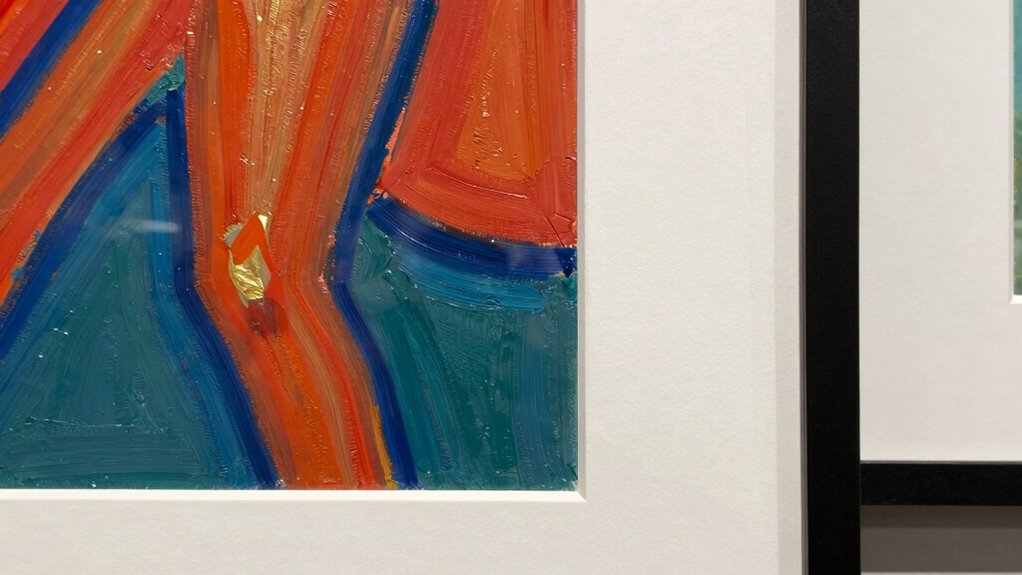

You might find that some artwork looks better unmatted because it features strong edges or intricate details that can get lost behind a mat, or you prefer a sleek, modern look that a thin frame provides. However, artworks with delicate shading or soft colors often benefit from a mat, which creates visual separation and highlights nuances. To truly enhance your pieces, understanding when to choose matted or unmatted displays makes a big difference—discover how to make the best choice for your art.
Listen free for 30 days with Audible
Thousands of audiobooks and originals — cancel anytime.
As an affiliate, we earn on qualifying purchases.
Key Takeaways
- Art with strong edges or intricate details benefits from an unmatted presentation to maintain visual continuity.
- Minimalist, modern artworks often look better unmatted, emphasizing sleekness and simplicity.
- Delicate or subtly shaded pieces are enhanced with a mat to create separation and highlight nuances.
- Thick or ornate frames complement matted art, adding character and emphasizing textures or soft color palettes.
- Proper lighting and environment are crucial; well-designed lighting enhances both matted and unmatted displays’ visual impact.

Are you looking to make your art presentation stand out? The way your artwork is framed and displayed can significantly influence how viewers perceive it. One crucial aspect often overlooked is whether to mat your art or leave it unmatted. Some pieces look better without a mat, allowing the artwork to breathe and stand on its own. Others benefit from a mat, especially when you consider how gallery lighting interacts with frame styles. The lighting setup in your display space can make or break the visual impact of your art, and the choice of whether to matte or not plays a role in this dynamic.
Choosing to matte or not can dramatically enhance your art’s visual impact and overall presentation.
When you opt for no mat, you’re giving your artwork an uninterrupted visual flow. This approach works best with pieces that have strong edges or intricate details that might get lost behind a mat. Without a mat, you allow the viewer’s eye to travel seamlessly across the entire artwork, enhancing its presence and immediacy. Choosing the right frame styles becomes critical here. Thinner, sleek frames complement unmatted art by keeping the focus squarely on the piece itself. These frames, paired with well-placed gallery lighting, can create a modern, minimalist look that emphasizes the artwork’s colors and textures. Additionally, understanding how visual communication influences viewer perception can help you craft a more compelling presentation. Recognizing the impact of lighting design can further optimize how your art is appreciated in its display environment. The presentation environment also plays a significant role in how effectively your artwork resonates with viewers.
On the other hand, some artworks are better suited to being matted. If your piece has delicate details, subtle shading, or a soft color palette, a mat can provide a buffer that enhances these qualities. It creates a visual separation between the art and the frame, preventing the colors from blending into the frame’s surroundings. When you select a mat, you have the opportunity to experiment with frame styles—thick, ornate frames or simple, classic ones can both work depending on the mood you’re aiming for. Proper gallery lighting becomes even more important here, as it can highlight the textures and nuances of the matted artwork, making it pop without overwhelming the viewer. Considering the artwork’s style and how it interacts with the overall presentation can also help you decide whether a mat will elevate or diminish its effect. Choosing the right framing and lighting setup ensures your artwork’s qualities are showcased to their fullest potential.
As an affiliate, we earn on qualifying purchases.
Frequently Asked Questions
How Do I Choose the Right Mat Color for My Artwork?
To choose the right mat color, consider color contrast—pick a hue that makes your artwork pop without clashing. Think about the mat texture too; smooth mats work well for sleek art, while textured mats add depth for more intricate pieces. You want the mat to complement, not overpower, your art. Test different colors and textures to see what enhances your piece best, creating a balanced and eye-catching display.
Can Framing Techniques Affect the Artwork’s Appearance?
Yes, framing techniques considerably influence your artwork’s appearance. Using different matting illusions can create depth and focus, enhancing the aesthetic impact. A well-chosen frame complements the piece, drawing the eye and highlighting details. You can experiment with various styles—classic, modern, or ornate—to see how they change the overall look. Proper framing guarantees your art looks vibrant and impactful, making each piece more captivating and engaging for viewers.
What Materials Are Best for High-Quality Mats?
You should choose acid-free materials for high-quality mats, ensuring your artwork stays preserved over time. Matboard textures like smooth, linen, or felt add visual interest, but always prioritize acid-free options to prevent deterioration. While textured mats can enhance the presentation, they should complement your art without overpowering it. Combining durable, acid-free materials with thoughtfully selected textures guarantees your piece looks polished and remains protected for years to come.
How Do I Prevent Damage When Matted or Unmounted?
To prevent damage when matted or unmounted, you should use proper preservation techniques like acid-free mats and backing. Avoid matting mistakes such as pressing too tightly or using adhesives directly on the artwork, which can cause deterioration. Handle your art with clean hands or gloves and store it in a stable environment. Regularly inspect your pieces to catch any issues early, ensuring they stay protected and preserved over time.
Is It Better to Frame Art With or Without a Mat?
You should frame art with a mat, especially if it’s thicker or delicate, because it creates a visual buffer and protects the artwork. Studies show mats can increase perceived value and highlight art’s details. Choose mat thickness based on your frame style; thinner mats suit sleek modern frames, while thicker mats complement traditional styles. A mat adds depth, while framing without one offers a clean, contemporary look—your choice depends on the art and your aesthetic.
As an affiliate, we earn on qualifying purchases.
Conclusion
Remember, the right presentation can profoundly enhance your artwork’s appeal. Whether you opt for an uncluttered, unmatted look or prefer a polished matte finish, trust your taste and the piece’s personality. Play with proportions, pairing, and placement to perfect your presentation. By balancing boldness with simplicity, you’ll create a mesmerizing, cohesive showcase that captures attention and conveys your artistic intent. Ultimately, your choice shapes how your art speaks—and how it’s truly seen.
As an affiliate, we earn on qualifying purchases.
As an affiliate, we earn on qualifying purchases.
Fall Picks
fall essentials
As an affiliate, we earn on qualifying purchases.