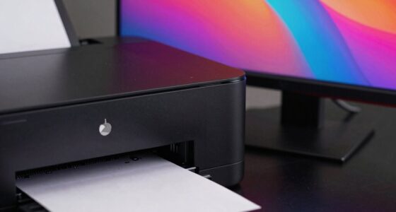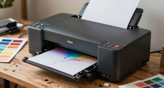

Your prints often don’t match your screen because of how color spaces, calibration, and device profiles work together. Your monitor displays colors differently than your printer can reproduce, especially since screens use wider color gamuts like Adobe RGB, while printers have smaller ranges. If you don’t calibrate your devices regularly or use the correct profiles, colors will shift. Understanding these details helps, and exploring further will show you how to manage these issues for consistent, beautiful artwork.
Key Takeaways
- Differences in color gamuts between screens and printers cause colors to appear mismatched; soft proofing helps preview adjustments.
- Inconsistent calibration of monitors and printers leads to inaccurate color display and discrepancies.
- Using incorrect or incompatible color profiles results in color shifts between digital files and printed artwork.
- Selecting appropriate color spaces (like Adobe RGB for print) ensures better color fidelity across devices.
- Regular calibration and proper profile management are essential to maintain consistent, accurate color reproduction.

Calibrite Display Pro HL Monitor Calibration Colorimeter for LCD Mini LED and OLED Displays, Measure up to 3000 Nits, PROFILER Software, USB C with Adapter, Validation/Color Uniformity Tools
SPECIFICATIONS: HL high luminance sensor colorimeter measures up to 3000 nits, calibrates and profiles LCD mini LED OLED…
As an affiliate, we earn on qualifying purchases.
As an affiliate, we earn on qualifying purchases.
Understanding Color Spaces and Why They Matter

Understanding color spaces is vital because they define how colors are represented and reproduced across different devices and mediums. When you choose a color space, you’re determining the range of colors your device can display or print, known as the print color gamut. Selecting the right color space is essential because it impacts how your art appears on screens and in print. For example, using an RGB color space like Adobe RGB offers a broader color range than sRGB, which can be beneficial for digital displays. Conversely, for printing, understanding your printer’s color gamut helps you select the most accurate color profiles. Proper color space selection ensures your artwork maintains its intended appearance, minimizing discrepancies between digital and physical versions. Additionally, understanding color gamuts is crucial for achieving accurate color reproduction across different devices and mediums. Recognizing how color management workflows integrate with color spaces can further improve consistency in your prints. Being aware of device calibration practices can also help maintain color accuracy throughout your workflow.
Calibrite Display Pro HL Monitor Calibration Colorimeter for LCD Mini LED and OLED Displays, Measure up to 3000 Nits, PROFILER Software, USB C with Adapter, Validation/Color Uniformity Tools
SPECIFICATIONS: HL high luminance sensor colorimeter measures up to 3000 nits, calibrates and profiles LCD mini LED OLED…
As an affiliate, we earn on qualifying purchases.
As an affiliate, we earn on qualifying purchases.
The Role of Calibration in Accurate Color Reproduction
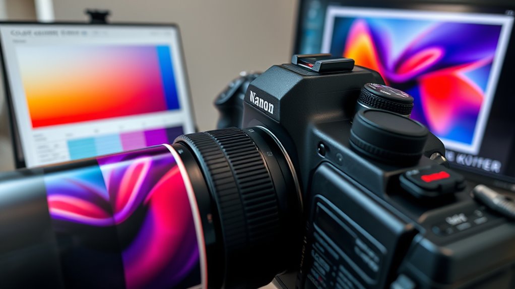
Calibration is essential for achieving accurate color reproduction because it aligns your display or printer with standardized color standards. Without proper calibration, colors can appear inconsistent, making it difficult to trust your color accuracy. The calibration process involves using specialized tools, like colorimeters or spectrophotometers, to measure how your device displays or prints colors. These measurements then guide adjustments to ensure your device produces colors that match industry standards. Regular calibration maintains consistency over time, preventing drift that can distort your artwork’s colors. By investing time in calibration, you create a reliable foundation for color management. This helps ensure your prints reflect the true hues you see on your screen, making your art look as intended across all mediums.
Calibrite ColorChecker Studio Spectrophotometer for Complete Color Management for Display, Projector, Printer and Scanner Profiling Software, w/ColorChecker Classic Mini for Custom Camera Profiling
SPECIFICATIONS: All in one spectrophotometer for camera to print color control, supports monitor display and projector profiling plus…
As an affiliate, we earn on qualifying purchases.
As an affiliate, we earn on qualifying purchases.
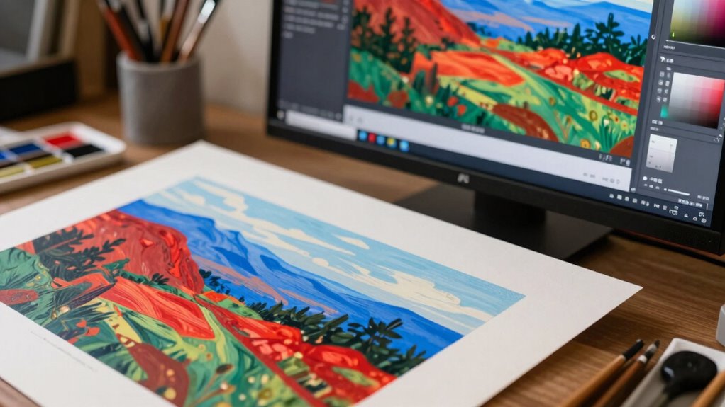
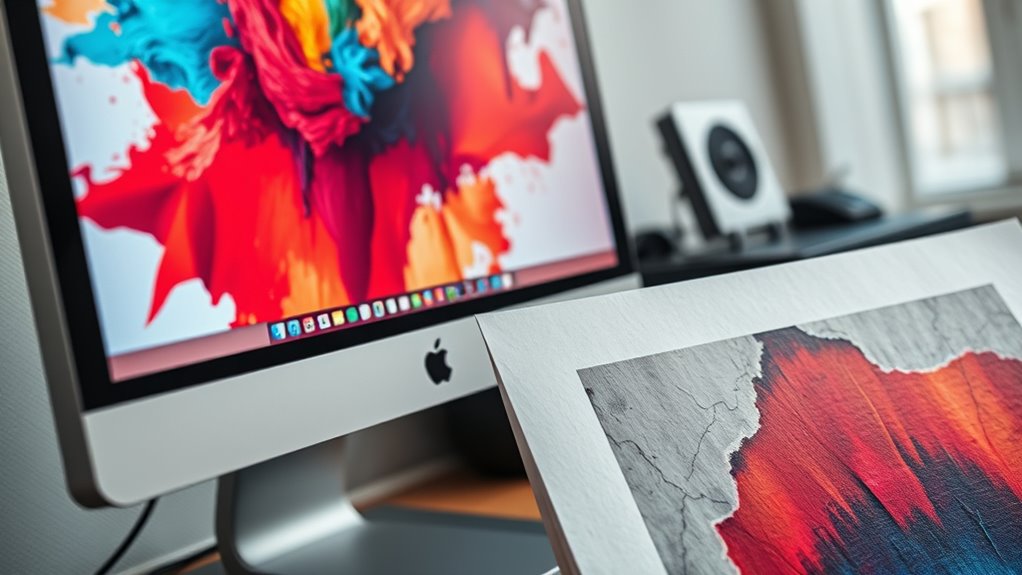
Differences Between Screen and Print Color Gamuts
While screens and print outputs both display colors, they do so within different color gamuts, which are the ranges of colors each medium can reproduce. The screen’s color gamut covers a broad portion of the color spectrum, emphasizing vibrant, luminous hues, especially in reds and greens. In contrast, print gamuts are generally smaller, limiting the range of reproducible colors. This limitation means that certain hues, especially neon or highly saturated tones, are often impossible to reproduce in print. This discrepancy can cause colors to look different when you print artwork compared to viewing it on your screen. To understand this better:
Colors on screens and prints are limited by their different gamuts, causing potential color discrepancies.
- Screens typically display colors within the RGB color gamut, which is larger.
- Prints rely on CMYK, with a smaller color spectrum.
- Bright, neon-like colors are often impossible to reproduce in print.
- Subtle color differences on screen may disappear or shift in print.
- Color management techniques can help mitigate some of these discrepancies by adjusting digital files for specific outputs. Additionally, understanding the color gamut of your device can guide you in choosing appropriate color profiles for accurate reproduction. Being aware of your device’s color profile can further improve consistency between digital and print formats.
This gamut gap explains why your printed art never quite matches what you see on your monitor.
Calibrite ColorChecker Studio Spectrophotometer for Complete Color Management for Display, Projector, Printer and Scanner Profiling Software, w/ColorChecker Classic Mini for Custom Camera Profiling
SPECIFICATIONS: All in one spectrophotometer for camera to print color control, supports monitor display and projector profiling plus…
As an affiliate, we earn on qualifying purchases.
As an affiliate, we earn on qualifying purchases.
Choosing the Right Profile for Your Artwork

Since different devices and print processes can show colors differently, selecting the right color profile is key to ensuring your artwork looks consistent across mediums. Focus on proper color space selection by choosing profiles that match your intended output. For digital displays, sRGB is common, but for professional printing, Adobe RGB or ProPhoto RGB offer wider gamuts. Ensuring profile compatibility between your editing software, monitor, and printer prevents color shifts. Always use profiles designed for your specific device and workflow. When you pick the appropriate profile, your colors will translate more accurately from screen to print. This reduces surprises and helps you achieve consistent, vibrant results, no matter where or how your art is displayed. Proper color management is essential for maintaining color fidelity across all devices and outputs, especially when considering color calibration to match your device’s display and print profiles.
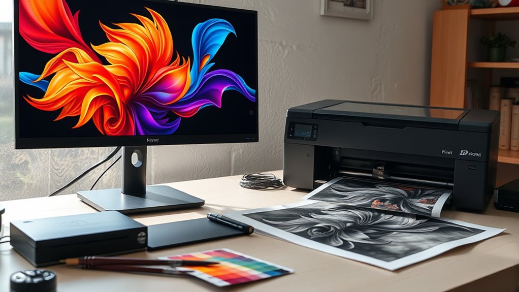
Soft Proofing: Previewing How Your Art Will Look in Print
Soft proofing allows you to preview how your digital artwork will look once printed, helping you catch potential color and detail issues before committing to the final output. Using soft proofing techniques, you can assess and improve color accuracy early in the process. Here’s how to make the most of it:
Soft proofing helps preview and perfect your artwork’s colors before printing.
- Enable soft proofing in your editing software, selecting the printer profile.
- Compare your screen preview with the soft proof to identify discrepancies.
- Adjust colors and tones directly within your software for better accuracy.
- Use a calibrated monitor to ensure your screen’s colors align with soft proofing results.
- Incorporate proper color management practices to further enhance the fidelity of your prints.
Managing Color Consistency Across Devices and Media
Ensuring your colors stay consistent across different devices and media is vital for achieving professional-quality artwork. You need to consider how ink formulation impacts color output, especially when switching between printers or papers. Different inks have unique color gamuts and drying properties, which can alter how colors appear. Lighting conditions also play a crucial role; viewing your work under various lighting can change your perception of color accuracy. To maintain consistency, calibrate your monitor regularly and use color profiles tailored to each device and media type. When preparing files, embed the correct profiles and perform test prints or proofs. Additionally, understanding how color gamut limitations influence the final appearance can help you make informed choices during the printing process. Paying attention to ink formulation and lighting conditions can significantly improve the fidelity of your prints, ensuring your artwork looks cohesive, regardless of where and how it’s displayed or printed. Incorporating monitor calibration as part of your workflow is essential for consistent color reproduction across digital and print media. Regularly reviewing your setup and making adjustments based on environmental lighting can further enhance color accuracy in your work. Moreover, being aware of media-specific profiles can help optimize color fidelity for different papers and printing surfaces.
Common Mistakes That Lead to Color Discrepancies

One of the biggest mistakes you can make is using inconsistent color settings across your devices, causing your artwork to look different everywhere. Improper color profiles can also lead to unexpected color shifts, making your work appear inaccurate. Additionally, neglecting monitor calibration can result in mismatched colors, undermining your entire color management process. To achieve true color fidelity, understanding color profiles and how they function is essential for consistent results, especially when working with vetted wave and wind for color accuracy.
Inconsistent Color Settings
When your color settings are inconsistent across different devices or software, it becomes almost impossible to achieve accurate color reproduction. Variations in color space can cause color shifting, making your artwork look different on screens and prints. To avoid this:
- Make certain all devices use the same color space, like sRGB or Adobe RGB.
- Double-check your software settings to prevent automatic conversions.
- Use consistent color profiles across editing and printing workflows.
- Regularly calibrate your monitor to maintain color accuracy.
Improper Color Profiles
Using incorrect or incompatible color profiles is a common mistake that can cause significant color discrepancies in your artwork. When you choose the wrong color profile, it leads to color profile mismatches that distort how colors appear across devices. Selecting an incorrect color space, such as working in Adobe RGB instead of sRGB for web display, can cause colors to shift unexpectedly. These mismatches affect how your artwork is rendered during printing or viewing, making it look different from what you see on your screen. To avoid this, always match your color profiles to your intended output medium. Verify your software uses consistent color space settings and that your printer’s profile aligns with your artwork. Proper color profile management guarantees more accurate color reproduction and reduces surprises in the final result. Additionally, incorporating Suprem fabric into your design process can enhance color fidelity due to its high resistance to fading and pilling, ensuring your artwork maintains its intended hues over time.
Monitor Calibration Errors
Monitor calibration errors are a frequent cause of color discrepancies in digital art. If your display isn’t properly calibrated, your art may look vibrant on your screen but dull or off in print. Here are common mistakes to avoid:
- Skipping calibration altogether, which leaves display color accuracy to chance.
- Using outdated calibration tools or software that don’t reflect current display technology.
- Calibrating in inconsistent lighting conditions, causing inaccurate color readings.
- Relying solely on default factory settings instead of customizing calibration for your environment.
- Neglecting to verify calibration results with a colorimeter, which ensures precise color matching across devices. Additionally, understanding monitor calibration errors can help identify and correct issues that lead to color discrepancies.
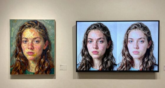
Tips for Achieving Perfect Color Harmony in Digital and Print Art
Achieving perfect color harmony in digital and print art requires careful planning and a keen eye for detail. To do this, understand how color perception varies between screens and prints, influencing how viewers interpret your work. Use color calibration tools to guarantee your monitor displays accurate hues, and select color profiles that match your intended output. When working with pigments, remember that mixing colors can alter their appearance; a hue that looks vibrant digitally might dull when printed due to the differences in pigment mixing. Test prints regularly to gauge how colors translate from screen to paper. By paying attention to these factors, you can create art with consistent, harmonious colors that captivate viewers across both digital and physical formats.
Frequently Asked Questions
How Does Ambient Lighting Affect Color Perception in Prints?
Ambient lighting, especially light temperature, markedly affects how you perceive print colors. In a viewing environment with warm lighting, colors may appear more yellow or orange, while cool lighting can make them seem bluer or more muted. To get accurate color perception, make sure your viewing environment has consistent, neutral lighting—preferably natural daylight or balanced artificial light—so your prints look true to their intended colors.
Can Color Management Improve Consistency Across Different Printing Methods?
Sure, color management can definitely improve consistency across different printing methods—if you don’t ignore the basics. By using proper color calibration and applying accurate color profiles, you guarantee your prints match your digital files more reliably. It’s almost magical how consistent your colors become when you take these steps, even with various printers. Of course, it’s not perfect, but it’s a huge step toward that “what you see is what you get” goal.
What Hardware Improvements Can Enhance Color Accuracy?
You can improve color accuracy by upgrading your hardware with precise monitor calibration tools and high-quality color profiling devices. Regularly calibrate your monitor to guarantee it displays accurate colors, and use professional color profiles tailored to your printer and paper type. These steps minimize discrepancies, so your prints match your screen more closely. Investing in reliable hardware and maintaining consistent calibration routines is key to achieving better color fidelity in your artwork.
How Do I Select the Best Monitor for Accurate Art Display?
You should select a monitor with a wide color gamut, like Adobe RGB or DCI-P3, to guarantee accurate color display. Look for models that support hardware calibration techniques, allowing you to fine-tune colors precisely. Prioritize monitors with consistent color uniformity and good resolution. Regular calibration using calibration tools helps maintain accuracy over time, ensuring your art looks consistent across screens and prints.
Are There Industry Standards for Color Matching in Art Printing?
Yes, industry standards exist for color matching in art printing. You should focus on proper color calibration of your monitor and printer, ensuring consistent color profiles across devices. Using standardized color profiles like Adobe RGB or sRGB helps maintain color accuracy. Regularly calibrate your equipment and embed correct color profiles in your files to achieve more consistent, predictable print results that match your screen display.
Conclusion
Did you know that up to 60% of artists struggle with color consistency between screens and prints? By understanding color spaces, calibrating your devices, and soft proofing, you can bridge that gap. Remember, mastering color management isn’t just about technical steps—it’s about bringing your vision to life accurately. Take control of your workflow, and you’ll enjoy artwork that matches your creative intent every time, with vibrant, true-to-life colors.