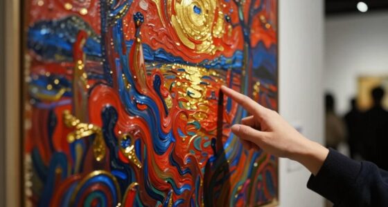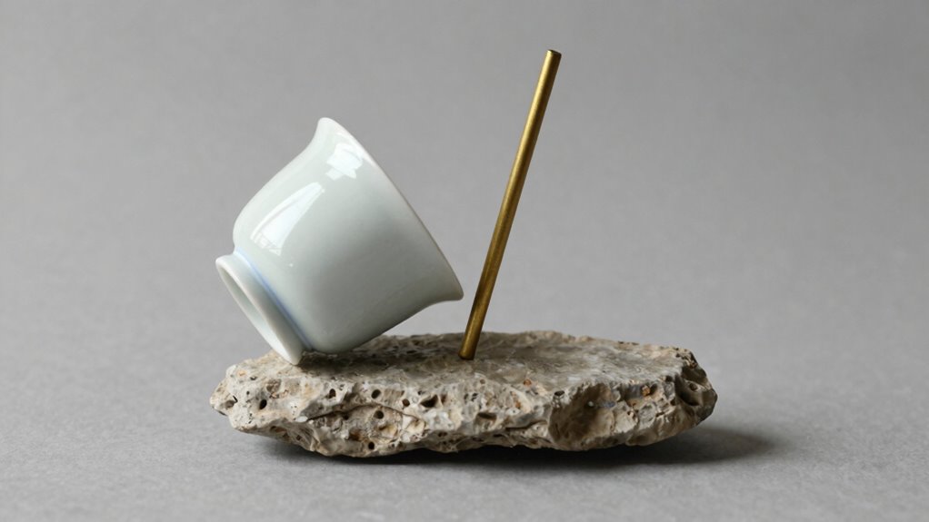

To spot balance in a piece without formal design knowledge, pay attention to how your eye moves naturally across it. Check if different parts feel harmonious and if the composition guides your gaze smoothly from one area to another. Look for even distribution of elements like color, shape, and negative space, which prevent any section from feeling too heavy. If everything feels comfortable and lively without chaos, you’re likely seeing a balanced work—keep exploring to learn more subtle cues.

Prime made for students and young adults
- Fast, free delivery for dorm and study essentials
- Prime Video and Amazon Music included
- Member-only deals
Key Takeaways
- Observe if the eye moves smoothly across the piece without feeling pulled to one side.
- Check for harmonious color relationships that create a natural visual flow.
- Notice if focal points are well-placed, guiding the eye comfortably around the composition.
- Look for even distribution of shapes, lines, and visual weight to avoid clutter or emptiness.
- Trust your instinct to feel if the overall arrangement feels stable and pleasing.

Ever wondered how to tell if a piece of art or design feels balanced? You don’t need a formal background in design theory to recognize it. Balance isn’t just about symmetry; it’s about how the elements work together to guide your eye naturally across the composition. One of the easiest ways to determine this is by observing the use of color harmony. When colors are thoughtfully chosen, they create a visual rhythm that feels comfortable and cohesive. For example, if a design uses a warm, vibrant color on one side, it might be balanced out with cooler, subdued tones on the other. This subtle interplay of hues helps prevent any one part from feeling too heavy or distracting, contributing to an overall sense of harmony. Recognizing how visual rhythm is created can help you develop an intuitive sense of balance in any design. Additionally, paying attention to how the distribution of visual weight**** is managed across the piece can deepen your understanding of balance without needing formal training.
Furthermore, noticing the use of negative space** can reveal how designers intentionally craft balance by giving elements room to breathe, which is especially important in more minimalistic compositions. When negative space is used effectively, it can emphasize the focal points and create a more harmonious overall look. Next, look at where the focal point is placed. The focal point is the part of the piece that immediately draws your attention—the center of interest. If it’s positioned too far to one side or awkwardly off-center without any supporting elements, the composition can feel unbalanced. However, when the focal point is carefully placed—perhaps slightly off-center, in line with the rule of thirds—you’ll notice your eye naturally moves around the piece, exploring other elements without feeling unsettled. This placement helps distribute visual weight and guides your gaze smoothly from the focal point to surrounding details**, reinforcing a sense of stability.
Consider how the elements are arranged overall. Are the shapes, lines, and textures distributed evenly? If one side feels cluttered while the other feels sparse, your eye will instinctively sense imbalance. Conversely, if visual weight is spread thoughtfully, with larger shapes balanced by smaller ones or contrasting textures, the composition feels more grounded. Don’t forget about negative space—sometimes, the empty areas are just as important as the filled ones. Proper use of negative space can enhance the balance by providing breathing room and preventing the design from feeling overwhelming or chaotic.
Finally, trust your instincts. If a piece feels right—if your eye moves effortlessly across it and nothing seems out of place—then it’s likely balanced. Whether it’s through color harmony, focal point placement, or the arrangement of elements, your natural perception picks up on the cues that create harmony. Recognizing these signs is a valuable skill that improves with practice. You don’t need to know the technical jargon to tell if a design feels balanced; your eyes and intuition are more than enough to recognize when all parts come together in a way that feels just right.
As an affiliate, we earn on qualifying purchases.
Frequently Asked Questions
Can Balance Be Achieved Without Symmetry?
Yes, balance can be achieved without symmetry. You can explore asymmetry to create emotional equilibrium, making a piece feel stable yet dynamic. By carefully distributing visual weight through contrasting shapes, colors, or elements, you guide the viewer’s eye smoothly across the work. This asymmetry exploration helps evoke a sense of harmony and interest, proving that perfect symmetry isn’t always necessary for a balanced, engaging composition.
Does Color Influence Visual Balance?
Yes, color influences visual balance considerably. Bright or bold colors carry more visual weight, drawing your eye and creating imbalance if overused. Using color harmony helps distribute this weight evenly, guiding your attention smoothly across the piece. You can tell if a design feels balanced by observing how the colors work together—if one color dominates, it might disrupt harmony, but balanced color placement maintains overall equilibrium.
How Does Scale Affect Balance Perception?
Scale greatly influences your perception of balance by affecting perceived stability and visual weight. When elements are larger, they draw more attention and seem heavier, creating a sense of stability. Conversely, smaller elements appear lighter and less dominant. You’ll notice that balanced compositions often distribute scale thoughtfully, with larger and smaller elements arranged to achieve harmony. Pay attention to how different sizes influence the overall sense of equilibrium in the artwork.
Can Imbalance Create a Dynamic or Intentional Effect?
Yes, imbalance can create a dynamic or intentional effect by emphasizing asymmetrical harmony and generating visual tension. When you intentionally place elements off-center or unevenly, it adds energy and movement to the piece, engaging the viewer’s eye. This deliberate imbalance guides attention and evokes emotion, making the artwork feel lively rather than static. It’s a powerful way to communicate movement, excitement, or a specific mood without relying on traditional symmetry.
Is Balance the Same in Both Two-Dimensional and Three-Dimensional Art?
Balance isn’t exactly the same in 2D and 3D art, but both rely on visual weight and composition. In 2D art, you focus on color harmony and texture variability to create equilibrium, guiding the viewer’s eye smoothly across the piece. In 3D art, balance involves spatial arrangement and physical stability, but the principles of distributing visual and tactile elements remain similar. Both require careful attention to maintain harmony.
As an affiliate, we earn on qualifying purchases.
Conclusion
Next time you look at a piece, notice how your eye naturally drifts to certain areas—almost like it’s finding balance on its own. Sometimes, the right arrangement of elements just feels right without you knowing why. That’s the magic of balance happening beneath the surface, guiding your perception effortlessly. Trust that instinct; it’s no accident that your eye finds harmony. After all, balance isn’t just in the design—it’s in how you experience it.
As an affiliate, we earn on qualifying purchases.
As an affiliate, we earn on qualifying purchases.
Fall Picks
fall essentials
As an affiliate, we earn on qualifying purchases.