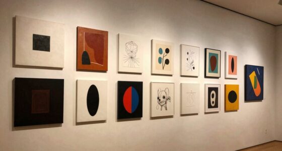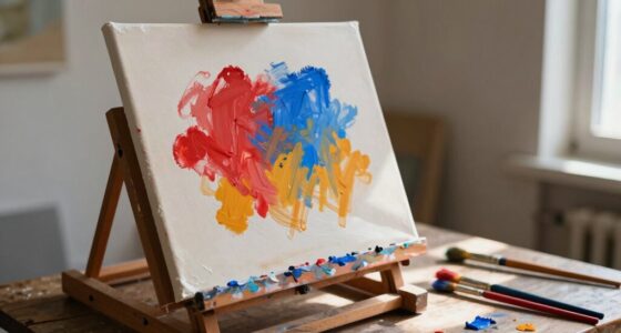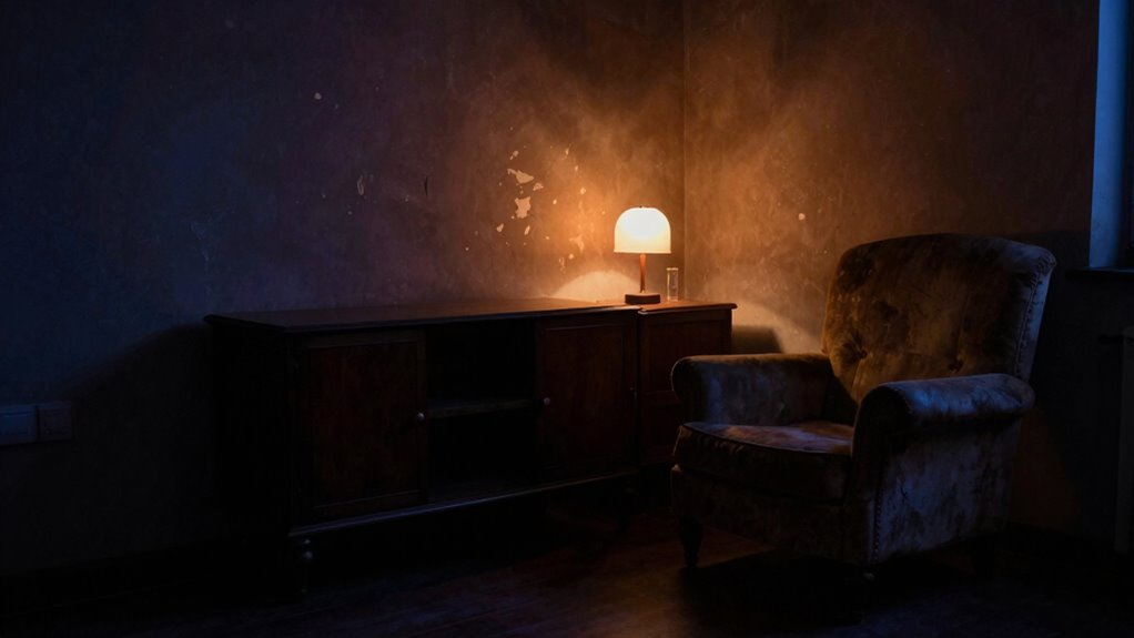

You can understand someone’s or an artwork’s mood by paying attention to their color palette instead of just subject matter. Colors reveal emotional states more than often recognized; for example, warm tones like orange or yellow suggest optimism, while cool blues or purples evoke calmness or introspection. Notice how muted or dark tones might reflect heaviness during stress. By tuning into these color cues, you gain insight into inner feelings and emotional intentions, helping you interpret mood more deeply as you continue exploring.
Listen free for 30 days with Audible
Thousands of audiobooks and originals — cancel anytime.
As an affiliate, we earn on qualifying purchases.
Key Takeaways
- Analyze color choices to uncover subconscious emotional cues influencing mood beyond the subject matter.
- Recognize how warm or cool tones reflect feelings like optimism or tranquility.
- Observe palette consistency to identify shifts in emotional states over time.
- Use color symbolism to interpret underlying mood signs independent of the depicted scene.
- Be aware of how palette adjustments can intentionally alter or convey specific emotional atmospheres.
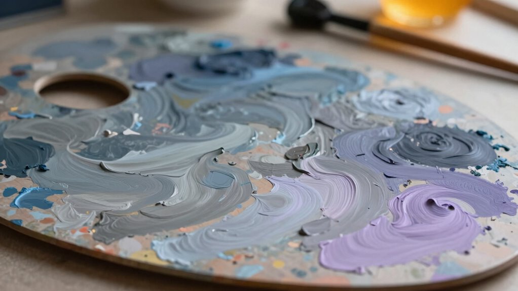
Colors can reveal more about your mood than you might realize, acting as silent indicators of how you’re feeling inside. When you choose a palette for your artwork or even your clothing, you’re not just selecting colors randomly; you’re tapping into a language of emotion. This is where color symbolism comes into play. Different shades carry specific meanings that can influence how others perceive your mood and, more subtly, how you feel. For example, red often symbolizes passion or energy, but it can also signify anger or urgency. Blue might evoke calmness and serenity, yet it can also be associated with sadness. Recognizing these subtle messages allows you to better understand your emotional state or intentionally communicate it through your choices.
Beyond mere symbolism, colors also carry an emotional resonance that deeply connects with your feelings. When you surround yourself with warm hues like oranges and yellows, you might feel uplifted or more optimistic. Conversely, cooler tones like greens and purples can foster introspection or tranquility. Pay attention to how certain colors make you feel—this emotional response is a crucial clue to understanding your mood. If you notice that you gravitate toward muted or dark tones during stressful times, it could reflect feelings of heaviness or introspection. Alternatively, bright, lively colors might indicate a desire for joy or celebration. Your emotional resonance with specific shades is a mirror of your inner world.
Analyzing the palette you naturally lean toward can give you insight into your current mental state. When you’re aware that your choices are influenced by your emotions, you gain a new level of self-awareness. For instance, if you’re feeling anxious, you might subconsciously select calming blues or soft neutrals to soothe yourself. If you’re feeling excited or energetic, bold reds and oranges might dominate your selections. Recognizing these patterns helps you understand your mood without needing words. It’s a subtle, intuitive process that reveals what’s happening inside, often before you even consciously realize it. Understanding the emotional impact of color can empower you to use color intentionally to influence your mood and well-being.
In essence, understanding mood through palette involves more than just recognizing subject matter; it’s about interpreting the nuanced language of color symbolism and emotional resonance. Your color choices act as a visual diary, illustrating your emotional landscape. By tuning into these signals, you can better grasp your feelings, communicate them more effectively, and even influence your mood through intentional color selection. It’s a powerful tool for self-awareness and emotional expression, using the silent language of color to tell your story.
As an affiliate, we earn on qualifying purchases.
Frequently Asked Questions
How Do Color Choices Influence Viewer Emotions in Art?
Color choices directly influence your emotions by evoking specific feelings through color symbolism and cultural influences. For instance, red can evoke passion or urgency, while blue offers calmness. Your perception is shaped by cultural context—white symbolizes purity in some cultures but mourning in others. By understanding these associations, you can intentionally select colors that resonate emotionally with viewers, enhancing the mood and message of your art.
Can Palette Changes Alter the Perceived Mood of a Painting?
Can palette changes truly alter how you perceive a painting’s mood? Absolutely. When you adjust colors, you’re manipulating color symbolism and cultural perceptions, which directly influence emotional responses. For example, warm tones evoke warmth or passion, while cool tones suggest calm or sadness. By changing the palette, you shift the viewer’s emotional experience, proving that color choices are powerful tools for conveying mood beyond subject matter alone.
What Role Does Lighting Play in Mood Creation Through Color?
Lighting plays a vital role in shaping mood through color by enhancing color symbolism and emotional resonance. When you use bright, warm lighting, it amplifies feelings of happiness and energy, while dim, cool lighting can evoke calmness or melancholy. By carefully controlling light, you influence how colors interact, guiding viewers’ emotional responses and deepening the overall mood of your artwork.
Are Certain Color Combinations Universally Associated With Specific Emotions?
You might believe certain color combinations universally evoke specific emotions, but research shows that color symbolism and cultural perceptions heavily influence this. For example, red often symbolizes passion in Western cultures but signifies luck in China. Cultural context shapes how you interpret colors, making some combinations more emotionally charged in one society than another. So, don’t assume all viewers will feel the same; perception varies based on cultural background and personal associations.
How Can Artists Use Palette to Evoke Complex or Conflicting Moods?
You can evoke complex or conflicting moods by carefully selecting colors that symbolize different emotions, leveraging color symbolism. Use contrasting hues to create tension or harmony, and consider cultural interpretations that shape how viewers perceive these colors. For example, combining warm and cool tones might express both passion and calmness simultaneously. Experimenting with saturation and brightness further enhances the layered emotional impact, allowing your palette to communicate nuanced, multifaceted moods.
emotional color palette for painting
As an affiliate, we earn on qualifying purchases.
As an affiliate, we earn on qualifying purchases.
Conclusion
By mastering color palettes, you hold the power to *unleash* emotions more explosive than a fireworks show on New Year’s Eve. Your palette isn’t just a set of colors—it’s a secret code that can make your audience feel joy so intense they could leap out of their chairs, or despair so deep it feels like sinking into an endless, dark ocean. Embrace this tool, and you’ll wield emotional mastery that can turn a simple painting into a heart-stopping experience.
As an affiliate, we earn on qualifying purchases.
As an affiliate, we earn on qualifying purchases.
Fall Picks
fall essentials
As an affiliate, we earn on qualifying purchases.