
To understand why a piece feels dramatic, pay attention to how contrast in light, color, and composition guides your eye and creates emotional tension. High contrast, like sharp shadows and vibrant colors, adds excitement and intensity, while softer contrasts evoke calmness. Notice how contrast creates depth and directs focus, making elements stand out or recede. By exploring these variations, you’ll discover how they shape the emotional impact of the artwork—exploring further reveals even more subtle effects.
Key Takeaways
- High contrast between light and shadow creates a sense of tension and emphasizes emotional intensity.
- Contrasting colors, especially complementary ones, evoke excitement and heighten dramatic impact.
- Sharp differences in elements guide the viewer’s focus and enhance the feeling of conflict or urgency.
- Variations in contrast can evoke specific emotions, such as calmness with softer contrast or tension with strong contrast.
- Balancing contrast with harmony prevents chaos, ensuring the piece remains visually compelling and emotionally resonant.
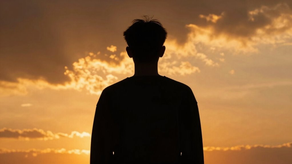
Have you ever wondered how to make your designs or photographs stand out? One of the most powerful tools you can use is contrast. When you master contrast, you can guide viewers’ eyes, evoke emotions, and create a sense of drama. To do this effectively, understanding how contrast interacts with color harmony and emotional impact is essential.
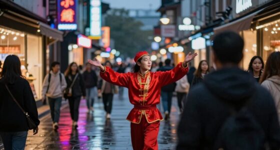
Color harmony involves selecting colors that work well together, creating a pleasing or intentional visual experience. When you introduce contrast within a harmonious color palette, you add vibrancy and energy to your work. For example, pairing complementary colors like blue and orange or red and green creates a striking visual difference while maintaining balance. This deliberate contrast heightens the emotional impact, making the scene feel more intense or urgent. The key is to choose contrasting elements that complement each other rather than clash, which amplifies the dramatic effect without overwhelming the viewer. Recognizing how contrast interacts with other elements is crucial for creating impactful compositions. Developing an awareness of how contrast affects visual hierarchy can help you guide the viewer’s eye more effectively. Additionally, understanding how contrast influences perception of depth and focus can add a three-dimensional quality to your images, further enhancing their emotional resonance. This understanding of visual contrast enables you to craft more compelling narratives within your work.
Pair contrasting colors like blue and orange for vibrant, balanced, and emotionally impactful designs.
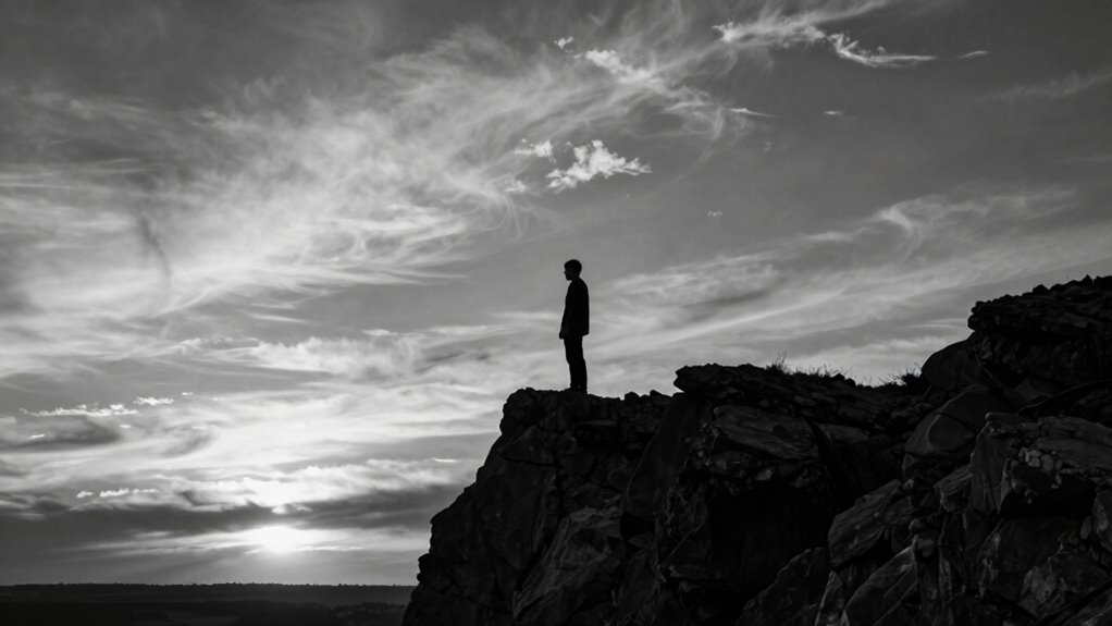
The emotional impact of contrast is what makes a piece feel dramatic. When you increase the difference between elements—whether through color, brightness, or form—you evoke stronger feelings. High contrast can generate excitement, tension, or even a sense of conflict, depending on how you apply it. Conversely, softer contrast produces calmness or subtlety. Understanding the role of light and shadow in contrast helps in crafting more dynamic and emotionally resonant images. Recognizing how contrast influences emotional perception allows you to craft compositions that resonate more deeply with your audience. Moreover, mastering the balance between contrast and harmony ensures that your work remains engaging without becoming overwhelming or chaotic.
Ultimately, understanding how to use contrast effectively hinges on your ability to balance these elements. By thoughtfully combining contrasting colors with harmonious palettes and leveraging light, shadow, and form, you can create works that feel both visually compelling and emotionally charged. When you do this intentionally, your designs and photographs won’t just catch the eye—they’ll evoke the feelings you want your audience to experience, making your work truly stand out with a dramatic flair.

Tiffen Red 25 72mm Filter Increase Contrast in Black and White Photography
Enhances Black & White Contrast: Builds strong tonal separation for high‑contrast black and white photography.
As an affiliate, we earn on qualifying purchases.
As an affiliate, we earn on qualifying purchases.
Frequently Asked Questions
How Does Contrast Influence Emotional Response in Art?
Contrast influences your emotional response by creating emotional intensity and guiding your visual focus. When an artist uses stark differences in color, light, or texture, it heightens feelings of drama or tension. You naturally focus on the contrasting areas, which amplifies the emotional impact. This interplay between elements pulls you into the artwork, making the emotional experience more vivid and powerful, emphasizing key themes or moments.
Can Contrast Be Used to Create Tension Without Color?
Yes, you can create tension without color by using monochrome contrast and texture contrast. Monochrome contrast emphasizes differences in light and dark shades within a single hue, heightening drama. Texture contrast, on the other hand, plays with surfaces—smooth versus rough—to evoke unease or anticipation. Combining these techniques draws the viewer’s eye, builds suspense, and intensifies emotional impact, proving contrast’s power beyond just color use.
What Are Common Mistakes When Applying Contrast?
Jumping the gun is a common mistake in contrast application—you might overdo it, creating chaos instead of harmony. Aiming for artistic balance helps you avoid this pitfall, ensuring your contrast enhances rather than detracts. Many artists rely too heavily on contrast, losing focus on overall composition. Keep your contrast subtle and deliberate, and you’ll maintain a cohesive piece that draws viewers in without overwhelming them.
How Does Contrast Differ Across Various Art Mediums?
In different art mediums, contrast varies considerably. In monochrome textures, contrast relies on light and dark shades to create depth and drama, making your work more intense. In digital art, saturation levels influence contrast, where higher saturation amplifies vibrancy, and lower creates subtlety. Understanding these differences helps you manipulate contrast effectively, whether you’re working with monochrome textures or digital saturation, ensuring your piece feels compelling and emotionally resonant.
Is High Contrast Always More Dramatic Than Low Contrast?
High contrast isn’t always more dramatic than low contrast because contrast psychology shows that the effect depends on context and intention. High contrast creates strong visual emphasis, grabbing your attention and conveying intensity. However, low contrast can evoke subtlety, calmness, or mystery, which can also be dramatic in a different way. Ultimately, it’s about how contrast guides your focus and emotional response, making the piece feel powerful or subdued.

Large Print Coloring Book for Seniors With Low Vision: Mandalas, Nature and Flowers, Images for Everyone to Enjoy
As an affiliate, we earn on qualifying purchases.
As an affiliate, we earn on qualifying purchases.
Conclusion
By mastering contrast, you can turn a simple piece into something truly dramatic. Think of it as painting with light and shadow—when you highlight differences, you make emotions pop and stories resonate. Don’t be afraid to play with extremes; it’s often the little differences that make a big impact. Remember, sometimes it’s the quiet moments beside the storm that truly show what’s at stake. Use contrast wisely, and your work will speak volumes without saying a word.

NiceVeedi 2-Pack Photography Lighting Kit, 36W Bi-Color Studio Lights 2700-6500K CRI 95+, Dimmable LED Video Light Kit with Remote Control & 72” Tripod Stand, Lighting for Video Recording/Photography
【BI-COLOR LIGHTING WITH POWERFUL OUTPUT】The photography lighting features a high output of 36W which provides powerful but stable…
As an affiliate, we earn on qualifying purchases.
As an affiliate, we earn on qualifying purchases.

Artist's Guide to Composition
Used Book in Good Condition
As an affiliate, we earn on qualifying purchases.
As an affiliate, we earn on qualifying purchases.