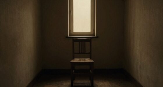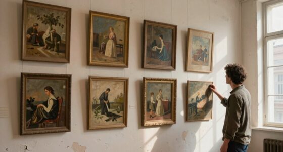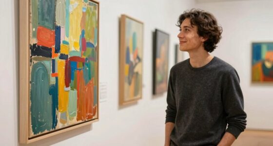

The emotional feel of an artwork, whether quiet or loud, depends on how color harmony and composition work together. Soft, analogous colors with balanced, symmetrical arrangements tend to create a calming, quiet mood. In contrast, bold, contrasting colors with dynamic, asymmetrical layouts evoke excitement and energy. The way elements like space, focal points, and visual weight are balanced can amplify or suppress the sense of noise. Keep exploring to uncover how these techniques shape your visual experience.

Prime made for students and young adults
- Fast, free delivery for dorm and study essentials
- Prime Video and Amazon Music included
- Member-only deals
Key Takeaways
- Color harmony influences emotional tone, with soft, analogous colors creating quietness and saturated, contrasting colors generating loudness.
- Symmetrical, balanced compositions promote a sense of order and calm, contributing to a quiet visual impression.
- Dynamic, asymmetrical arrangements with movement and focal points increase visual energy and perceived loudness.
- Use of empty space and focal points commands attention, making artwork feel more energetic and loud.
- The interaction between color choices and composition determines whether the artwork feels subdued or vibrant.

Art can evoke powerful reactions, but whether it appears quietly subtle or boldly loud depends on how it engages your senses. When you look at a piece, your perception of its quietness or loudness largely hinges on how the artist uses color harmony and composition techniques. Color harmony influences the emotional tone of the artwork, guiding your feelings without overwhelming you. A harmonious palette with soft, analogous colors can create a sense of calm and serenity, making the artwork feel quiet and understated. Conversely, contrasting, saturated colors placed strategically can evoke excitement or tension, making the piece seem loud and assertive. Your eye is naturally drawn to areas of high contrast or bold color, which can amplify the visual impact and contribute to the artwork’s loudness.
Composition techniques also play a critical role in shaping the artwork’s tone. When an artist employs balanced, symmetrical arrangements, your gaze moves smoothly across the piece, encouraging a sense of order and restraint. This balance can make the artwork feel quiet, inviting you to explore its details at a gentle pace. On the other hand, dynamic compositions—such as diagonals, asymmetry, or the deliberate use of empty space—generate movement and energy. These techniques command your attention and create a sense of immediacy, making the artwork feel louder and more vibrant. The placement of focal points, the use of leading lines, and the distribution of visual weight all influence whether you perceive a piece as subtle or assertive. Additionally, the visual weight distribution within the artwork interacts with color choices to further shape its overall impact, emphasizing how perception and emotional response are affected by these elements can deepen your appreciation of different artistic styles. Recognizing the balance between elements helps in understanding how different compositions influence emotional reactions.
The interaction between color harmony and composition techniques determines the overall sensory impact. For example, an artwork with a harmonious color scheme but a chaotic, energetic composition can feel surprisingly loud despite its gentle palette. Conversely, a piece with striking colors but a balanced, restrained composition might come across as more subdued. Your reaction depends on how these elements work together to either soothe or stimulate your senses. When you’re experiencing a quiet artwork, your attention is drawn inward, inviting reflection and calm. When you encounter a loud piece, it commands your focus, sparking excitement or a visceral response. This nuanced balance between visual elements and emotional engagement is what allows artworks to communicate their quiet or loud qualities effectively. Recognizing the interplay of artistic elements helps you understand why certain pieces evoke specific emotional responses. Ultimately, it’s this delicate interplay that makes some artworks whisper softly while others shout loudly, shaping your emotional connection with each piece.
As an affiliate, we earn on qualifying purchases.
Frequently Asked Questions
How Does Color Choice Influence the Perception of Quiet or Loud Artwork?
Color choice greatly influences how you perceive artwork as quiet or loud. Using color psychology, soft, muted tones create a calming, quiet effect, while bold, vibrant hues evoke energy and loudness. Tonal harmony also plays a role; harmonious color combinations foster a sense of balance and tranquility, making the piece feel quieter. Conversely, contrasting, clashing colors can generate visual noise, making the artwork seem louder and more dynamic.
Can Cultural Background Affect How We Interpret Visual Loudness or Quietness?
Your cultural background shapes how you interpret visual loudness or quietness because cultural symbolism influences your emotional response. For example, bold colors might feel aggressive in one culture but celebratory in another. Artistic context also guides perception; familiar symbols or styles evoke quietness or loudness based on your experiences. So, your background filters these elements, making your perception of artwork uniquely personal and deeply rooted in cultural meaning.
Does the Size of an Artwork Impact Its Perceived Loudness or Quietness?
Yes, the size of an artwork influences its perceived loudness or quietness. Larger pieces often evoke a sense of scale dominance, making them feel louder and more commanding. Conversely, smaller works can create a feeling of intimacy and quietness. Composition balance also plays a role; well-balanced larger artworks can feel harmonious, while uneven or cluttered small pieces might seem chaotic or loud. Size profoundly impacts your emotional response.
How Do Viewer Emotions Alter Their Perception of Artwork’s Visual Intensity?
They say, “Beauty is in the eye of the beholder,” and your emotions shape how you perceive an artwork’s visual intensity. When you connect emotionally, it enhances emotional resonance, making the piece feel louder or more vibrant. Conversely, if you’re feeling subdued, perceptual shifts may quieten your perception. Your mood influences how you interpret contrasts, colors, and details, directly altering your experience of an artwork’s visual loudness or quietness.
Are There Specific Art Movements Known for Creating Quiet or Loud Visual Effects?
You’ll notice that movements like Minimalism and Japanese Zen art often emphasize quiet effects through subtle texture contrast and careful compositional balance. In contrast, Abstract Expressionism and Pop Art create loud visual effects by using bold colors, energetic brushstrokes, and striking contrasts. These movements manipulate texture contrast and compositional balance to evoke either a sense of calm or excitement, shaping your emotional response to the artwork’s visual intensity.
As an affiliate, we earn on qualifying purchases.
Conclusion
Ultimately, your artwork is like a silent garden or a bustling city street. A quiet piece whispers like a gentle breeze, inviting viewers to pause and reflect, while a loud work roars like a festival, demanding attention. By balancing elements like color, contrast, and space, you craft a visual symphony or a peaceful sanctuary. Remember, your art’s voice—loud or quiet—depends on the story you choose to tell through your symbolic palette.
As an affiliate, we earn on qualifying purchases.
As an affiliate, we earn on qualifying purchases.
Evergreen bestsellers Picks
bestsellers
As an affiliate, we earn on qualifying purchases.