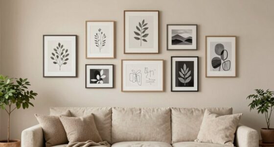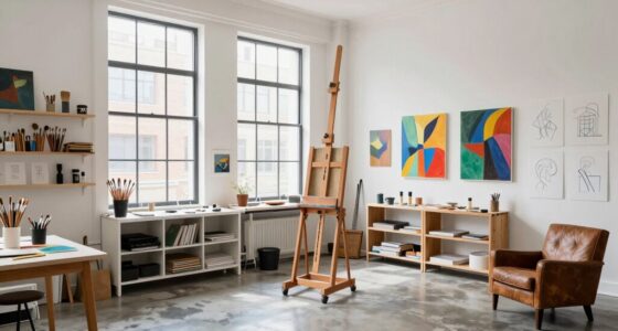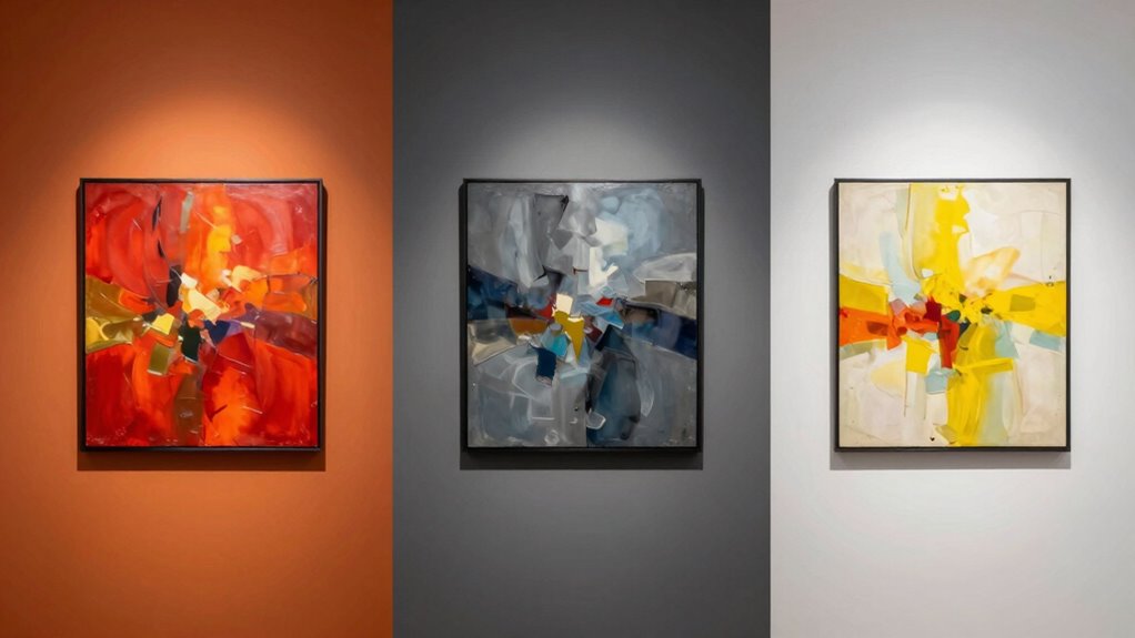

Your choice of wall color can greatly change how artwork appears to you. Bold, contrasting hues make colors and textures pop, while softer shades create a calm, understated backdrop. The right color enhances the emotional tone and helps you focus on details. Lighting also plays a role, working with wall hues to set the mood. Keep exploring, and you’ll discover how pairing wall color and lighting transforms your art space into a true visual experience.

Get school and study supplies delivered free — and shop member deals
- Fast, free delivery on millions of items
- Access to Prime Big Deal Days deals on October 6–7
- Prime Video, Amazon Music and more included
Key Takeaways
- Wall color creates a backdrop that can either enhance or diminish the artwork’s colors and textures.
- Clashing or poorly chosen hues cause visual confusion, affecting how details and emotional tones are perceived.
- Contrasting wall colors can make artwork stand out more vividly, influencing its visual impact.
- The interaction between wall color and lighting alters the mood and perception of the artwork.
- Harmonious wall colors help viewers focus on the art, improving overall appreciation and emotional response.
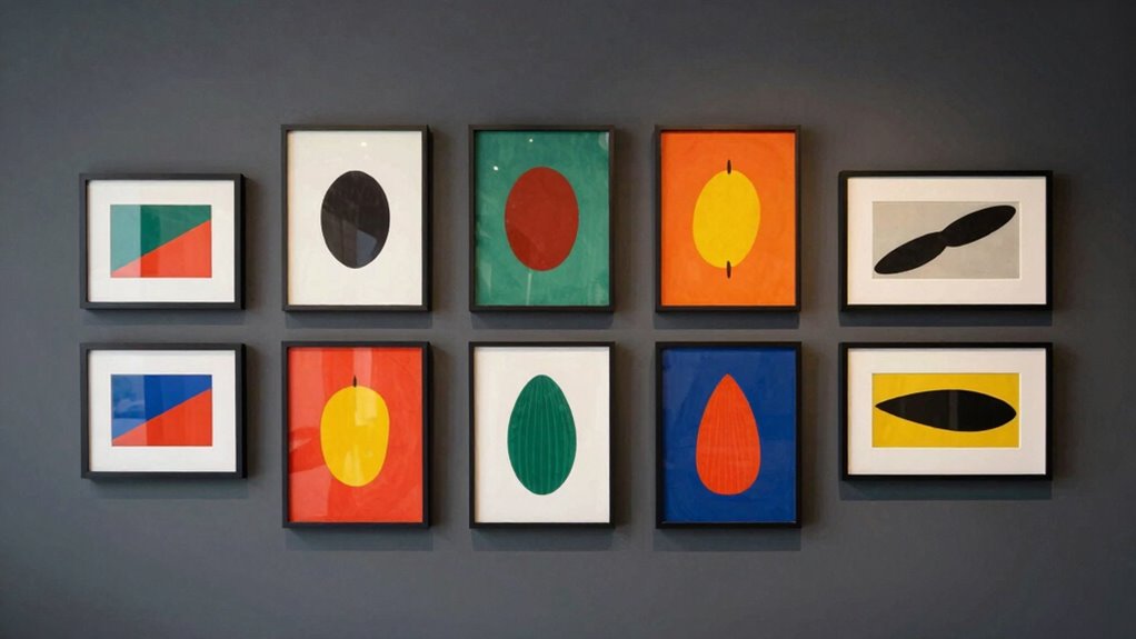
Choosing the right wall color can profoundly influence how artwork is perceived in a space. When you select a wall hue thoughtfully, it creates a backdrop that can either elevate or diminish the impact of your pieces. One of the most essential aspects to consider is color contrast. If your walls clash with the artwork, it can create visual confusion, making it harder to appreciate the details or emotional tone of the piece. Conversely, a well-chosen contrast enhances the artwork’s colors and textures, allowing them to stand out vividly. For example, a deep navy wall can make bright, warm-toned paintings pop, while a soft pastel background might create a calming, understated effect that allows subtle details to shine through.
Lighting effects also play a critical role in how artwork reads on your walls. The way light interacts with both the color of your walls and the artwork itself can dramatically change perception. Bright, direct lighting on a darker wall can create harsh shadows or glare, distracting from the art’s true hues and textures. On the other hand, soft, diffused lighting paired with a neutral or complementary wall color can produce a warm glow that invites viewers to engage more intimately with each piece. Adjusting wall color to work harmoniously with your lighting setup means you can control the ambiance and mood of the space, making the artwork feel more vibrant or subdued as desired.
You should also think about the overall atmosphere you want to create. Bold wall colors can energize a room and make artwork appear more dynamic, but they may also overpower delicate pieces. Subtle shades create a serene environment, emphasizing a sense of calm and allowing detailed or intricate artwork to be appreciated without distraction. When you consider how your chosen color interacts with lighting effects, you’re better equipped to craft a space where art isn’t just displayed but truly read and experienced. Understanding color contrast and how it influences perception can help you make more informed decisions about your interior design choices. Additionally, considering the lighting environment ensures your artwork’s colors and textures are showcased in the best possible way. Being aware of how lighting conditions impact color perception allows you to optimize your space for a more harmonious and immersive art display. Recognizing these visual elements can transform an ordinary room into a captivating gallery.
Moreover, understanding the psychological effects of color can help you select a wall hue that aligns with the mood or message you want your art to convey, enhancing the overall experience. In the end, selecting the right wall color isn’t just about personal taste — it’s about understanding how color contrast and lighting effects influence perception. When you pay attention to these elements, you guarantee that your art reads clearly, beautifully, and with the impact you intend. Your walls become a stage that enhances every brushstroke and detail, guiding viewers’ eyes and emotions seamlessly through your curated space.
wall paint samples for art display
As an affiliate, we earn on qualifying purchases.
As an affiliate, we earn on qualifying purchases.
Frequently Asked Questions
How Does Lighting Affect Artwork Perception on Different Wall Colors?
Lighting profoundly influences how artwork appears on different wall colors. Ambient lighting enhances or softens the color contrast, making details more or less prominent. On darker walls, bright lighting can create a striking contrast, drawing your eye to the artwork. Conversely, softer or warmer lighting on lighter walls can make the piece feel more harmonious. Your choice of ambient lighting directly impacts the perception of color and detail, shaping how you experience the art.
Can Wall Textures Influence How Artwork Appears Alongside Paint Colors?
Yes, wall textures influence how artwork appears alongside paint colors through texture interaction and color harmony. Rough textures can add depth and contrast, making artwork stand out more vividly, while smooth surfaces foster a seamless look that emphasizes color harmony. Your choice of texture impacts how light interacts with the wall, subtly altering the artwork’s perception. Consider these factors to create a cohesive display that enhances both the piece and the surrounding environment.
Do Certain Wall Colors Enhance Specific Art Styles Better Than Others?
Think of wall colors as a backstage pass to art’s true voice. Certain hues, guided by color psychology, can elevate specific art styles—rich blues often enhance classical pieces, while vibrant reds make modern art pop. You create art harmony by choosing wall colors that resonate with the artwork’s mood and style, helping viewers connect more deeply. So yes, some wall colors do enhance specific art styles better than others, shaping perception and emotion.
How Do Room Size and Wall Color Work Together to Affect Art Viewing?
Room size and wall color work together to influence how you perceive art through color contrast and visual harmony. In smaller spaces, darker or bolder wall colors may overwhelm artwork, while lighter shades create openness. Conversely, larger rooms benefit from contrasting wall colors that highlight art pieces, creating depth. Achieving visual harmony involves balancing wall tones with artwork, ensuring each element complements the other without overpowering the overall aesthetic.
Are There Psychological Effects of Wall Color on Art Appreciation?
Yes, wall color influences your psychological mood and emotional response when viewing art. Bright, bold colors can energize you and make artwork seem more dynamic, while softer hues promote calmness and reflection. The right wall color enhances your appreciation by aligning with the emotional tone of the artwork, helping you connect more deeply. Ultimately, choosing a color that complements the piece creates a more immersive and meaningful art experience for you.
As an affiliate, we earn on qualifying purchases.
Conclusion
Choosing the right wall color isn’t just about aesthetics; it’s about creating a stage where your artwork can truly shine. Like a painter’s palette, your walls set the tone, guiding how viewers perceive and feel about each piece. When you pick thoughtfully, it’s as if you’re tuning an instrument, ensuring every artwork resonates perfectly. So, embrace the power of color—your walls are the silent partners in telling your art’s story.
neutral wall paint for art gallery
As an affiliate, we earn on qualifying purchases.
As an affiliate, we earn on qualifying purchases.
color contrast wall art backdrop
As an affiliate, we earn on qualifying purchases.
As an affiliate, we earn on qualifying purchases.
Halloween Picks
halloween
As an affiliate, we earn on qualifying purchases.