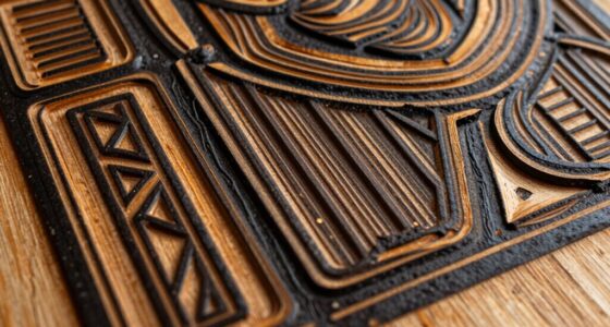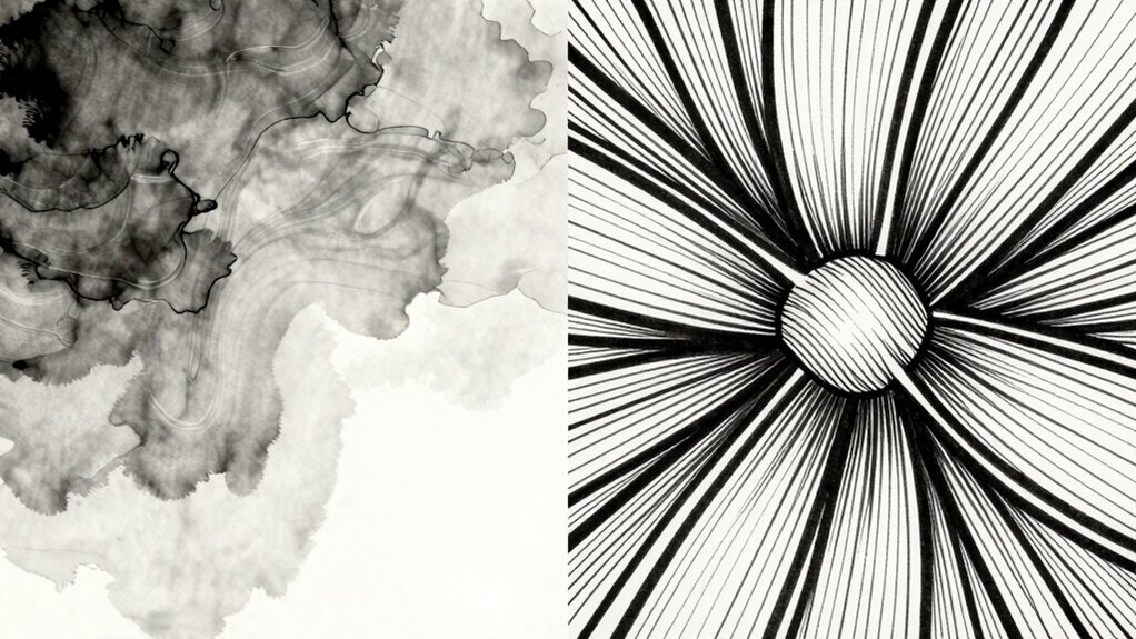
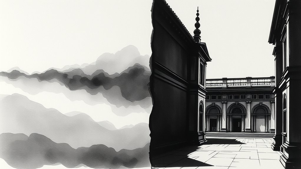
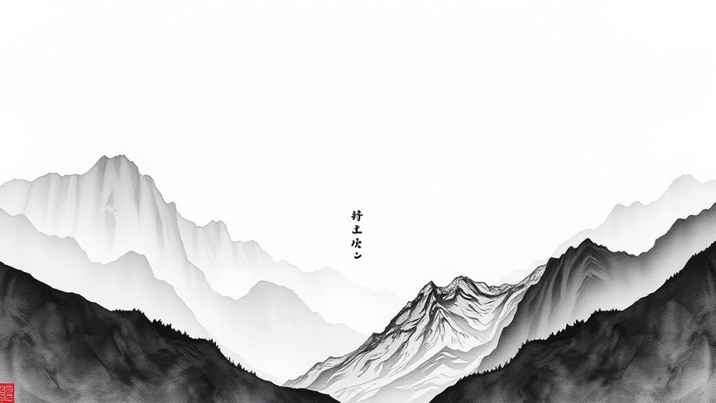
Ink wash and linework are two powerful ink styles that can dramatically transform your art. Ink wash emphasizes smooth tonal gradations and atmosphere, creating mood and depth, while linework uses precise strokes to define shapes, textures, and details, adding clarity and energy. Combining both allows you to blend softness with sharpness, enhancing storytelling and emotional impact. Exploring these techniques opens new creative possibilities—continue exploring to master how they can change your artwork’s whole feel.
Key Takeaways
- Ink wash creates atmospheric depth with tonal gradients, while linework emphasizes clarity and detailed contours.
- Ink wash uses fluid brush strokes for soft textures, whereas linework employs precise lines for sharp definition.
- Combining both styles enhances mood, depth, and detail, offering versatile expressive possibilities.
- Ink wash is ideal for mood and background, while linework highlights structure and intricate features.
- Balancing these styles allows artists to craft dynamic, emotionally resonant artwork with visual contrast.
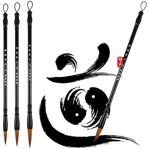
Zonon 3 Pieces Chinese Calligraphy Brush Pens Japanese Calligraphy Brush Sumi Drawing Brush Traditional Wooden Watercolor Ink Pens for Beginner Watercolor Painting Tools (3 Sizes)
Package content: you will receive 3 pieces of black calligraphy writing brushes in different brush sizes, namely about…
As an affiliate, we earn on qualifying purchases.
As an affiliate, we earn on qualifying purchases.
The Foundations of Ink Wash and Linework
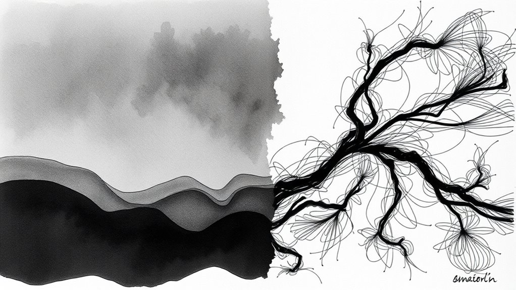
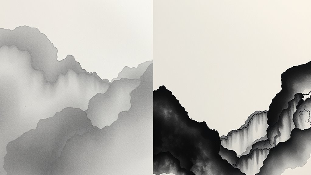
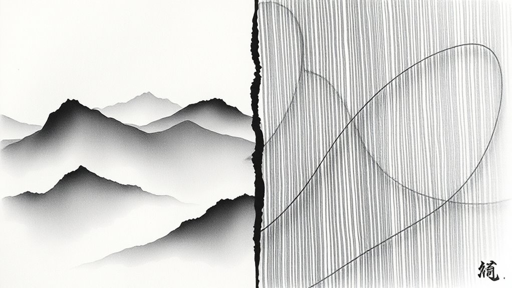
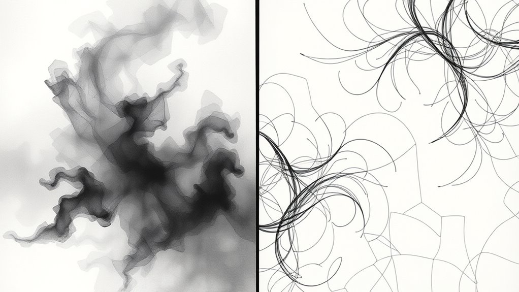
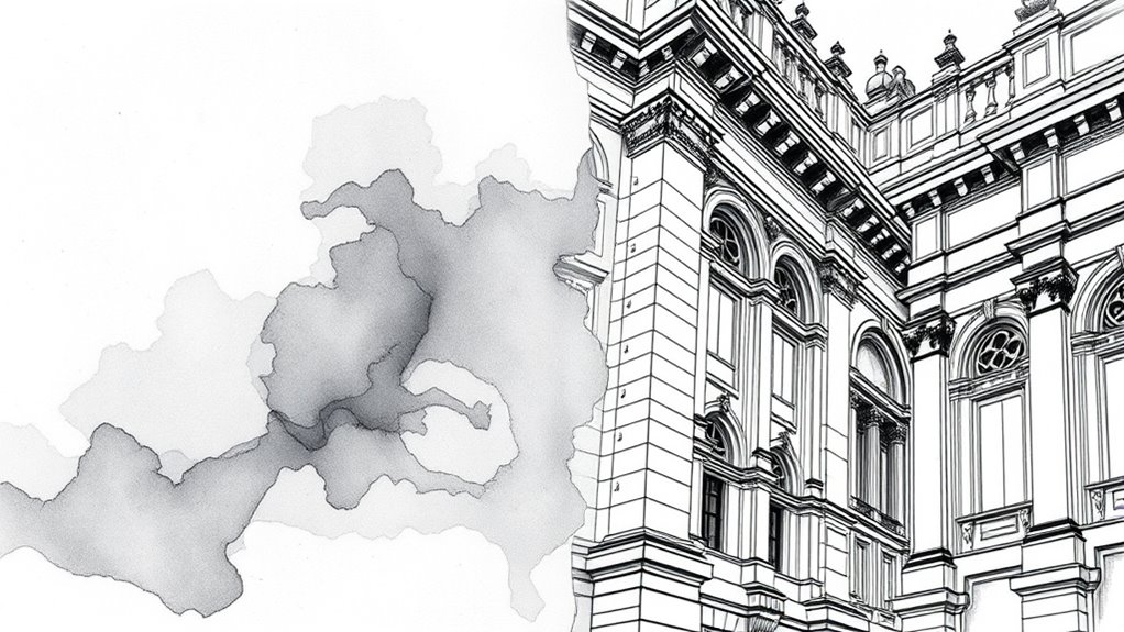
Understanding the foundations of ink wash and linework is essential to appreciating their unique qualities. Ink wash emphasizes subtle gradations achieved through varying ink saturation, creating a sense of depth and atmosphere. It often draws from traditional calligraphy styles, where the flow and fluidity of ink are paramount. The wide color gamut enhances the visual experience by allowing a broader range of colors and tones to be represented. Additionally, ink wash techniques often require a nuanced ink control to produce smooth transitions and delicate shading. Mastery of brush techniques is crucial for executing both styles effectively, as it influences the texture and expressiveness of the artwork. Developing a steady hand and understanding pressure sensitivity is vital for achieving the desired effects in ink wash. Linework, on the other hand, relies on precise, deliberate strokes to define shapes and details. It focuses on the contrast between thick and thin lines, capturing structure and form with clarity. Both styles require mastery of ink control but approach it differently—ink saturation for wash techniques and line thickness for linework. Recognizing these core principles helps you appreciate how each style communicates mood and detail through distinct methods of ink application. Additionally, techniques like ink wash can evoke a more expressive, atmospheric feeling, whereas linework tends to favor clarity and precision.

TWOHANDS Art Pens,Fineliner Ink Pens,Set of 12 Technical Drawing pen,Pigment Pen,Fine Point,Black,Waterproof,for Art Watercolor,Sketching,Anime,Manga, 902188
The archival quality ink is waterproof, chemical resistant, fade resistant, bleed free, quick drying.
As an affiliate, we earn on qualifying purchases.
As an affiliate, we earn on qualifying purchases.
Techniques and Tools for Each Style
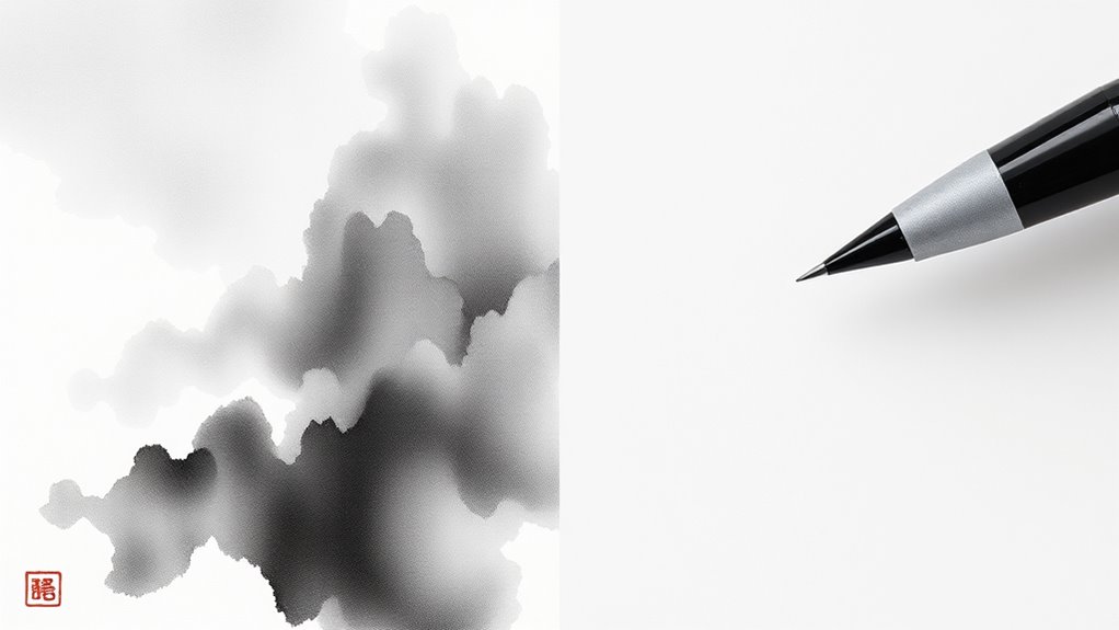
To master ink wash and linework, you need to familiarize yourself with their distinct techniques and tools. Ink wash relies on controlled brush strokes, blending shades for depth and atmosphere. You’ll use brushes of various sizes, from broad to fine, to create fluid, expressive washes. Conversely, linework emphasizes precise pen techniques, using fine-tipped pens or technical pens to produce clean, consistent lines. Understanding Free Floating allows artists to create versatile and dynamic compositions that emphasize form and space. Developing a strong understanding of ink application techniques is crucial for achieving the desired effects in each style. Proper ink flow control ensures smooth application and prevents blotting or uneven lines. Key tools include:
Master ink wash with varied brushes; perfect linework with fine pens for dynamic, precise art.
- Different brushes for varied brush strokes
- Technical pens for detailed linework
- Ink bottles for smooth, consistent ink flow
Practicing technique control helps artists refine their skills and adapt tools effectively for each style. Understanding how to manipulate brush strokes for washes and applying disciplined pen techniques for linework helps you develop your style and achieve desired effects. Mastery of these tools and techniques forms the foundation for dynamic ink art, and exploring material quality can significantly impact your results.

Winsor & Newton Collection Drawing Ink Set, Vibrant Tones, 0.5, Set of 4
Our drawing inks have been used by illustrators since their introduction by Winsor & Newton in the 1890's,…
As an affiliate, we earn on qualifying purchases.
As an affiliate, we earn on qualifying purchases.
Creating Mood and Atmosphere With Ink Wash
Mastering the techniques and tools for ink wash opens up powerful ways to evoke mood and atmosphere in your artwork. By skillfully applying color blending, you can create seamless progressions that set the tone—darker shades evoke mystery or somberness, while lighter washes suggest serenity or lightness. Pay close attention to your composition layout; strategic placement of washes can direct the viewer’s eye and emphasize specific areas, enhancing the overall mood. Use gradations of tone to deepen shadows and highlight focal points, adding depth and emotional impact. Remember, the fluidity of ink wash allows you to experiment with varying degrees of transparency, giving you control over the atmosphere you wish to convey. This approach transforms simple ink work into an evocative visual story.

I-MART Chinese Calligraphy Set for Beginners with 4 Brushes, Ink Stone, Ink Stick, Red Ink Paste, Seal, Porcelain Water Bowl, Brush Holder, Calligraphy Kits for Beginners and Sumi Painting
Complete Chinese Calligraphy Set – Includes 4 traditional calligraphy brushes, ink stone, ink stick, red ink paste, porcelain…
As an affiliate, we earn on qualifying purchases.
As an affiliate, we earn on qualifying purchases.
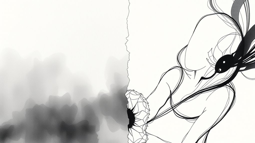
Defining Form and Detail Through Linework
Your linework can bring clarity and precision to your drawings, making forms easy to read. By varying line weight and style, you add expressive detail that guides the viewer’s eye. This control over line helps define both the overall shape and intricate features with impact. Incorporating vetted techniques ensures your linework maintains consistency and enhances the overall quality of your artwork. Additionally, understanding the different ink styles such as wash versus linework enables artists to choose the most effective approach for their desired visual effect. Mastering technique consistency can further elevate the professionalism and cohesiveness of your drawings. Using appropriate tools can also significantly affect the outcome of your linework, emphasizing the importance of selecting the right materials to match your style.
Precision and Clarity
Linework plays a crucial role in establishing both precision and clarity in an artwork, as it directly shapes the viewer’s understanding of form and detail. Sharp, deliberate lines define contours, ensuring that shapes are easily recognizable. Through careful line placement, you can emphasize surface texture, conveying roughness or smoothness without color blending. Additionally, precise linework guides the eye, highlighting focal points and creating visual hierarchy. Consider these techniques to enhance clarity:
- Varying line weight to distinguish foreground from background
- Using clean, consistent lines for detailed areas
- Employing strategic line density to suggest surface texture
- AI-powered tools can assist artists in refining linework for more accurate and expressive results. Understanding the different ink styles helps artists choose the most suitable approach to achieve their desired effect. Incorporating knowledge of visual hierarchy allows artists to better organize elements within their composition, ensuring clarity and focus.
Expressive Line Variations
Varying line weight and style allows you to inject emotion and movement into your artwork, shaping form and detail with greater expressiveness. By adjusting line thickness, you emphasize depth and focus, creating a dynamic flow. Incorporate brush textures to add richness and tactile quality, making lines feel lively and organic. Color blending with linework can subtly enhance mood and atmosphere, guiding viewers’ eyes through your piece. Consider these approaches:
| Technique | Effect |
|---|---|
| Thick, bold lines | Stronger emphasis, solidity |
| Thin, delicate lines | Subtle detail, lightness |
| Varied line weight | Dynamic movement and depth |
| Textured brush strokes | Organic, tactile feel |
| Smooth color blending | Seamless transitions, mood setting |
These variations deepen your control, transforming simple linework into expressive storytelling.
Artistic Expressions and Visual Impact
Your choice between ink wash and linework shapes the mood and atmosphere of your art, influencing how viewers feel. The level of detail and texture you incorporate adds depth and richness, making your work more engaging. Incorporating artistic resources and techniques can help you refine your skills and achieve your desired effects. Understanding the visual impact of each style can further enhance your artistic expression and connection with viewers. Additionally, exploring different ink styles can expand your creative repertoire and inspire new approaches. Recognizing the passive voice in your writing can also improve clarity and engagement in your artistic descriptions. Utilizing composition principles can further enhance the overall effectiveness of your artwork.
Mood and Atmosphere
The choice between ink wash and linework considerably influences the mood and atmosphere of an artwork, shaping how you emotionally connect with the piece. Ink wash creates a soft, atmospheric quality, often evoking tranquility or melancholy through subtle gradations. Conversely, linework tends to produce a more energetic, defined mood, emphasizing clarity or tension. Your perception is also affected by color symbolism, where specific hues deepen emotional resonance, and cultural influences, which inform the visual language and emotional tone. Consider how these elements interact:
- Ink wash’s fluidity enhances mood through tonal variations.
- Bold linework emphasizes structure and intensity.
- Cultural symbolism guides emotional interpretation of style choices.
- The biography of an artist can influence the emotional depth conveyed through their chosen style, adding layers of meaning to the artwork.
- Additionally, understanding the techniques involved in each style can help artists better manipulate mood and atmosphere to achieve their desired effect. Recognizing the role of visual language is essential for understanding how different styles evoke specific emotional responses.
Together, these factors craft a distinctive atmosphere, resonating uniquely with each viewer.
Detail and Texture
How does the choice between ink wash and linework influence the level of detail and texture in an artwork? With ink wash, you create smooth transitions through color blending, adding subtle depth and soft textures that evoke a sense of realism. The fluid brush strokes allow you to emphasize shading and volume, making fine details feel more organic. Linework, on the other hand, relies on precise, deliberate strokes to define textures and intricate details sharply. It offers clarity and control, letting you highlight specific elements with fine lines or bold outlines. Your choice impacts how textures are perceived—whether as soft and blended or crisp and detailed—ultimately shaping the richness and tactile quality of your artwork. Additionally, understanding artistic techniques can help you leverage these styles to enhance the overall visual impact. Incorporating digital tools can further refine your control over texture and detail, bridging traditional styles with modern technology.
Visual Intensity
Choosing between ink wash and linework considerably affects the emotional impact and visual intensity of your artwork. Ink wash creates a moody, atmospheric quality with softer progressions, enhancing color saturation and emotional depth. Linework, on the other hand, offers sharp, defined contours that command attention and emphasize details. Consider these aspects:
- *Color saturation*: Ink wash often produces richer, more immersive hues, amplifying emotional resonance.
- *Visual impact*: Bold linework delivers immediate clarity, while ink wash invites a subtle, layered experience.
- *Expressive power*: The fluidity of ink wash evokes mood, whereas linework conveys strength and precision.
Your choice influences how viewers perceive and feel your piece, shaping its overall emotional and visual intensity.
When to Use Ink Wash Versus Linework
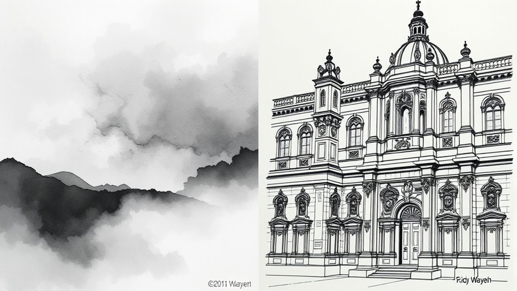
Deciding whether to use ink wash or linework depends on the mood and detail level you want to achieve. Use ink wash when you aim for soft gradations, subtle shading, and a more atmospheric feel, which enhances brush textures and creates a sense of depth. It’s ideal for scenes that benefit from smooth color integration and a fluid, organic look. Linework, on the other hand, works best when you need crisp outlines, clear definition, and precise details. It emphasizes structure and contrast, making it perfect for expressive characters or intricate designs. Consider the emotional tone and visual impact you want to convey. If you seek a moody, atmospheric effect, ink wash is your choice. For sharp, controlled visuals, linework delivers the clarity you need.
Combining Ink Wash and Linework for Dynamic Art
Combining ink wash and linework can create artwork that is both visually striking and emotionally nuanced. By blending the fluidity of ink wash with precise line details, you enhance depth and atmosphere. To master this, focus on brush techniques that vary pressure and stroke direction, creating contrasting textures. Pay attention to paper textures; rough surfaces can amplify the richness of wash, while smooth papers support sharp linework. Consider these approaches:
- Use ink wash for background shading, layering with controlled brush techniques
- Add fine linework over washes to define forms and create focal points
- Experiment with paper textures to influence how ink behaves and interacts
This synergy allows you to craft dynamic compositions that captivate viewers, emphasizing mood and movement through thoughtful technique choices.
Challenges and Considerations for Artists
While blending ink wash and linework can produce compelling artwork, it also presents specific challenges that artists must navigate. Achieving seamless color blending with ink wash requires control over water and ink ratios, which can be tricky, especially when combined with precise linework. Shading techniques demand patience and skill, as over-application can muddy the details or obscure line clarity. Maintaining contrast between the soft gradients of ink wash and sharp lines is essential, but balancing these elements requires careful planning. Additionally, working with ink wash can be unforgiving; mistakes are hard to correct, so you need to be deliberate with your strokes. Overall, mastering both styles involves understanding their limitations and knowing when to emphasize blending or linework for a harmonious composition.
Inspiring Examples and Masterpieces
Some of the most inspiring examples of ink wash and linework can be found in the works of renowned artists whose mastery brings these techniques together seamlessly. These masterpieces showcase exceptional color blending, where ink wash creates depth and atmosphere, while precise linework defines detail. Digital adaptation has further elevated these styles, allowing artists to experiment with layers and textures effortlessly. You’ll find examples like traditional Japanese sumi-e, where subtle ink gradations evoke emotion, or contemporary digital illustrations that combine bold outlines with soft washes. These works demonstrate how blending techniques can produce striking contrasts and harmony. To deepen your understanding, consider:
- Examining how masters balance ink wash with sharp linework
- Observing digital adaptations that enhance traditional styles
- Noticing innovative use of color blending in modern masterpieces
Tips for Incorporating Both Styles Into Your Projects
To effectively combine ink wash and linework, focus on balancing the techniques so they complement each other without overpowering. Use ink wash to highlight key elements and create depth, while sharp linework can define details and structure. Don’t be afraid to experiment with textures to add visual interest and unify both styles seamlessly.
Balance Ink Techniques
Balancing ink wash and linework can elevate your artwork by creating dynamic contrast and depth. To achieve this harmony, focus on integrating techniques that highlight each style’s strengths. Use brush techniques to layer ink wash smoothly, enhancing tonal variation and color blending, while sharp linework defines details and structure. Experiment with blending ink wash in larger areas to set a mood, then add precise linework to accentuate focal points. Adjust the density of your lines to complement the wash’s softness, creating a balanced composition. Consider these tips:
- Vary brush techniques to control ink flow and texture
- Use color blending in ink wash for subtle gradations
- Incorporate fine linework to anchor the composition and add clarity
Highlight Key Elements
Integrating ink wash and linework into your projects requires identifying and emphasizing the key elements that benefit from each style. Use ink wash to create smooth color blending and subtle shading, which helps highlight background elements or soft progressions. For focal points, employ bold linework to make details stand out sharply. Pay attention to your brush strokes: gentle, flowing strokes in ink wash can evoke mood and atmosphere, while crisp, deliberate lines define structure and form. Balance these techniques by applying ink wash where depth and mood are essential, and reserve linework for clarity and emphasis. By strategically combining both styles, you direct viewers’ attention effectively, making your artwork more dynamic and visually engaging without overwhelming the composition.
Experiment With Textures
Ever wondered how textures can elevate your artwork? Texture experimentation is key to creating dynamic pieces that blend ink wash and linework seamlessly. To achieve effective style fusion, try incorporating different textural techniques, such as cross-hatching, stippling, or dry brushing, to add depth and contrast. Experiment with layering textures to highlight specific elements or create atmospheric effects. For example:
- Combine soft ink wash backgrounds with sharp linework for striking contrast
- Use stippling to add intricate details within ink wash areas
- Incorporate textured patterns to unify mixed styles and add visual interest
Frequently Asked Questions
How Does Cultural Background Influence Ink Wash and Linework Styles?
Your cultural background shapes how you approach ink wash and linework styles by influencing your use of cultural symbolism and traditional influences. You may adopt specific techniques, motifs, or themes rooted in your heritage, which add depth and meaning to your artwork. These cultural elements guide your choice of brushstrokes, shading, and detail, helping you create pieces that reflect your identity and connect with viewers through shared traditional symbolism.
Can These Ink Techniques Be Adapted for Digital Art Platforms?
You can absolutely adapt ink wash and linework techniques for digital art platforms. Some might think the tactile feel is lost, but digital adaptation allows for seamless technique transfer. You can mimic traditional brush strokes, shading, and line work with various brushes and tools. This flexibility helps you preserve the essence of these styles while exploring new creative possibilities, making your artwork both innovative and deeply rooted in traditional ink techniques.
What Are Common Mistakes Beginners Make With Ink Wash and Linework?
You often make mistakes with ink wash and linework by handling your brush incorrectly, leading to uneven line quality and unpredictable washes. To improve, focus on controlling your brush pressure and ink flow, practicing steady strokes, and avoiding overworking areas. This helps create consistent lines and smooth washes. Remember, patience and deliberate movements are key to mastering these ink techniques and preventing common errors.
How Do Ink Wash and Linework Impact Storytelling in Comics?
Think of ink wash and linework as the heartbeat of your story’s visual rhythm. You impact storytelling by setting the emotional tone—soft washes evoke intimacy, sharp lines create tension—while enhancing visual clarity. As a storyteller, you wield these tools like a painter’s brush, guiding your audience’s feelings and focus. When used skillfully, they turn simple images into a vivid narrative, making your comic resonate deeply with every reader’s heartbeat.
Are There Specific Art Genres That Favor One Style Over the Other?
You’ll find that calligraphic expression and abstract illustration often favor linework, as its clean, precise lines enhance detailed designs. Conversely, ink wash suits more experimental art genres like abstract illustration, where fluid shading and tonal variation create depth and mood. Certain fantasy or horror genres also lean toward ink wash for atmospheric effects, while traditional comic styles prefer the clarity of linework. Your choice depends on the emotional tone and visual complexity you aim to achieve.
Conclusion
Ultimately, blending ink wash and linework can transform your art, creating depth and emotion that resonate deeply. Some believe this harmony mirrors life’s balance—where fluidity meets structure—reminding you that embracing both can lead to richer, more dynamic creations. So, experiment boldly, trust your instincts, and discover how integrating these styles reveals new possibilities. After all, true artistry lies in exploring the tension between control and spontaneity.