
Understanding print terminology helps you make confident choices for your projects. Learn the difference between finishes like matte, gloss, embossing, and coatings to enhance appearance and durability. Recognize how paper textures, such as smooth or textured surfaces, affect the look and feel of your printed materials. Knowing these terms guarantees you select options that match your design goals and stand up to handling over time. Keep exploring to discover even more ways to achieve professional, eye-catching results.

Prime made for students and young adults
- Fast, free delivery for dorm and study essentials
- Prime Video and Amazon Music included
- Member-only deals
Key Takeaways
- Familiarize yourself with common print finishing techniques like laminating, embossing, and coating to understand their visual and tactile effects.
- Learn how different paper textures (smooth, linen, felt) influence the look and feel of your printed materials.
- Understand the durability of various finishes to select the right option for projects exposed to handling or environmental elements.
- Match paper textures with appropriate finishes (e.g., matte with textured paper, gloss with smooth paper) for desired visual impact.
- Consult with printers and review samples to clarify terminology and ensure your choices align with your design and durability goals.
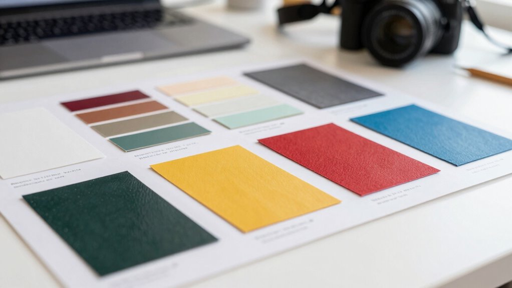
Exploring the world of print can feel overwhelming, especially with all the specialized terms used by printers and designers. But once you get a handle on some basics, you’ll find it easier to communicate your needs and understand the options available. One key area to grasp is print finishing, which refers to the processes applied after printing to enhance the look, feel, and durability of your printed materials. Print finishing includes techniques like laminating, coating, embossing, and die-cutting. These steps can make your project stand out by adding texture, gloss, or a tactile feel. For example, a matte or gloss coating can give your print a sleek, professional look, while embossing creates a raised design that adds depth and dimension. Knowing what kind of finish suits your project helps you make informed decisions and ensures your final product aligns with your vision. Additionally, understanding the durability of different finishes can help in selecting options that will withstand handling over time. Considering print durability is especially important for items that will be handled frequently or exposed to the elements.
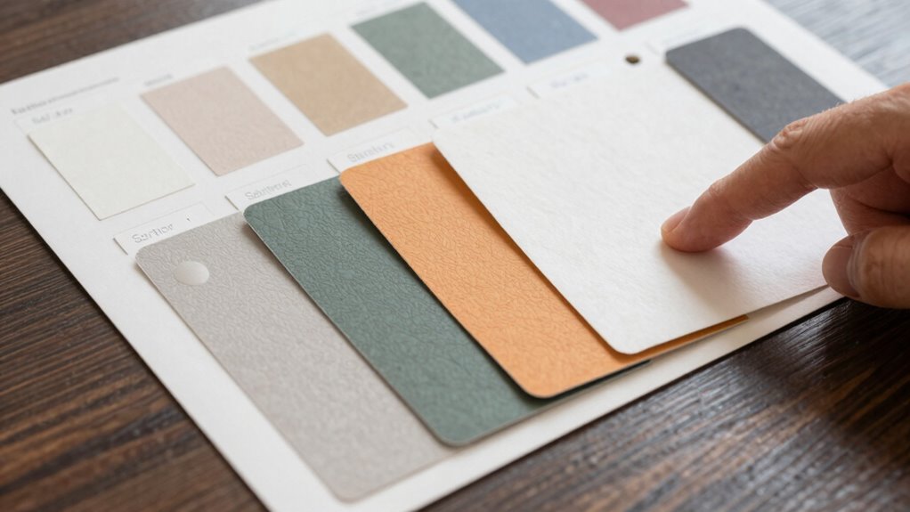
Another important aspect to understand is paper textures. Paper isn’t just about color or weight; it also involves the surface feel and visual effect. Textured papers can add a sense of sophistication or uniqueness to your print, whether it’s a smooth, uncoated stock for a clean appearance or a linen or felt finish for a tactile, luxurious feel. When choosing paper textures, consider the purpose of your project. A high-quality textured paper can elevate business cards, invitations, or packaging, making them memorable and more engaging to touch. Conversely, smooth papers work well for clean, modern designs that emphasize sharp images and crisp text. Understanding the difference in paper textures helps you select the right material that complements your design and enhances the overall impact of your print.
Getting familiar with print finishing and paper textures also means understanding how they work together. For instance, pairing a textured paper with a matte finish can create a subtle, understated look, while combining a smooth paper with gloss coating can produce a vibrant, eye-catching effect. When discussing your project with a printer, don’t hesitate to ask about these options. They can advise you on the best finishes and textures to achieve your desired aesthetic and durability. Ultimately, understanding print finishing and paper textures empowers you to make choices that elevate your printed materials, giving them a professional, polished appearance that captures attention and communicates quality. With this knowledge, you’re better equipped to navigate the printing world confidently, ensuring your projects turn out just as you envision.
As an affiliate, we earn on qualifying purchases.
Frequently Asked Questions
How Do I Choose the Right Paper Type for My Project?
To pick the right paper type, consider your project’s purpose and desired look. Think about the paper texture—smooth for professional documents, textured for artistic projects. Also, check ink compatibility; some papers work better with certain inks, ensuring vibrant colors or sharp text. Test samples if possible, and consult with your printer or supplier to match paper choice with your printing method, ensuring the best results.
What Is the Difference Between Matte and Gloss Finishes?
Matte and gloss finishes differ mainly in their appearance and texture. Gloss finishes give your prints a shiny, reflective surface, making colors pop and details stand out, while matte finishes provide a muted, non-reflective look, offering a softer texture variation. When choosing, consider varnish options—gloss varnish enhances gloss finishes, and matte varnish complements matte surfaces. Think about the desired visual impact and tactile feel to pick the right finish for your project.
How Does Print Resolution Affect the Quality of My Print?
Think of print resolution like a camera’s megapixels: higher resolution means sharper images. When you focus on resolution, you should also consider color calibration and ink compatibility to guarantee vibrant, accurate results. I once printed a photo with low resolution, and it looked pixelated, like a puzzle with missing pieces. To get professional quality, aim for higher DPI settings, which deliver crisp details and true-to-life colors in your prints.
What Are Common Print Production Mistakes to Avoid?
To avoid common print production mistakes, always check your color calibration to guarantee colors match your design expectations. Additionally, maintain proper bleed margins so your images or backgrounds extend beyond the trim line, preventing white edges. Double-check your file resolution and fonts before submitting. By paying attention to color calibration and bleed margins, you’ll ensure a professional, high-quality final print without costly errors or reprints.
How Do I Estimate Printing Costs Accurately?
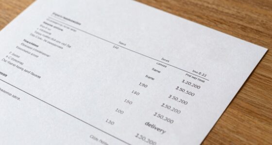
Imagine you’re preparing a brochure, and you want accurate cost estimation. Start by gathering detailed specs—size, quantity, paper type, and finishes. Use pricing strategies like bulk discounts to refine your estimate. Always request detailed quotes from printers, including setup fees and delivery costs. Comparing multiple estimates helps you identify realistic pricing and avoid surprises, ensuring your budget aligns with your project’s scope and quality expectations.
As an affiliate, we earn on qualifying purchases.
Conclusion
By mastering print terminology, you’ll confidently navigate your printing projects and avoid costly misunderstandings. For instance, knowing the difference between matte and gloss finishes can help you select the perfect look for your brochure, ensuring it resonates with your audience. When you speak the same language as your printer, your ideas come to life smoothly. So keep learning those terms—your next successful print job depends on it!
As an affiliate, we earn on qualifying purchases.
As an affiliate, we earn on qualifying purchases.
Fall Picks
fall essentials
As an affiliate, we earn on qualifying purchases.