Your monitor colors rarely match print because of differences in display technology, calibration, ink absorption, and paper type. Monitors use emitted light, while prints rely on ink and paper interactions, which can cause color mismatches. Without proper calibration and color management, your screen images may be misleading for printing. Variations in ink absorption and paper surface also impact final hues. Keep exploring to discover how to improve color accuracy and bridge these gaps more effectively.
Key Takeaways
- Monitors emit light, while printers rely on ink and paper, causing inherent color differences.
- Lack of proper calibration leads to discrepancies between screen and printed colors.
- Variations in ink absorption and paper type affect how colors appear in print.
- Inconsistent color profiles and management systems can cause color shifts during printing.
- Differences in device calibration, materials, and environmental factors contribute to mismatched colors initially.

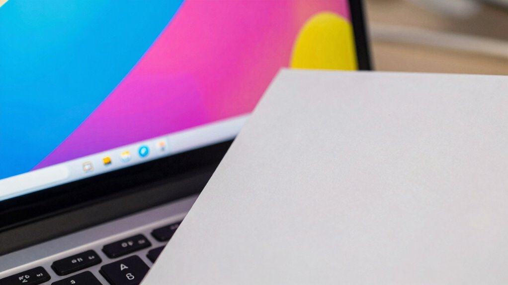
Have you ever noticed that the colors on your monitor don’t quite match the printout? It’s a common frustration, and the reason lies in how displays and printers handle color differently. Your monitor uses light to display colors, while printers rely on ink and paper, making accurate color reproduction a complex process. To bridge this gap, you need to understand color calibration, which adjusts your monitor’s settings to produce consistent and accurate colors. Without proper calibration, what you see on your screen can be misleading, leading to mismatched prints. Achieving good color calibration involves tweaking gamma, white point, and color profiles so that your monitor more closely reflects real-world colors. This step is essential because a poorly calibrated monitor can give you a false sense of how your artwork or photos will look once printed.
Proper monitor calibration ensures your digital colors match your prints accurately.
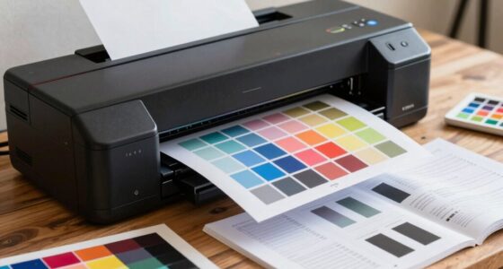
Another key factor influencing the discrepancy is ink absorption. Unlike digital screens, which display colors through emitted light, printers deposit ink onto paper. Paper isn’t just a blank canvas—its surface affects how ink spreads and absorbs. Different paper types absorb ink at varying rates, which can markedly alter the final color. For example, glossy paper tends to reflect more light and can make colors appear more vibrant, while matte paper absorbs ink more deeply, often dulling the hues. If you don’t account for ink absorption, your printed colors may seem off compared to what you saw on your monitor. That’s why choosing the right paper and understanding how it interacts with ink is essential to achieving a closer match. Additionally, paper quality plays a significant role in how colors are reproduced in print. Being aware of ink absorption can help you select the best materials for your printing needs.
Furthermore, print processes involve color profiles and color management systems, which help translate digital colors into physical ones. These profiles consider the specific inks and paper you’re using, but if they aren’t correctly embedded or calibrated, colors can shift unexpectedly. Even minor differences in ink formulations or paper textures can impact the final look, underscoring the importance of consistent color management. When you print, the combination of ink absorption and paper quality, along with your printer’s settings, determines how accurately the colors are reproduced. Without proper adjustments, the printed result can appear dull, oversaturated, or simply different from what you initially saw on your monitor.
In essence, a mismatch between monitor and print colors boils down to differences in how light and ink create visual impressions. By focusing on precise color calibration and understanding ink absorption, you can minimize these disparities. It’s about making intentional choices—selecting the right paper, managing color profiles, and calibrating your display—to guarantee that your printed work truly reflects your digital vision. Recognizing the importance of color management systems can further enhance your ability to achieve consistent results across devices.

Calibrite Display Pro HL Monitor Calibration Colorimeter for LCD Mini LED and OLED Displays, Measure up to 3000 Nits, PROFILER Software, USB C with Adapter, Validation/Color Uniformity Tools
SPECIFICATIONS: HL high luminance sensor colorimeter measures up to 3000 nits, calibrates and profiles LCD mini LED OLED…
As an affiliate, we earn on qualifying purchases.
As an affiliate, we earn on qualifying purchases.
Frequently Asked Questions
How Can I Calibrate My Monitor for Better Color Accuracy?
To calibrate your monitor for better color accuracy, start with hardware calibration tools like a colorimeter or spectrophotometer. Use calibration software to adjust brightness, contrast, and color temperature. Perform display profiling to create an accurate color profile for your monitor. This process guarantees your display reflects true colors, making your monitor’s output more consistent and reliable for professional editing or printing, reducing color mismatches.
What Printing Settings Influence Color Matching the Most?
Printing settings that influence color matching the most include choosing the right color gamut and adjusting ink absorption. A wider color gamut guarantees your printer can reproduce a broader range of colors, improving accuracy. Proper ink absorption settings prevent colors from appearing dull or oversaturated. By fine-tuning these options, you’ll get closer color matches between your monitor and print, reducing the need for extensive adjustments post-printing.
Do Different Paper Types Affect Printed Color Accuracy?
Yes, different paper types markedly affect printed color accuracy. Paper texture influences how ink settles, impacting color vibrancy and detail. Smooth papers produce sharper, more consistent colors, while textured papers can cause color variations due to uneven ink absorption. Ink absorption varies among paper types, affecting how colors appear—some papers absorb more ink, dulling colors, while others preserve brightness. Choosing the right paper guarantees better color fidelity between your monitor and print.
How Does Ambient Lighting Impact Color Perception?
Ambient lighting dramatically impacts your color perception, making you think your monitor and print match perfectly—until you step into the sunlight. Bright or uneven lighting alters color temperature and light reflection, causing colors to look different. So, if you’re puzzled why your hues seem off, blame the environment. To get true colors, view your work in consistent, neutral lighting—otherwise, your eyes are just playing tricks on you.
Can Color Profiles Improve Print and Monitor Color Consistency?
Yes, color profiles can improve print and monitor color consistency. By using color calibration tools, you can create accurate profiles for your devices, ensuring they display and print colors more accurately. Profile adjustment helps fine-tune color settings, reducing discrepancies between what you see on your screen and the final print. Regular calibration and profile updates are essential for maintaining consistent, true-to-original colors across both monitor and print outputs.
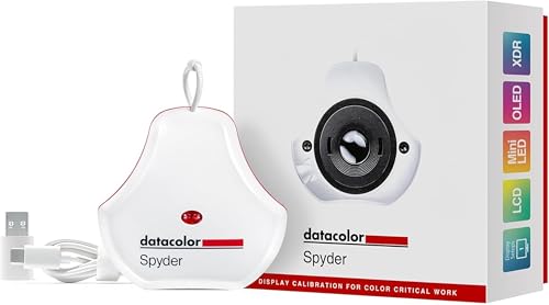
datacolor Spyder – Monitor Calibrator for Graphic Designers, Photographers, and Content Creators, Shows You True Colors, Works on OLED Monitors & LED Screens, Easy-to-Use Color Calibration Tool
Color “Surprises” Are a Thing of the Past: Datacolor’s exclusive DevicePreview TM Beta feature simulates what your photos…
As an affiliate, we earn on qualifying purchases.
As an affiliate, we earn on qualifying purchases.
Conclusion
In the end, understanding why your monitor and print colors rarely match is like chasing a fleeting rainbow—beautiful but elusive. By recognizing the differences in color profiles, lighting, and printer calibration, you can get closer to your desired result. It’s a continuous journey, much like tuning an instrument to perfection. Patience and small adjustments will help bridge the gap, making your prints feel more like the vibrant visions you see on your screen.
photo printer ink and paper set
As an affiliate, we earn on qualifying purchases.
As an affiliate, we earn on qualifying purchases.
professional color management system
As an affiliate, we earn on qualifying purchases.
As an affiliate, we earn on qualifying purchases.