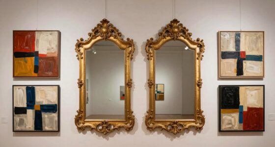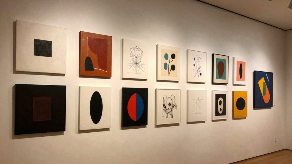

When hanging multiple works, think about creating a visual rhythm by considering placement, spacing, and size to guide the eye smoothly across the collection. Group similar or contrasting colors to direct movement and use spacing to balance clutter and flow. Vary the orientation and size of pieces to add dynamism, and incorporate negative space to give each work room to breathe. This approach turns your display into a cohesive, engaging experience—more tips like these can help you perfect your arrangement.
Listen free for 30 days with Audible
Thousands of audiobooks and originals — cancel anytime.
As an affiliate, we earn on qualifying purchases.
Key Takeaways
- Create a visual flow by varying sizes, orientations, and spacing to guide the viewer’s eye smoothly across the display.
- Group works with similar or contrasting color schemes to establish cohesive visual movement.
- Use negative space strategically to control pacing and prevent clutter, allowing the eye to rest.
- Arrange pieces considering composition principles to enhance perceived movement and viewer navigation.
- Balance focal points and overall elements to maintain harmony and prevent visual overload.
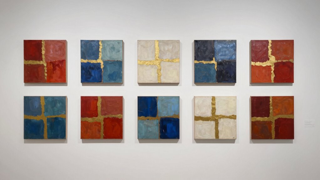
Have you ever noticed how some images draw your eye effortlessly, guiding you through their elements with a natural flow? When you think about visual rhythm, it’s this intuitive sense of movement that keeps viewers engaged. As you hang multiple works, creating a sense of harmony becomes essential, and understanding how color harmony and negative space influence this flow can make all the difference. Color harmony ties the pieces together, ensuring they complement each other without clashing. Whether you choose analogous, complementary, or monochromatic schemes, the goal is to establish a visual language that feels cohesive. When the colors work well together, your eye moves smoothly from one piece to the next, avoiding abrupt stops or jarring transitions. Negative space, on the other hand, acts as the breathing room between works. It’s not just empty space; it’s a deliberate tool to control movement and pace. By carefully balancing negative space around each piece, you create a rhythm that guides the viewer’s eye naturally from one work to another, preventing visual overload or confusion. Additionally, understanding the role of visual flow can help you craft a more engaging display. You’ll want to think about how the placement of each piece influences this rhythm. For example, grouping works with similar color schemes or contrasting hues can create visual cues that lead the eye in a certain direction. The distance between pieces matters too—spacing them too close can make the display feel cluttered, while too much space might interrupt the flow. A consistent pattern or rhythm in spacing can evoke a sense of movement, like a visual dance across the wall. Think about the overall composition as a dynamic sequence where each element plays a role in guiding the viewer’s eye seamlessly through the collection. You can achieve this by varying the size and orientation of the works, but always keeping in mind how they relate to each other through color harmony and negative space. Recognizing the importance of composition principles can help you refine your arrangements for a more harmonious display. An understanding of visual rhythm also involves recognizing the importance of balance, which ensures that no single element overwhelms the overall arrangement. When you pay attention to perceived movement, you can better anticipate how viewers will naturally navigate your display. It’s also helpful to consider how visual hierarchy can emphasize certain pieces and influence the viewer’s journey. Ultimately, visual rhythm when hanging multiple works isn’t about strict rules; it’s about creating a balanced, engaging flow. Pay attention to how your eye moves across the arrangement, adjusting color relationships and spacing until everything feels natural. When you master this balance, your display will feel unified and lively, inviting viewers to explore each piece without interruption. It’s this careful consideration of rhythm—through color harmony and negative space—that transforms a simple grouping into a compelling visual experience.
As an affiliate, we earn on qualifying purchases.
Frequently Asked Questions
How Does Lighting Affect Visual Rhythm in Artwork Displays?
Lighting dramatically influences visual rhythm by highlighting key areas and creating movement across your display. Through lighting dynamics, you guide viewers’ eyes, emphasizing certain artworks or details. Shadow interplay adds depth and contrast, enhancing the sense of flow and harmony. By carefully adjusting light angles and intensities, you establish a rhythm that guides viewers smoothly from piece to piece, making the overall display more engaging and cohesive.
Can Negative Space Influence the Overall Rhythm of Multiple Works?
Negative space influence plays a vital role in shaping the overall rhythm of multiple works. By thoughtfully incorporating negative space, you create a sense of spatial harmony that guides viewers smoothly from one piece to the next. This balance prevents visual clutter, emphasizes relationships between artworks, and establishes a cohesive flow. When you manage negative space well, it enhances the visual rhythm, making your display more engaging and harmonious.
How Do Color Schemes Impact Visual Flow Between Pieces?
Color schemes markedly influence the visual flow between pieces by creating harmony or contrast. You should aim for color harmony to establish a smooth, cohesive rhythm, guiding viewers effortlessly from one work to the next. Conversely, palette contrast can add visual interest and emphasize shifts. By thoughtfully balancing these elements, you control the overall rhythm, ensuring each piece complements the others without disrupting the gallery’s visual harmony.
What’s the Role of Framing in Establishing Visual Rhythm?
Framing acts as a gentle conductor, guiding your eye through a harmonious dance of composition balance and thematic coherence. It subtly emphasizes relationships between pieces, creating a visual rhythm that feels natural and engaging. By thoughtfully choosing frames, you set a consistent tone and structure, helping viewers intuitively follow the narrative flow. Ultimately, framing weaves individual works into a cohesive story, enriching the overall experience and reinforcing the gallery’s visual symphony.
How Does Audience Perspective Alter Perceived Visual Rhythm?
Your audience’s perspective considerably alters perceived visual rhythm because perception shifts based on their viewing angle and distance. When viewers move through the space, their engagement with the works changes, creating dynamic shifts in rhythm. You should consider sightlines and flow, guiding viewers intuitively. This active engagement enhances the overall experience, making the rhythm feel more lively and connected, which keeps viewers engaged and encourages them to explore the entire display.
As an affiliate, we earn on qualifying purchases.
Conclusion
As you arrange your works, remember that visual rhythm is like a heartbeat—guiding viewers through your story. Think of each piece as a note in a symphony, where spacing and placement create harmony and tension. When you balance these elements, your display becomes a dance of shadows and light, inviting viewers to move effortlessly from one work to the next. Embrace this rhythm, and your collection will resonate long after they leave.
As an affiliate, we earn on qualifying purchases.
As an affiliate, we earn on qualifying purchases.
Fall Picks
fall essentials
As an affiliate, we earn on qualifying purchases.