

Color palettes feel calm or loud based on saturation, brightness, and how colors are paired. Calm palettes often use muted, soft tones with lower saturation and gentle contrast, creating a soothing vibe. Loud palettes usually incorporate vibrant, highly saturated hues with high brightness and bold contrasts, making them energizing and attention-grabbing. Understanding how these elements interact helps you craft emotions in your designs—keep exploring to discover how to master this balance effortlessly.
Key Takeaways
- Calm palettes often use muted, pastel colors with low saturation to create a soothing visual effect.
- Loud palettes typically feature high saturation and bold, vibrant hues that attract attention and evoke energy.
- Harmonious schemes balance warm and cool tones, avoiding excessive contrast, which maintains a relaxed feel.
- Contrast level and brightness influence mood; softer contrasts promote calmness, while high contrast creates vibrancy.
- The overall color combination, including cultural symbolism and context, shapes whether a palette feels tranquil or energetic.

AUREUO Morandi Acrylic Paint Set – 8 Muted Colors x 0.71 Fl Oz/21ml Tubes, Vintage Neutral Earthy Tones for Canvas Painting, DIY Crafts, Home Decor, Wall Art Non-Toxic Matte Finish
MORANDI COLOR PALETTE: This Acrylic Paint Set features 8 soft, muted shades inspired by the tranquil and sophisticated…
As an affiliate, we earn on qualifying purchases.
As an affiliate, we earn on qualifying purchases.
Learn the Basics of Color Theory and the Color Wheel
Understanding color theory and the color wheel is essential for creating visually appealing designs. When you grasp how colors relate, you can craft harmonious palettes that evoke specific feelings. Color symbolism plays a key role here—certain colors represent ideas or emotions across different contexts, influencing viewer perception. Color symbolism can vary significantly across cultures, adding complexity to design choices. Cultural influences also shape how colors are interpreted; for example, red might symbolize luck in some cultures but danger in others. The color wheel serves as a visual guide, helping you see relationships like complementary or analogous colors. By learning these basics, you’ll develop a deeper awareness of how colors interact, enabling you to choose combinations that resonate with your audience and strengthen your visual message. Additionally, understanding how AI-driven content generation can influence visual design choices allows designers to experiment more efficiently. Exploring color psychology can further enhance the emotional impact of your palettes, making your designs more compelling. Developing an understanding of color harmony principles can also assist in creating balanced and aesthetically pleasing compositions. Recognizing the symbolism embedded in Polynesian symbols can also inspire culturally rich color choices in your designs.

AMOIENSIS Vibrant Orange Balloon Dog Statue Decor, 4 inch Small Knick Knacks Balloon Animal for Shelf Decor
Compact Charmer, Maximum Impact: At just 4×1.9×4 inches, this petite balloon dog statue fits in the palm of…
As an affiliate, we earn on qualifying purchases.
As an affiliate, we earn on qualifying purchases.
Discover the Principles Behind Color Harmony

What makes a color combination feel balanced and pleasing to the eye? It’s about understanding the principles behind color harmony. You’ll find that color symbolism plays a significant role—certain hues evoke specific emotions or ideas, and knowing these can help you craft harmonious palettes. Additionally, cultural influences shape how colors are perceived; for example, white symbolizes purity in some cultures but mourning in others. By considering both color symbolism and cultural context, you can create combinations that resonate on a deeper level. Recognizing color associations can further enhance your ability to select palettes that evoke the desired mood or message. Harmonious palettes often balance warm and cool tones or use complementary colors that naturally enhance each other. Understanding visual balance is key to achieving a cohesive and pleasing design. For instance, paying attention to color contrast can help you create more dynamic and engaging compositions. Incorporating an understanding of color schemes can guide you in choosing combinations that are more effective. Mastering these principles also involves color harmony techniques, which help ensure your palette feels unified and intentional. Ultimately, mastering these principles allows you to choose colors that feel intentional, cohesive, and visually appealing.

SIGNLEADER Framed Canvas Print Wall Art Set Abstract Pastel Harmony Soft Color Blends Illustrations Modern Relax/Calm Multicolor for Living Room, Bedroom, Office – 16"x24"x2 BLACK
GORGEOUS ARTWORK – High definition artwork is printed by inkjet on thick, professional grade framed canvases.2 panels of…
As an affiliate, we earn on qualifying purchases.
As an affiliate, we earn on qualifying purchases.
See How Color Schemes Affect Our Emotions

Warm tones can energize your mood, while cool tones often create a calming effect. Brightness levels also influence how you feel—brighter colors tend to lift your spirits, whereas softer shades can soothe. Additionally, understanding color psychology can help you select palettes that evoke the desired emotional response in your space. Recognizing how visual impact influences perception can further enhance your design choices and emotional well-being. Being aware of color harmony principles can guide you in creating balanced and emotionally resonant environments. Moreover, applying visual balance can help achieve a more harmonious and psychologically pleasing color scheme, fostering a sense of emotional well-being.
Warm vs. Cool Tones
Colors evoke emotions, and the difference between warm and cool tones plays a significant role in how you feel in a space. Warm tones, like reds and oranges, energize and create a cozy atmosphere, while cool shades such as blues and greens promote calmness and relaxation. Your choice influences your mood and perception. Consider this table:
| Warm Tones | Cool Shades |
|---|---|
| Stimulate excitement | Encourage tranquility |
| Feel inviting and cozy | Induce peacefulness |
| Boost energy levels | Enhance focus and calm |
Additionally, understanding how color harmony impacts emotional responses can help you create spaces that foster the desired mood. When selecting color schemes, it’s important to consider how different hues interact to produce a balanced emotional response, promoting overall well-being in your environment. Recognizing the role of color psychology can further refine your choices to craft harmonious and emotionally beneficial spaces.
Brightness and Mood
Have you ever noticed how a brightly lit room can lift your spirits, while a dimly lit space might make you feel more subdued? Brightness markedly influences mood through psychological effects and cultural associations. Bright environments often evoke energy, optimism, and alertness, making you feel more awake and positive. Gold IRAs are an example of how a specific investment strategy can be tailored to align with your financial goals, just as choosing the right lighting can influence your emotional state. Additionally, understanding credit card terms can help you manage your personal finances more effectively, much like selecting appropriate lighting enhances a space’s ambiance. Moreover, color accuracy plays a significant role in how we perceive visual comfort and emotional impact in a space. Understanding how color psychology impacts mood allows you to choose color schemes intentionally, creating spaces that foster the desired emotional response—whether lively or restful. Conversely, dim lighting can create a calming, introspective atmosphere, but may also induce feelings of sadness or fatigue. These responses are shaped by cultural associations; for example, bright lights are linked to celebration and activity in some cultures, while in others, softer lighting signifies tranquility.

Yerliker 6 Pcs Floor Pillow Cushions 15inch Round Velvet Throw Pillows Colorful Flexible Cushions Alternative Pillows for Couch Chair Living Room Bedroom Home Office Decor(Pastel Color)
Velvet Floor Pillow: the package contains 6 pieces velvet throw pillows , feature with 6 different colors, vibrant…
As an affiliate, we earn on qualifying purchases.
As an affiliate, we earn on qualifying purchases.
Understand the Role of Saturation and Brightness

Saturation influences how intense or subdued a color feels, affecting the emotions it evokes. Brightness sets the overall mood, making a space feel lively or calm. Additionally, understanding how visual cues and color technology can enhance visual narratives helps in designing more compelling and emotionally resonant color palettes. Recognizing the key traits of successful designers can further refine how these elements are applied for maximum impact. For instance, leveraging color perception techniques can heighten the emotional response elicited by different palettes.
Saturation’s Emotional Impact
Since brightness and saturation work together to influence how we feel about a color, understanding their impact is essential for creating emotional harmony.
Color saturation directly affects your emotional response, shaping whether a palette feels energetic, soothing, or overwhelming. High saturation intensifies feelings, making colors seem more vibrant and lively, which can energize or excite your audience.
Conversely, lower saturation produces a muted, subtle effect, fostering calmness and relaxation. By adjusting saturation thoughtfully, you control the emotional tone of your design or space.
Bright, highly saturated colors evoke excitement and passion, while desaturated hues promote serenity. Recognizing how saturation influences emotions helps you craft palettes that resonate with your intended mood, creating a balanced and harmonious visual experience.
Brightness and Mood
Brightness plays a fundamental role in shaping the mood of a color, directly influencing how you perceive and feel about a space or design. Higher brightness levels evoke energy, making a space feel lively or cheerful. Conversely, lower brightness creates calmness or somberness, promoting relaxation. Brightness affects visual comfort by reducing strain and enhancing clarity. When selecting palettes, consider how brightness impacts color perception and emotional response:
| Brightness Level | Effect on Mood | Visual Comfort |
|---|---|---|
| High | Energetic, vibrant | Increased clarity |
| Moderate | Balanced, neutral | Comfortable |
| Low | Calm, subdued | Soft, easy on eyes |
| Very high | Overwhelming | Can cause fatigue |
| Very low | Dull, heavy | Might promote tiredness |
Balancing Intensity Levels
Balancing intensity levels in colors involves carefully managing both saturation and brightness to create harmonious and visually appealing designs. When you adjust saturation, you control how vivid or muted a color appears, which influences emotional impact. Brightness determines how light or dark a color feels, affecting overall mood.
Using complementary contrast, you can pair high-saturation colors to create vibrancy without overwhelming the viewer, ensuring the palette remains balanced. Monochromatic unity relies on subtle variations in saturation and brightness within a single hue, fostering harmony and calmness.
Get Practical Tips for Creating Harmonious Palettes
Creating harmonious color palettes becomes easier when you understand some practical tips. Start by experimenting with color blocking, which involves grouping colors into distinct sections to create balance and visual interest. This technique helps you see how different hues interact and guides you in selecting complementary shades.
Additionally, consider using monochromatic schemes, which involve variations of a single hue. Monochromatic palettes often evoke calmness and simplicity, making them great for soothing environments.
When choosing colors, pay attention to contrast and saturation to avoid overstimulation or dullness. Use tools like color wheels or digital palettes to visualize combinations before applying them.
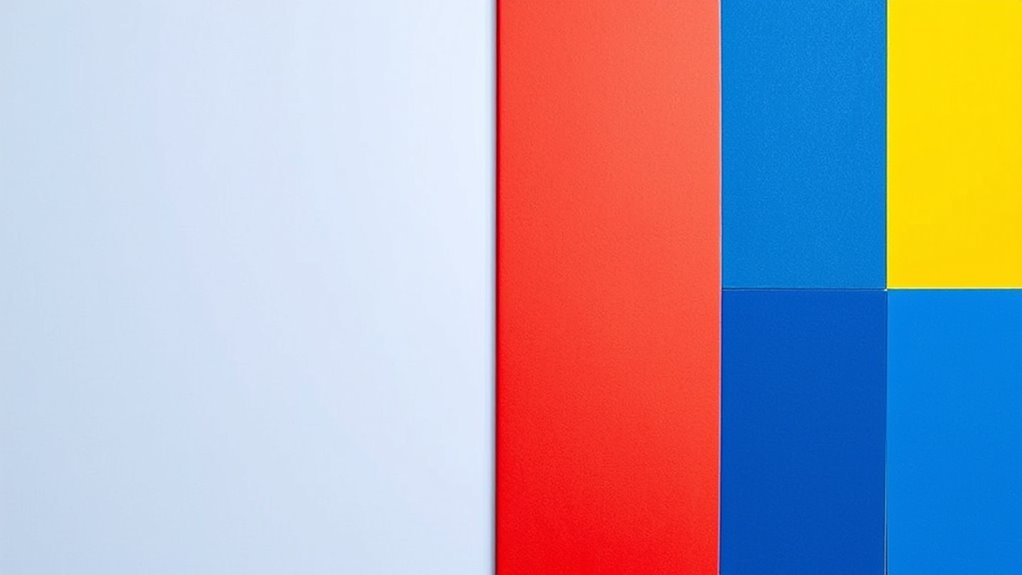
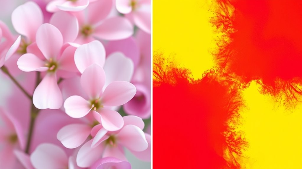
Explore Real Examples of Calm and Loud Color Schemes

When exploring color schemes, seeing real-world examples can help you grasp how different palettes evoke specific moods. Calm schemes often feature pastel palettes, such as soft pinks, blues, and greens, creating a soothing atmosphere. You might notice how interior designs or branding use these gentle colors to promote relaxation.
In contrast, loud color schemes tend to rely on bold color blocking, with vibrant reds, yellows, and oranges arranged in striking patterns. These palettes grab attention and energize a space or design. For example, fashion collections or murals often incorporate loud color blocking to make a statement.
Observing these examples helps you understand how subtle pastel palettes foster calm, while intense color blocking delivers loud, dynamic impacts.
Frequently Asked Questions
How Do Cultural Differences Influence Perceptions of Color Harmony?
Cultural differences shape how you perceive color harmony by influencing cultural symbolism and regional color preferences.
You might see certain colors as calming or vibrant based on cultural meanings, like white for purity in some cultures or red as luck. These associations affect your emotional response, making some palettes feel harmonious or loud.
Understanding these cultural nuances helps you design palettes that resonate effectively with diverse audiences.
Can Personal Experiences Alter How We Perceive Color Palettes?
Yes, your personal experiences can change how you perceive color palettes. When you recall a personal memory linked to a specific color, like a favorite childhood place with vibrant hues, it creates a strong color association.
This emotional connection influences your perception, making certain palettes feel more calming or loud based on your past experiences. Your unique history shapes how you respond to different color combinations.
What Role Does Lighting Play in Color Harmony and Emotional Response?
Lighting plays a pivotal role in shaping your emotional response and the overall mood of a space.
Bright, natural light enhances vibrant colors, making them feel energetic and loud, while soft, warm lighting creates a calming, intimate atmosphere.
Your perception of color harmony shifts with lighting, as it influences how colors interact and evoke feelings.
Adjusting lighting allows you to control the emotional impact, making your environment feel more harmonious or lively.
Are There Universal Color Combinations That Evoke Specific Feelings Globally?
You’ll find that certain universal color combinations evoke specific feelings because of color psychology and color symbolism.
For example, red often signals passion or urgency, while blue suggests calmness and trust. These associations are widely recognized across cultures, though some variations exist.
How Does Context Affect the Perception of Calm or Loud Color Schemes?
You’ll find that context heavily influences whether a color scheme feels calm or loud. Cultural associations shape your perception—what’s soothing in one culture might feel energetic in another.
The overall contextual mood, like a serene spa or lively festival, also guides your emotional response.
Conclusion
Now that you understand how color theory, harmony, and saturation influence feelings, you can craft palettes that evoke the right mood. Whether you want a calm, soothing vibe or a loud, energetic one, applying these principles helps you create balanced, impactful designs. Trust your instincts, experiment with different combinations, and observe how colors make you feel. With practice, you’ll effortlessly develop palettes that resonate perfectly with your intended message and audience.